New Look Logo
New Look is a prominent British global fashion retailer, known for its trendy clothing and accessories catering to women, men, and teenagers. Founded by Tom Singh in 1969, the company has established a significant presence in the fashion industry. New Look operates primarily in the United Kingdom but has extended its reach globally, with numerous stores in Europe, Asia, and the Middle East. The brand is recognized for its ability to quickly adapt to fashion trends, making it a favorite among fashion-conscious consumers.
Meaning and history
Tom Singh, a visionary entrepreneur, established New Look in Taunton, Somerset, in 1969. The company started as a single fashion store and has since evolved into an international retail giant. One of New Look’s main achievements is its rapid expansion and adaptation to online retail, which has significantly broadened its customer base. The brand has also been applauded for its inclusive sizing and affordable yet fashionable product range.
In recent years, New Look has faced competitive challenges in the fast-paced fashion industry. Despite this, it maintains a strong presence in the market, continually adapting its strategies to stay relevant and appealing to its diverse customer base. The company’s focus on digital growth and sustainable fashion practices positions it well for future success in the ever-evolving retail landscape.
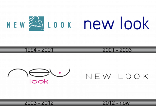
1994 – 2001
The logo depicts a central square containing a stylized line art of a human profile, which conveys the image of a face viewed from the side. The lines are simple and fluid, creating the outline of the forehead, nose, lips, and chin with minimal detail. This design embodies a contemporary and abstract approach.
Surrounding the square, the words “NEW LOOK” are presented in a clean, uppercase sans-serif font. The letters are evenly spaced and bold, providing a stark visual contrast to the minimalist artwork within the square. The color palette appears to consist of a soft teal for the square background, which suggests a modern and fresh brand image, while the text is in a darker color to ensure prominence and legibility. The overall effect of the logo is one of modern sophistication, indicative of the brand’s fashion identity.
2001 – 2003
The logo consist of the words “new look” in lowercase letters. The typeface used here is sans-serif, which provides a modern and clean appearance. The color of the text is a deep blue, which can be associated with trustworthiness and professionalism.
Comparing this logo to the previous one, there are notable differences. The earlier logo included a square with an abstract human profile, which added an artistic element to the design. In contrast, this logo is text-only, without any additional graphics or symbols. The simplicity of this design focuses entirely on the brand name, relying on the boldness of the color and the clarity of the font to make its impact. This minimalist approach reflects a trend in branding where the name alone must carry the brand’s identity and values.
2003 – 2012
The image showcases a playful and creative rendition of the “new look” logo. It features a unique typographic design where the letters “n” and “e” are represented by abstract, half-circle shapes, and the “w” is depicted as an oval shape, with a dot that seems to playfully suggest an eye winking. The letters are black, conveying a classic and sophisticated vibe.
Below this graphic representation, the word “look” is written in lowercase letters in a vivid magenta hue, adding a pop of color and a modern flair to the logo. The typeface is sans-serif, which contributes to a sleek and contemporary look.
Compared to the previous logo, which was straightforward with a solid blue color and standard sans-serif font, this logo introduces graphic elements that add character and a whimsical touch. The introduction of color with the magenta also provides a more vibrant and youthful feel. This logo is more visually engaging and suggests a brand identity that is fun, innovative, and fashion-forward.
2012 – Today
The letters are evenly spaced, conveying a sense of balance and modernity. The font choice is straightforward and clean, which gives the logo a timeless and versatile appearance.
This design is significantly different from the previous iterations of the New Look logo that incorporated stylized graphics and varied typography. In contrast, this logo opts for simplicity and clarity, focusing on the strength of the brand name without additional visual elements. The monochromatic color scheme further emphasizes the minimalist aesthetic, making it easily adaptable across various mediums and platforms for the brand. This iteration of the logo represents a modern, chic, and accessible brand identity.


