New York Giants Logo
The New York Giants is a renowned US-based football team that performs in the National Football League (NFL). Set up in 1925, it is the only surviving team of those who founded the League. It is anchored in the New York city area and takes on its adversaries at MetLife Stadium in East Rutherford, New Jersey.
Meaning and history
The Giants’ moniker doesn’t trace back to the traditional gigantic creatures of myth and legend, but it packs a symbolic punch. It is a nod to the early baseball team champions of the 1880s, the renowned New York Giants. Their name signifies power and passion, and this is precisely what the Giants strive to embody.
The team possesses an illustrious history, boasting an impressive haul of eight NFL tournaments, four of which were clinched before the Super Bowl appeared. Moreover, the team has earned five Super Bowl appearances, winning an impressive four. The Giants have given rise to a line of legendary footballers, such as Lawrence Taylor, Frank Gifford, and Eli Manning. The robust defense has produced many Hall of Fame players in that position.
What is New York Giants?
The New York Giants are the shining champions of the NFL, a constellation of talented American football clubs. This legendary team was born in 1925 and has since become a vital member of the East Division and NFC. The Giants’ hub is the MetLife Stadium in East Rutherford, placed 8 km west of NYC.
1946 – 1950
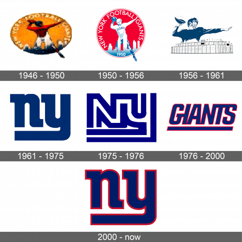
The earliest insignia of the New York Giants was crafted in a contemporary fashion, displaying a crimson and snow-white garbed team member positioned on an orange sack-like form that encircles a horizontally-arranged oval, with the aim of mimicking the form of the ball. The “New York Football Giants” inscription was placed along the boundary of the emblem, hovering above the player’s figure, inscribed in bright yellow caps of a simple script without serifs.
1950 – 1956
The logotype from 1950 underwent a transformation in shape from an oval to a circle, and the orange backdrop was swapped for red. In that iteration, the ivory and gray skyscrapers, etched in the picture’s lower par, became more conspicuous than its predecessor due to robust color contrast. The footballer was dressed in a pure white uniform, with blue inscription on it, and the ball clasped in his grasp was painted blue.
1956 – 1961
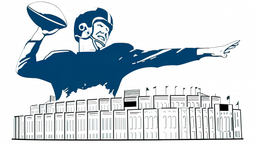
The logo reinvention of 1956 accentuated the logo, outlining the upper part of the player with the ball atop the picture of the Giants’ hub stadium. The whole composition was done in a light blue color code that showed luminous and rejuvenating.
1961 – 1975
During the 60s and early 70s, the Giants used a moderst monogram as its official symbol. It showcased two lowercase “NY” characters in an unusual script with large angular serifs. The lower bar of the “Y” was stretched and bent, underscoring the “N”. The regal blue shade of the new symbol appeared chic and self-assured on a white backdrop.
1975 – 1976
In 1975, the club modified its logotype, releasing the variant with the two connected white letters, contoured blue. The “N” was uppercase, while the “Y” was in lowercase, with its tail building two parallel bold lines underneath the caption. This emblem only lingered with the team for several months before being supplanted by another insignia in 1976.
1976 – 2000
The reinvention of 1976 represented the name caption without the address. It was inscribed in a thick, narrowed script without serifs. Its capitalized characters were italic and underscored. The characters were grouped and touched one another’s bars, which appeared solemn in a dark blue hue. That variant of the logo remains live, but only as the secondary one.
2000 – today
In 2000, New York Giants reverted to the 1961 edition of the badge. The stout lowercase “NY” acronym in a dark blue hue has a distinguished red contour, which is the single alteration to the original emblem. This laconic yet striking sign reflects its professionalism and love for the game.
Font
The New York Giants’ iconic insignia flaunts a distinct font, created exclusively for Giants back in 1961. This typeface boasts robust and curvy characters, with striking rectangular serifs that give it an air of distinction. The lower horizontal stroke of “y” runs right under the “n”.
Color
Their color code is comprised of dark blue and red hues. This duo of hues blazes against the pure white backdrop, boldly demanding attention and admiration. These electrifying colors have been used of the Giants’ legendary logo for most of their storied history, apart from the first quarter of the century and a stretch in the mid-1950-mid-1970s, when red was conspicuously absent from the logo.
