Obey Logo
Obey is an influential streetwear brand, renowned for its unique blend of activism, skateboarding culture, and music. Founded in 2001 by artist Shepard Fairey, it gained prominence through a distinctive style that combines provocative graphics and countercultural messaging. The brand’s ethos challenges societal norms and encourages individual expression. Fairey’s iconic “Obey Giant” street art campaign, featuring the face of wrestler André the Giant, is a cornerstone of its identity. Obey’s apparel line includes T-shirts, hoodies, and accessories, often adorned with bold, thought-provoking designs. The brand’s impact extends beyond fashion, symbolizing a fusion of art, social commentary, and rebellious spirit.
Meaning and history
Obey Clothing, a distinctive brand in the streetwear realm, was born from Shepard Fairey’s artistic vision in the early 2000s. Its genesis can be traced to Fairey’s impactful “Andre the Giant Has a Posse” sticker project during his days at the Rhode Island School of Design in 1989. This project morphed into the seminal “Obey Giant” artwork, merging artistry with a penchant for social and political discourse.
Fairey’s methodology was groundbreaking. He transformed public spaces into platforms for intellectual stimulation and debate. The emblematic “Obey Giant” image, an homage to wrestler André the Giant, transcended its initial street art form, embodying a critique of the establishment and a call for personal empowerment.
As this artwork gained cultural momentum, Fairey ventured into the fashion world with Obey Clothing. The brand swiftly garnered acclaim for its seamless integration of compelling visuals and messages into everyday wear, such as T-shirts, hoodies, and assorted accessories. Each item was more than a fashion statement; it was an embodiment of youthful zeal for articulation and dissent.
Obey’s influence extended beyond mere apparel. It became an emblem for a counterculture valuing artistic expression, social consciousness, and proactive political stance. Collaborating with diverse artists and groups, the brand magnified issues spanning environmentalism, human rights, and social justice.
Over the years, Obey sustained its foundational values. Growing into a globally recognized brand, it consistently championed challenging societal conventions, nurturing creativity, and endorsing a spirit of defiance. Fairey’s artistic contributions and Obey’s apparel range continued to motivate and engage, cementing Obey as a quintessential element in street fashion and a beacon for the defiant and the nonconformist.
What is Obey?
Obey is a distinctive streetwear brand, rooted in the artistic visions of Shepard Fairey. It stands out for blending fashion with social activism, encapsulated in bold, provocative designs that challenge norms and encourage individual expression. Originating from Fairey’s iconic “Obey Giant” street art, the brand has grown into a symbol of rebellious creativity and cultural influence.
2001 – 2000s
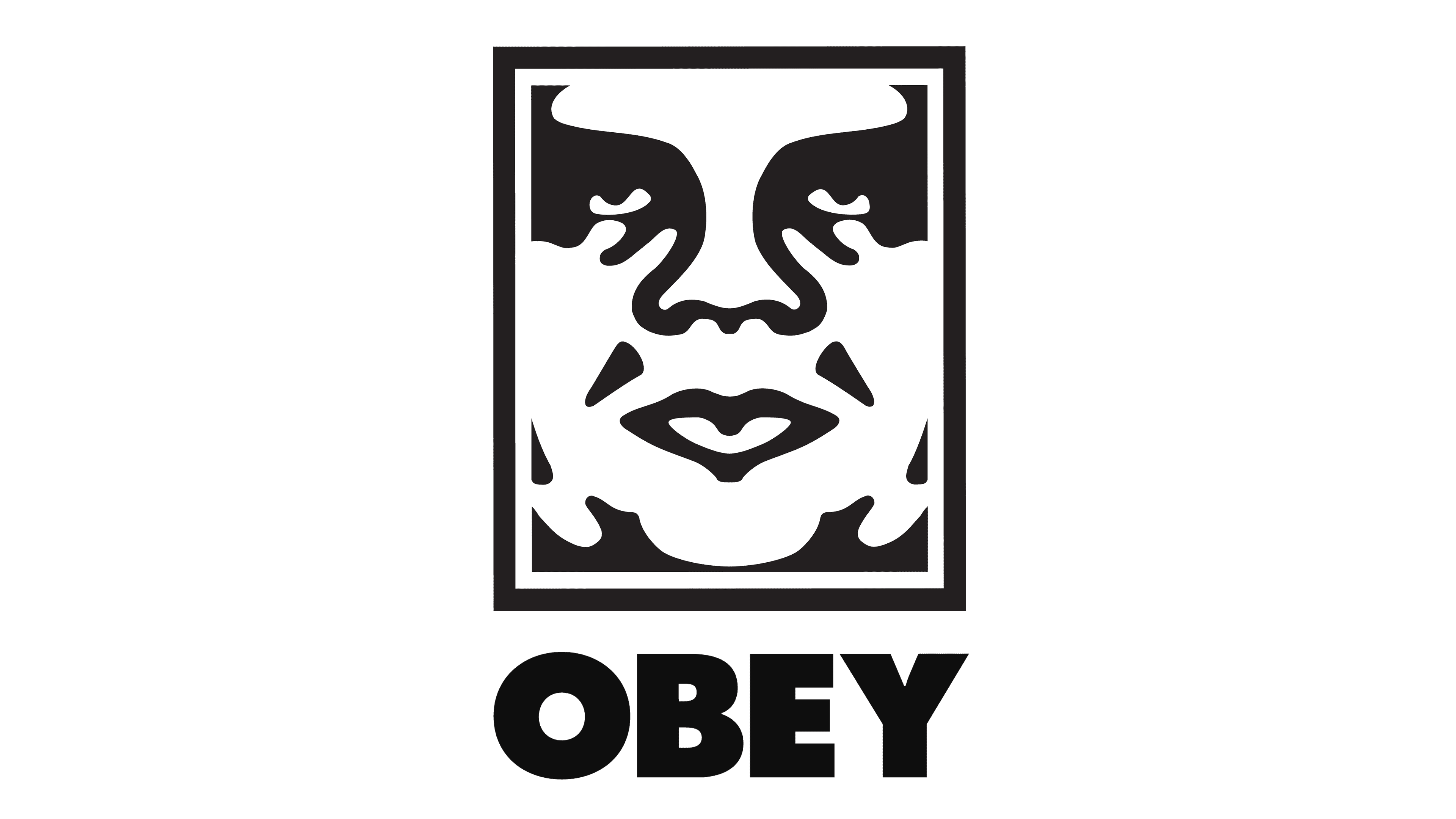
The emblem is a stark, high-contrast image that commands attention with its monochrome palette. Set within a slender, vertical rectangle, a stylized visage stares out, features abstracted to their most essential forms, evoking the iconic work of street artist Shepard Fairey. Below the face, a banner of red sharply interrupts the black and white, its blocky letters spelling out “OBEY” in an imperative tone. The design is both minimalist and complex, its simplicity belying the depth of its cultural commentary. This is not merely a logo but a symbol, a call to awareness in the landscape of contemporary fashion and activism. It is as much a piece of art as it is a brand identifier, a manifestation of dissent and the power of visual language.
2000s – Today
The evolution of the Obey logo sees a marked transition in its typographic element. The previous slanted, lighter font has been replaced with a bold, upright typeface, enhancing legibility and assertiveness. This bolder, wider font reinforces the brand’s authoritative stance, echoing its call to action with increased visual strength. This typographic shift complements the iconic face above, creating a cohesive and powerful visual statement that underlines the brand’s identity. The new font choice anchors the logo with a sense of stability, reflecting a matured confidence in the brand’s voice and message.


