Ocean Spray Logo
Ocean Spray is a union of farming companies, located in Plymouth, Massachusetts. Today it unites more than seven hundred members from around the US. The Ocean Spray’s goods consist of many versions of the cranberry, such as sauce or dried ones, and lots of fruit drinks and foods.
Meaning and History
Ocean Spray was founded in the year 1930 by three entrepreneurs in cranberry production and selling sphere, Marcus Urann, Elizabeth Lee and John Makepeace. They wanted to increase their sales and expanse their access to the cranberry market. The brand was called Ocean Spray by Marcus Urann, for an unknown reason.
1930 – 1932
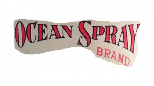
The new brand also gained the logo. It consisted of the inscriptions ‘Ocean Spray’ and ‘Brand’, and they were placed on the background of the piece of paper. These inscriptions also had the red serif fonts, although in different styles.
1932 – 1939
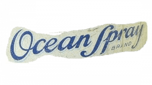
The following logotype had the similar features, but their color was changed to the blue, and the font of the name became handwritten. The words had also another positioning.
1939 – 1949
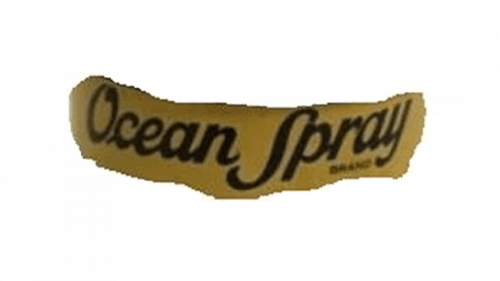
Another redesign occurred in 1939 and that time it affected background. It became dark yellow. The inscriptions’ color was changed as well.
1949 – 1955
The next logo depicted the blue inscription ‘Ocean Spray’, written on the white paper background. The font style was changed again. That time it was still handwritten, but the design of some letters changed.
1955 – 1962
The next brand mark had another font and background color. That time, there was the bright green-and-yellow color palette of the entire logo.
1962 – 1972
The 1962 brand mark became the foretype of the modern brand logotype. It had sans-serif typeface for the two-floor lettering and the white background in the paper style.
1972 – 1982
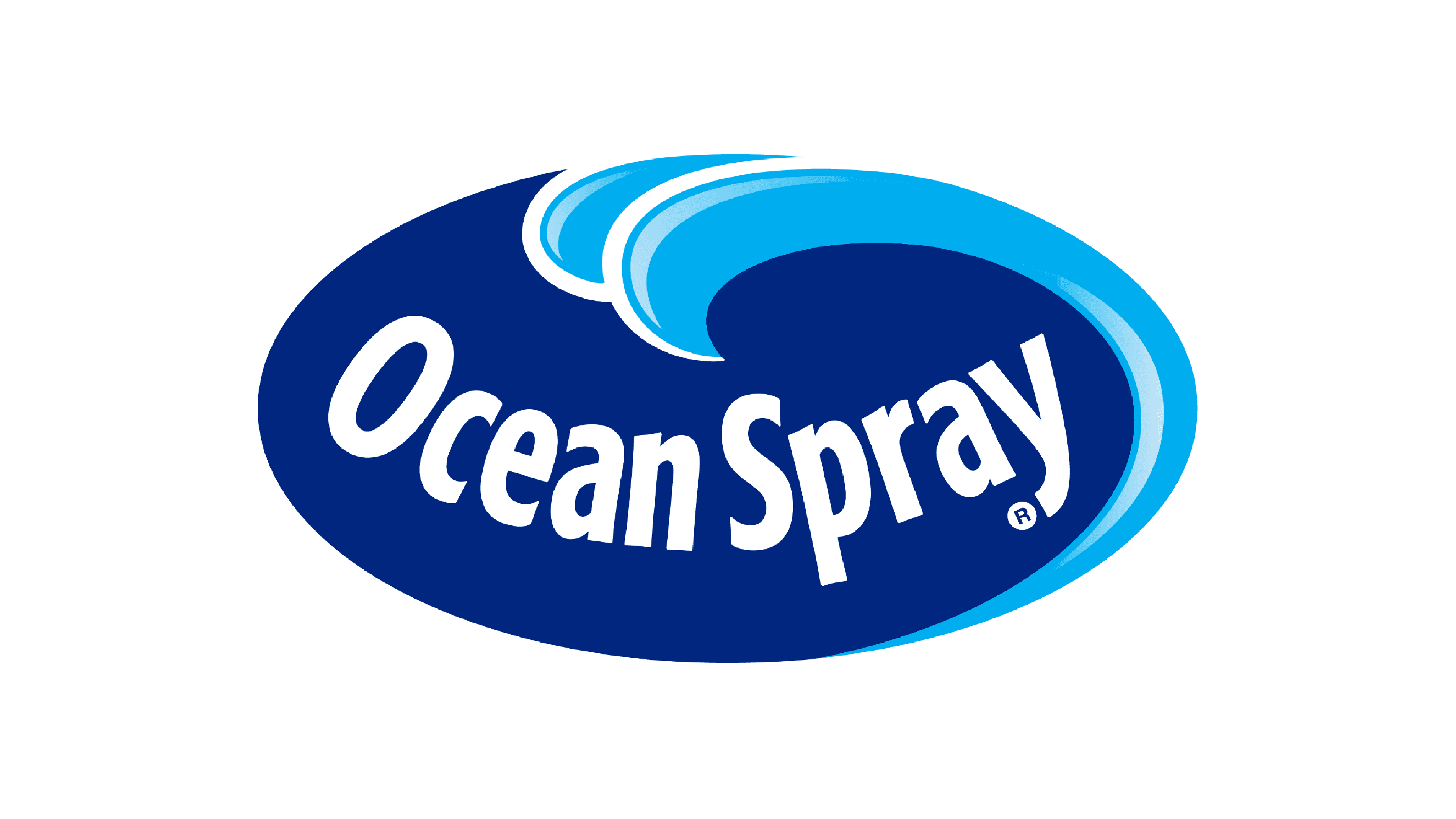
The following logotype had the white-colored inscription written in the Segoe font. It was depicted on the dark blue oval background with the wave of water. This logo became so successful that it wasn’t changed until now, except for a few modifications.
1982 – 1995
One of these modifications consisted of the brightening of the logo and adding a fleck of light on it.
1995 – 2003
This time, they simply added the white lines on the logotype.
2003 – Today
So, the very current brand watermark depicts the bright and simple in the same time inscription of the white color. It stands on the blue oval background with the water waves and without any lines, flecks and others.
Emblem and Symbol
This logotype is easy enough to use in different color palettes and situations. You can find the versions of the black and white color palette, extra-light variants and with the white outline. Due to the fresh and simple style, the brand watermark looks good and associative to the brand every time.
