Omation Logo
Omation is an animation studio, established by Steve Oedekerk. He founded it in Southern California. The studio was created to produce innovative and creative animated content. Its primary aim is to develop unique animated projects, tapping into cutting-edge technology and creativity. This allows Omation to stand out in the animation industry.
Meaning and history
Steve Oedekerk founded Omation Animation Studio in 2002, aiming to blend digital technology with traditional storytelling. The studio quickly made a name for itself with the CGI film “Barnyard”, which showcased a unique and creative approach. Omation then created the “Back at the Barnyard” TV series for Nickelodeon, solidifying its reputation.
Known for its distinctive visual style, Omation features exaggerated animations and expressive characters in its projects. Despite intense competition, the studio has secured a niche by focusing on humorous, family-friendly content. These projects blend adventure and comedy, attracting both children and adults.
Omation continues to expand its portfolio by engaging in various media projects, demonstrating its versatility in animation and storytelling. The studio consistently innovates, employing the latest technology to advance the art of animation.
What is Omation?
Omation is a creative animation studio known for its distinctive approach to animation and storytelling. Founded by Steve Oedekerk, it focuses on producing original and innovative animated content. The studio combines technology and art to create unique visual experiences.
2006 – Today
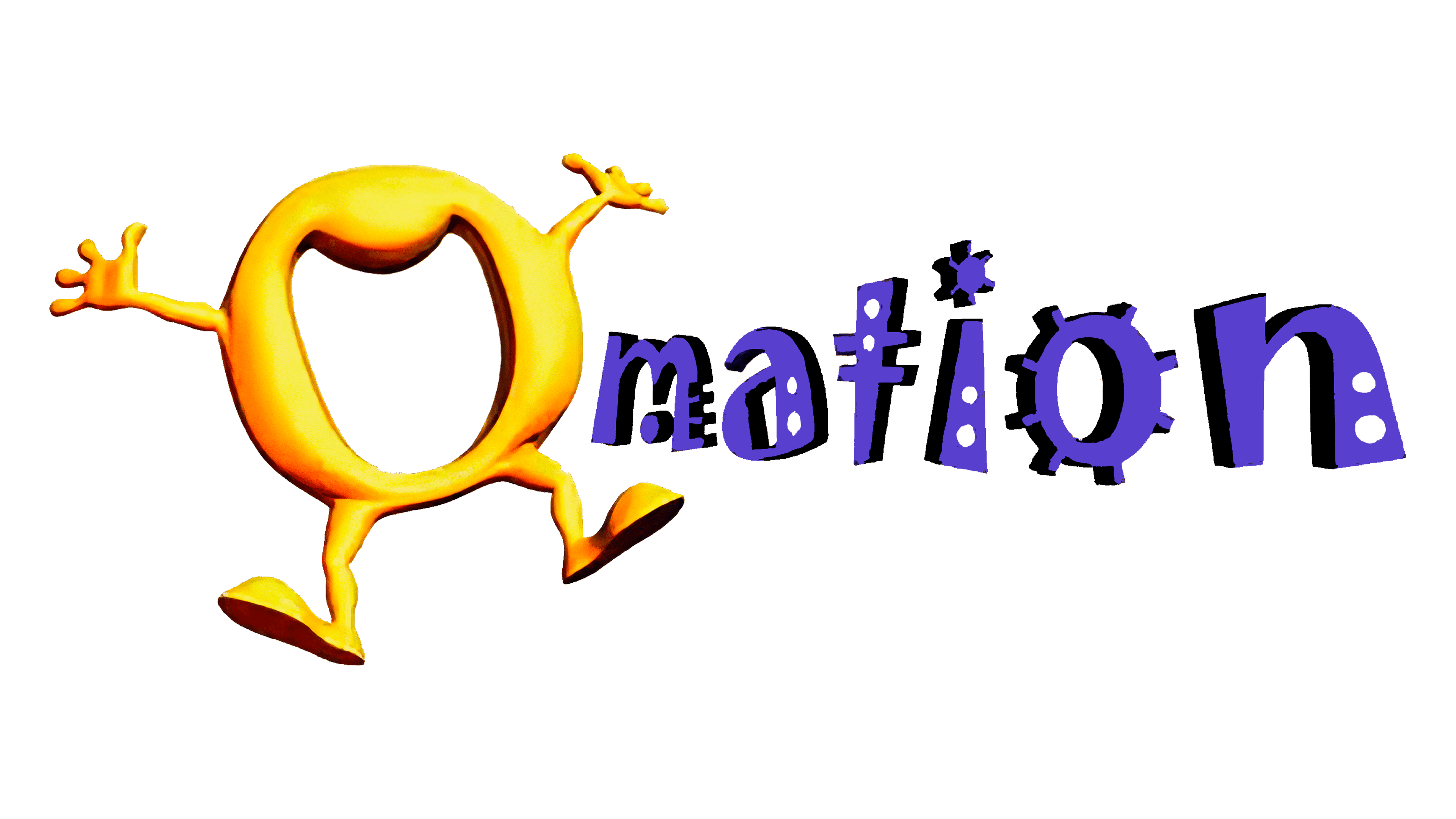
The logo of Omation Animation Studio features a vibrant and whimsical design. A stylized letter “O” forms the centerpiece, resembling a loop with playful, protruding appendages that mimic hands and feet. This “O” appears in a gradient of warm yellow and orange hues, giving it a dynamic and lively look. Surrounding the central “O” are various colorful elements including gears, stars, and shapes in purple, blue, and red, enhancing the creative and animated feel of the design. The words “Animation Studio” are neatly positioned below in a simple, modern purple font, completing the logo’s energetic and imaginative appeal.
2010 – Today
The updated logo of Omation Animation Studio displays noticeable changes, enhancing its dynamic and playful nature. The letter “O” remains the central element but now has a more defined and three-dimensional appearance with distinct limbs that suggest motion and activity. Its color shifts to a richer, deeper yellow, emphasizing vitality and energy. The accompanying text has been transformed into a more whimsical and stylized font in dark purple, adding a sense of creativity and innovation. Mechanical and geometric shapes like gears and rods in shades of purple and blue flank the “O”, highlighting the studio’s focus on technology and animation. These changes make the logo more vibrant and reflective of the studio’s artistic and technological pursuits.


