One Piece Logo
One Piece is a Japanese anime TV series based on the manga of the same name and directed by Kōnosuke Uda. The plot is about the boy who obtained superpowers after eating a mysterious fruit. Accompanied by his pirate crew, he travels across the world to find the ultimate treasure called ‘One Piece’ and become a new pirate king.
Meaning and History
The plot of the TV series has a lot of the pirate touch to it. This feature reflected on the logotype, as well. For example, we can see the pirate skull holding the rope in its teethes. The rope is tied to the anchor-stylized letter ‘E’. Due to these details, the logotype gained a very bright pirate style.
What is One Piece?
One Piece is a Japanese manga and anime series created by Eiichiro Oda. It follows the adventures of Monkey D. Luffy and his pirate crew as they search for the ultimate treasure, known as the “One Piece.” It has gained worldwide popularity for its engaging storyline, vibrant characters, and imaginative world-building.
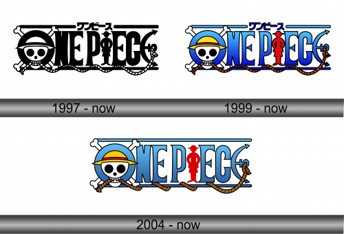
1997 – Today
The world within the manga is divided by two vast oceans, separated by a narrow strip of land. Among these, four treacherous seas harbor perilous crossings, encircling the entire planet. Within this realm, unique fruits grow, bestowing superpowers upon its inhabitants. The One Piece logo encapsulates the essence of Monkey D. Luffy’s universe, originating in 1999.
This visual identity for the comic book and game harmoniously combines graphic elements and text, crafted in a semi-amorous style. It comprises two distinct components: the icon on the left and the game’s name on the right.
The initial letter of the game’s name also doubles as a graphic element. Within its design, a white skull clutches a coiled rope in its teeth, adorned with a yellow hat featuring a red stripe. Its empty eye sockets and nose are filled with black, rounded shapes, while crossbones, a quintessential pirate symbol, loom behind. The rope meanders along the bottom line (with a parallel one on top), culminating at an anchor shaped like the capital letter “E.” The remaining two “E”s are standard with flared serifs, while a red figure donning a hat (presumably the main character) takes the place of the “I.”
1999 – Today
The classic logotype of the TV show depicts its name, written in the custom typeface. The pirate skull wears the hat and looks out of the hole in the letter ‘O’. A red boy’s silhouette stands where the letter ‘I’ would be. The whole logotype has the lines above and below, with ropes entwined into them.
2004 – Today
The logo underwent subtle color adjustments. In this iteration, blue leans towards celestial hues, yellow adopts a gentle, sunlit shade, and brown takes on a darker beige spectrum. Even the red hue has transformed, resembling the color of tomatoes. The designers mitigated its intensity by removing the outline from the figure. These alterations render the logo more child-friendly and soothing in its appeal.
Emblem and Symbol
There are many versions of the logotype, both official and fan-made. The official variations appear throughout the episodes of the show. The difference of these variants is not only in the color palette, but also in that the skull and the silhouette change their positions, as well as gain new items.
