Pontiac Logo
Pontiac is a division of General Motors, an American corporation. It was specializing in the design and manufacturing of sports cars. Over a hundred years, the company followed the path typical of an American automobile brand. Powerful sports cars and badge engineering were a big part of its history. The most successful sales for Pontiac were in 1968 when about a million Pontiacs were purchased.
Meaning and History
The story begins with the Pontiac Buggy started in 1893 by Edward M. Murphy in Pontiac. At first, it produced carriages. In 1907, it began to produce cars as the Oakland Motor Car Company. Later Oakland merged with General Motors. In 1926, the company became known as the Pontiac Motor Division. In the 1980s, the range of cars included many models, from miniature to large sedans with a classic layout. Unfortunately, Pontiac sales have been steadily declining. A decision to stop the production of Pontiac cars was officially announced by GM in April 2009, and the trademark ceased to exist by 2010.
What is Pontiac?
Pontiac was an American automobile brand owned by General Motors. Pontiac cars were designed primarily for young people. This iconic American brand ceased to exist in 2010.
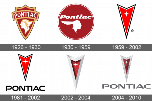
1926 – 1930
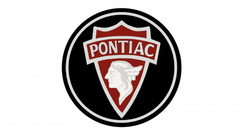
A Native American profile decorated a triangular heraldic shield. It was placed at the bottom, while a banner with the brand was running across the upper half of it. The logo was done in burgundy and white with muted golden accents. There was something traditional, yet luxurious about it.
1930 – 1959
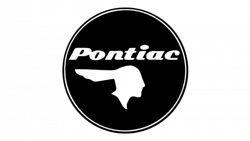
A black circle with a thin black outline slightly indented from it. Similarly to the original one the Native American profile was at the bottom of the emblem while the name was printed across the top. The profile was just a white icon of a man facing right. The name was written using an italicized bold cursive typeface.
1959 – 2002
An arrow pointing down became the new brand image. It was red with a thin white and black border. At the top of the arrow, the emblem featured a white, four-pointed star. “Pontiac” was printed underneath in bold title case letters of black color. The letters had a geometric feel to them. The emblem was bold and memorable.
1981 – 2002
2002 – 2004
The arrow was given a modern spin and acquired a 3D appearance. The border was now wide and metallic. The arrow was stretched out vertically, which made it look sharper and gave the overall look a daring and energetic feel.
2004 – 2010
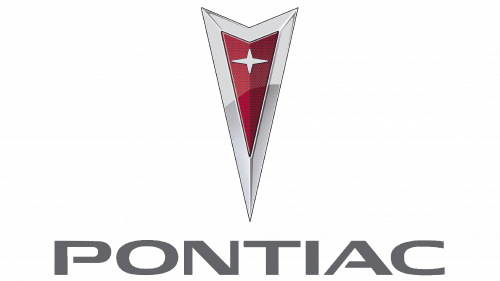
A shine was added to the metallic border, which created a luxurious appearance. The red portion was given a thin white accent line. The designers returned the “Pontiac” inscription under the emblem. It looked just like it did back in 1959, but was larger than before compared to the arrow symbol. The updated emblem became even more stylish and sharp.
Font and Color
The company used Good Times font in several of its logos. It is bold and geometric. The color choices were also bold. The company went for red with black and white accents right from the start. The red color is a symbol of strength, leadership, and power.


