Primark Logo
Primark, a retail giant, specializes in affordable fashion, homewares, and beauty products. It operates mainly in Europe and the United States, with over 370 stores. Owned by Associated British Foods, Primark is renowned for its low-price strategy, attracting a diverse customer base. Despite no e-commerce platform, its high-street presence and value-for-money ethos drive its market success.
Meaning and history
Primark’s story, a tale of strategic growth and adaptability, began in 1969 when Arthur Ryan, on behalf of the Weston family’s Associated British Foods (ABF), inaugurated the first store in Dublin, Ireland, named “Penneys.” This marked the inception of a brand that would soon become synonymous with affordable fashion.
As the brand ventured into the UK in 1973, it encountered a naming conflict with American retailer J.C. Penney, prompting the adoption of the Primark moniker for its international stores. The UK expansion was marked by strategic acquisitions, including the takeover of certain “Littlewoods” locations in 2005 and BHS stores in 2016, signaling a robust growth trajectory.
Primark’s international footprint expanded in the 2000s, stepping into Spain, the Netherlands, and subsequently into Portugal, Germany, and Belgium. Its global presence was further solidified with stores in Austria (2012), France (2013), Italy (2016), and notably, the United States in 2015 with a flagship store in Boston, a bold move considering the highly competitive U.S. retail landscape.
Ownership of Primark has consistently remained under the umbrella of ABF throughout its expansion. The brand’s success is anchored in its business model that emphasizes volume sales, low prices, and a focus on physical stores, deliberately sidestepping the e-commerce trend.
Ethical practices and sustainability, areas of increased public scrutiny, became pivotal for Primark, especially post the 2013 Rana Plaza disaster in Bangladesh. This event catalyzed a more transparent and ethically conscious approach in its supply chain management.
The COVID-19 pandemic tested Primark’s resilience, as its lack of an online sales platform led to significant revenue losses due to store closures. However, the brand’s recovery was aided by its strong physical store presence and a loyal customer base, reaffirming its place in the retail sector.
Primark’s narrative is characterized by its steady ownership under ABF, strategic global expansion, a unique business model prioritizing in-store experience over online sales, and a journey towards improved ethical practices and sustainability, positioning it as a distinctive player in the fast-fashion industry.
What is Primark?
Primark stands out in the retail sector, providing an extensive selection of cost-effective attire, house goods, and cosmetic items. With a commanding presence on main shopping streets and a strategy focused on competitive pricing, this subsidiary of Associated British Foods runs a network of over 370 outlets throughout Europe and the U.S., prioritizing physical store encounters rather than digital commerce.
1973 – 1980s
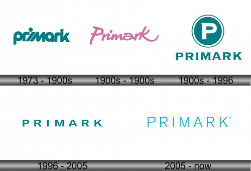
The logo presented is a minimalist yet distinct representation of the Primark brand, utilizing a teal color palette. The typography is bold and sans-serif, conveying modernity and accessibility. The name “Primark” is rendered in all lowercase letters, which adds a friendly and approachable feel to the brand identity. This simplicity in design reflects the brand’s straightforward approach to providing fashion at competitive prices. The absence of any additional imagery or icons ensures the focus remains on the brand name, emphasizing brand recognition. The choice of color is notable, not just for its visual appeal but also for its rarity in retail branding, which may aid in distinguishing Primark from its competitors.
1980s – 1990s
This logo showcases a playful, cursive script, casting the Primark name in a vibrant shade of pink. This design marks a departure from the previous teal, more structured logo, infusing the brand with a sense of whimsy and warmth. The font’s fluidity suggests accessibility and a more personal touch, resonating with a youthful and energetic audience. The pink color choice is both eye-catching and suggests a fun, less formal approach to retail. This logo’s lightheartedness aligns with the brand’s reputation for providing trendy, affordable apparel in a cheerful shopping environment. The evolution from the previous logo reflects a strategic shift, possibly aiming to appeal to a broader demographic or to refresh the brand’s image in the eyes of the consumer.
1990s – 1996
The logo presents identity with a “P” in a teal circle above the full name in a capitalized, sans-serif font. Returning to teal from pink, it signals a classic, professional image. The “P” emblem aims for strong recognition; the name provides clear branding. Its simplicity conveys trust, appealing to a wide audience with a corporate look. The circle symbolizes completeness, stability—key retail brand traits. Moving from pink to teal represents a strategic rebrand for broader appeal or new market positioning.
1996 – 2005
The Primark logo is bold and teal, with a modern typeface that highlights simplicity. It omits past designs like the circle emblem, focusing solely on the name to suggest transparency. The consistent color and letter spacing create a cohesive, memorable brand image. Its minimalistic approach, without extra graphics, aligns with modern branding trends. The shift from the emblem to text-only hints at a matured brand identity prioritizing name recognition. This change could signify a move towards a more sophisticated market strategy for Primark. The updated design reinforces Primark’s commitment to staying relevant in the fast-paced retail industry. It underscores a brand evolution, keeping pace with aesthetic sensibilities while maintaining its core identity.
2005 – Today
The logo displays the name “PRIMARK” in a striking shade of sky blue, utilizing a modern, clean font. The crisp, sans-serif typeface offers a contemporary and professional appearance. A notable addition is the registered trademark symbol, indicating Primark’s established brand status. Compared to the previous iteration, this logo maintains the minimalist approach but opts for a lighter, more vibrant blue, potentially to appear more inviting and fresh. The uniformity in the font size throughout the logo suggests a stable and consistent image, reinforcing the brand’s reliability in the retail market. The simplicity of the design aligns with current branding trends that favor a clean, uncluttered look, which can be versatile across various platforms and marketing materials. This evolution in design reflects a brand that is both aware of its legacy and looking towards the future.
