Puma Logo
Puma is a brand of the sports gear such as sneakers, clothes and accessories. Initially, the there was the factory that belonged to the Dassler brothers. After one serious argument among the brothers, in 1948 they decided to split the factory into separate businesses called Puma and Adidas.
Meaning and History
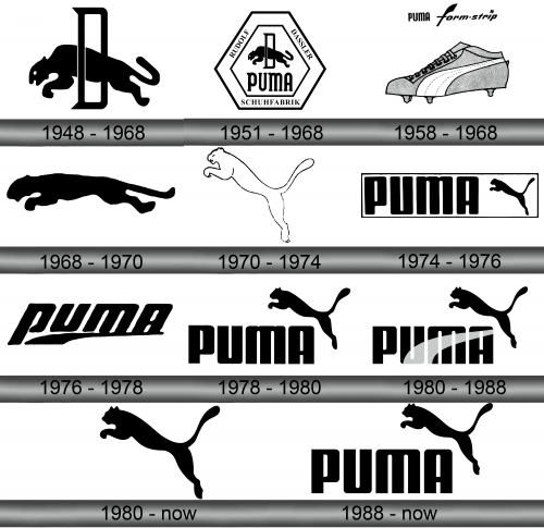
As the separation between the brothers happened, Rudolf quickly registered the new company called Ruda (this name came from the first two letters of Rudolf’s name and surname). But soon after, the name Puma appeared. The choice is simple: Puma is a quick, agile predator cat, an image of fitness.
1948 – 1968
The initial watermark consisted of the animal which was getting through the ring formed in the ‘D’-form. The whole logo was executed in the monochrome style.
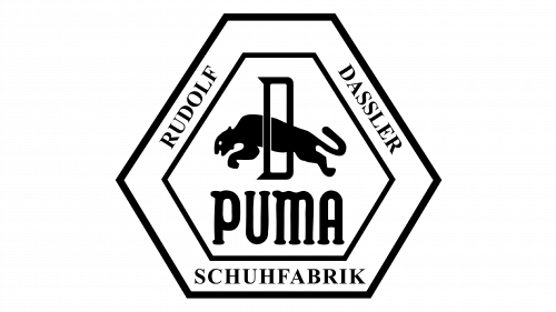
1951 – 1968
The next logo represented the initial picture, cased in the hex angular frame, which has the ‘Rudolf Dassler Schuhfabrik’ inscription on the perimeter. Below the picture with a jumping puma, there was the brand’s name, written in the serif font.
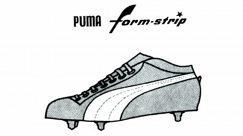
1958 – 1968
That time, the label used its general logo with the stripe, performed in 1958. This white line was depicted on all of their sneakers and clothes.
1968 – 1970
The designers had changed the visual identity once again. Our puma changed its position, while all other features were removed.
1970 – 1974
The cat’s new skin was white, with a thin outline. It changed its position as well.
1974 – 1976
The next logo brought us the cat, which turned back to its original color and placed right side from the inscription. It was made in the straight and smooth typeface. The whole logo was bordered by the rectangular frame.
1976 – 1978
Another logo, introduced in 1976, didn’t have any image, and the inscription was written in cursive. There was a black underline under the lowercase letters.
1978 – 1980
One more Puma’s logo represents the capitalized name of the brand in the same font as it was in 1974. The icon of the jumping cat placed right side from the inscription.
1980 – Today
In 1980, designers of the Puma’s visual identity simply decided to reuse the 1978 jumping cat emblem, but without the text part or any additional elements. This emblem is still being used today.
1980 – 1988
In the same year, designers added the form strip from 1958 to the next logo, made in the same style as the previous one. The strip had a bit lucid palette.
1988 – present
Emblem and Symbol
The jumping cat symbol is what the company uses primarily to label their boots and other products, much like what Adidas does with their lines and other symbols. When on sneakers, the symbol is located on the side of a boot, in the frontal area. They are usually black or white.

