Red Car Brands
In the vast spectrum of colors used in branding and logo design, red asserts itself as the color of passion, energy, and action. This bold hue captures attention, triggers emotion, and, most importantly, cements brand identity in the minds of consumers. A red logo can symbolize a range of concepts from fervent love to vibrant energy, making it a versatile choice for companies across various industries. From the high-speed allure of automobile manufacturers to the urgent appeal of tech companies, red is chosen to convey messages of dynamic strength, speed, and reliability.
This exploration of red logos delves into the psychology behind the color choice, the industry-specific messages it conveys, and the memorable impressions it leaves on the consumer psyche. As we dissect the layers behind the crimson emblems of today’s corporate world, we’ll uncover how this primary color shapes brand narratives and drives consumer engagement.
Join us as we navigate the visual impact of red in logo design, where the likes of automotive powerhouses, technology innovators, and consumer staples wield the color to not just stand out, but to also evoke a sense of daring and drive that aligns with their brand ethos. The fiery appeal of red in logos isn’t just a matter of chance—it’s a calculated decision to capture hearts, inspire confidence, and signal the boldness of a brand ready to lead.
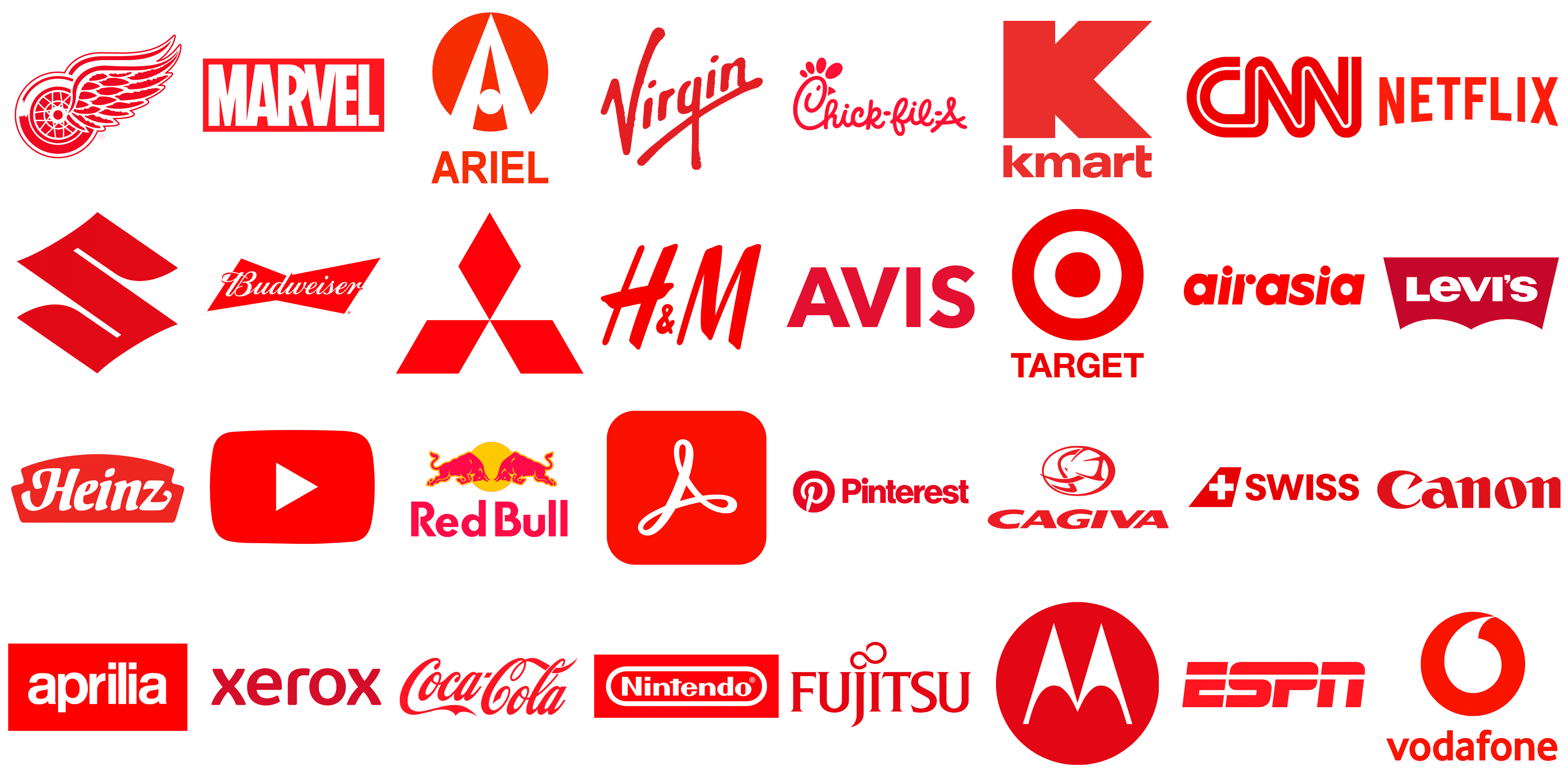
Ariel
Ariel, a historic British motorcycle and car manufacturer, evolved its logo over the years, culminating in a 2001 redesign featuring a vivid red badge with bold geometric elements, symbolizing the brand’s enduring legacy and modern approach. The logo presented here is Ariel’s, showcasing a dynamic red capital “A” with a clever negative space creating a smaller “a” within. This bold, peak-topped letter reflects the brand’s commitment to excellence in cleaning products. Underneath, “ARIEL” is written in a straightforward, uppercase sans-serif font. The consistent use of the red color suggests energy and efficiency, a nod to the product’s cleaning power. Its simplicity paired with the innovative use of space makes the logo stand out and remain memorable.
BYD
BYD (Build Your Dreams), a Chinese multinational powerhouse in electric vehicles and batteries, is a leader in sustainable energy and innovation. Its logo is characterized by the uppercase letters “BYD” in a strong red, encased in a red oval frame. This oval symbolizes the company’s global presence and inclusiveness. The modern, robust font used for “BYD” conveys a sense of strength and technological advancement. The red in both text and oval emphasizes energy and passion, reflecting BYD’s focus on innovation in electric vehicles and batteries. The smooth curves of the oval juxtapose the letters’ sharp angles, creating a visually appealing, balanced design.
Cagiva
Cagiva, originally a modest metalworking shop in Italy, evolved into a celebrated motorcycle brand, earning acclaim in racing circles and for producing models like the Mito, Elefant, and Raptor. Its logo, representing this Italian motorcycle powerhouse, cleverly features an elephant’s head silhouette within a red oval. This elephant, an emblem of might and durability, is artfully depicted with minimal lines, encapsulating the brand’s robust and enduring motorcycles. The emblem’s red hue radiates energy and motion, reflecting Cagiva’s racing lineage. The logo’s round frame suggests wholeness and global aspirations, encircling the elephant’s strength. The elephant motif pays homage to Cagiva’s roots and Italian heritage, signifying the brand’s dedication to power, performance, and design superiority.
Daihatsu
Daihatsu, a subsidiary of Toyota, is a Japanese automaker renowned for its compact, efficient vehicles ideal for city driving. Its logo showcases a stylized ‘D’ fashioned from bold, white lines, exuding a sense of motion and precision. Set against a red square, the white ‘D’ is striking, embodying enthusiasm and vigor. Below this square, “DAIHATSU” is spelled out in bold, red uppercase letters, complementing the logo’s modern, clean look. The red theme throughout symbolizes strength and boldness, mirroring the brand’s focus on compact, efficient vehicles. The logo’s straightforward yet compelling design ensures recognition, effectively conveying Daihatsu’s identity.
Ducati
Ducati, an emblematic Italian motorcycle manufacturer, is famed for its high-performance bikes, unique L-twin engines, and a consistent presence in the MotoGP World Championship. Its logo features a shield-like emblem, with a vivid red lower half and a white stripe at the top, where “DUCATI” is written in a striking, uppercase, red font. The shield represents strength and heritage, echoing Ducati’s reputation for top-tier motorcycles. The red color embodies the passion, excitement, and racing heritage central to Ducati’s brand. This logo merges simplicity with potency, reflecting the sleek design and speed of Ducati motorcycles, a symbol as distinct in the industry as the sound and performance of a Ducati engine.
Suzuki
Suzuki, a titan in the automotive industry, is globally acclaimed for its diverse portfolio that includes cars, motorcycles, and marine propulsion systems, gaining recognition for its pioneering spirit and dependability. The emblem depicted is Suzuki’s visual signature, distinguished by an ‘S’ carved in a vibrant red tone. Anchoring the symbol, “SUZUKI” is inscribed in robust, capital lettering drenched in a profound shade of blue, creating a compelling visual dichotomy with the red above. Employing a sans-serif typeface, the logo exudes contemporaneity and sleekness. The interplay of red and blue mirrors the brand’s roots in Japan and illustrates attributes of fervor and trustworthiness, integral to the Suzuki identity. Presented on an unadorned backdrop, the emblem and name are undeniably the centerpiece of the composition, reflecting the brand’s iconic status and focus on straightforward, impactful design.
Hero MotoCorp
Hero MotoCorp, a major force in the global two-wheeler sector from India, offers a wide array of motorcycles and scooters, including the well-liked Hero Splendor. Its logo features the name “Hero” in robust, red, sans-serif typography, reflecting the brand’s assertiveness and industry prominence. Accompanying the text to the left is a striking emblem of red and black shapes, creating an edgy, abstract design. The red in the text and part of the emblem symbolizes vigor and power, while black grounds the design, hinting at the brand’s deep-rooted history and reliability. The logo’s blend of color and form depicts Hero as a dynamic, forward-thinking company prioritizing innovation and quality.
Isuzu
Isuzu, a Japanese automotive giant, excels in producing commercial vehicles and diesel engines, known for their long-lasting and efficient trucks, buses, and SUVs. The Isuzu logo displays the company name in bold, uppercase letters, rendered in an eye-catching red. This heavy sans-serif font radiates durability and trustworthiness, aligning with Isuzu’s reputation for robust vehicles. The choice of red embodies the energy and strength central to the brand. Its minimalistic design, focusing on straightforward typography without additional graphics, underlines Isuzu’s commitment to quality and practicality. This clear, no-frills design mirrors Isuzu’s dedication to functionality and effectiveness in the automotive realm.
Jawa
Jawa, a venerable motorcycle brand with roots in Czechoslovakia, has seen a resurgence, merging classic aesthetics with modern technology to captivate both traditional and modern bike enthusiasts. Its logo, representing the Czech-originated motorcycle manufacturer, showcases “JAWA” in prominent, uppercase letters within a circular frame, symbolizing wholeness and cohesion. Beneath the brand name, stylized lines extend outward, reminiscent of a spinning wheel or sunbeams, denoting speed, direction, and vitality. The central feature, resembling a wheel hub, underscores themes of movement and biking. The logo’s red color is vivid and associated with enthusiasm and vigor, reflecting Jawa’s heritage of crafting high-performance motorcycles. This emblem, with its circular form and outward lines, encapsulates Jawa’s legacy in motorcycle manufacturing and its dedication to advancing in the field.
KIA
KIA, a prominent South Korean car manufacturer and a subsidiary of Hyundai Motor Company, is recognized globally for its varied vehicle range, fusing modern aesthetics, technology, and dependability at competitive prices. Kia’s logo features the brand name in a unique, angular font, indicative of modernism and precision. Rendered in a striking red hue, it symbolizes the brand’s energetic and youthful approach to car design. The interconnected letters convey unity and resilience. This logo mirrors Kia’s commitment to producing stylish, reliable vehicles with a focus on cutting-edge design and technology. Its minimalistic style, free from extra graphics or symbols, highlights Kia’s emphasis on simplicity and fundamental aspects of automotive design.
MG
MG, originally a British sports car maker and now under China’s SAIC Motor, offers a range from classic roadsters to contemporary electric vehicles, upholding a legacy of innovation and style. The MG logo showcases the initials “MG” in bold, uppercase letters within an octagonal frame. The font is classic and simple, echoing the brand’s rich history and British roots. The red color, used for both the letters and the frame, signifies passion and power, aligning with MG’s sporting nature and focus on dynamic, performance-oriented vehicles. The octagon shape lends distinctiveness to the logo, symbolizing MG’s tradition and quality in automotive artisanship. This design’s simplicity and boldness reflect MG’s ethos of marrying classic styling with modern functionality.
Microcar
Microcar, a brand dedicated to the microcar niche, manufactures small, fuel-efficient vehicles ideal for city life, offering a smart alternative to traditional cars with an emphasis on functionality and user-friendliness. The Microcar logo showcases the name “MICROCAR” in crisp white uppercase letters set against a red oval backdrop, framed by a slender black and white line for a three-dimensional look. The red background symbolizes vigor and enthusiasm, while the oval shape highlights the brand’s commitment to compactness and efficiency. The logo’s typography is clear and bold, mirroring the brand’s focus on straightforward, functional vehicle design. Its sleek, contemporary design reflects Microcar’s dedication to practical and accessible urban mobility solutions.
Mitsubishi Motors
Mitsubishi Motors, part of the expansive Mitsubishi Group, is recognized for its broad selection of vehicles, including sedans, SUVs, and electric models, renowned for their robust reliability, especially highlighted in their all-wheel-drive systems. The Mitsubishi emblem showcases a unique tri-pointed star, referred to as the “three diamonds” or “three water chestnuts,” set against an unblemished white canvas, creating a vivid contrast. This iconic symbol stands for steadfastness, sincerity, and triumph. Positioned below this emblem, the word “MITSUBISHI” is inscribed in stark, uppercase, sans-serif black letters. The emblem’s rich red tone speaks to a sense of boldness and strength, mirroring the brand’s dedication to superiority and its long-standing heritage. This design, both minimalist and symbolic, encapsulates Mitsubishi’s extensive involvement in various industries, with a notable emphasis on their automotive achievements.
Saturn
Saturn, a former subsidiary of General Motors, distinguished itself as an American automobile producer with a unique approach to customer relations and vehicle design, emphasizing set pricing and innovative polymer body panels until its dissolution in 2010. The Saturn emblem displays a vivid red square framing a creatively designed white “S,” reminiscent of the celestial Saturn and its rings. Beneath this motif, “SATURN” is boldly written in a stark black, uppercase, sans-serif font. The interplay of the pronounced lettering with the flowing “S” shape, coupled with the red and white color scheme, delivers a compelling visual narrative. The emblem’s straightforward yet distinct aesthetic reflects the brand’s drive for ingenuity and its customer-focused philosophy.
Tatra
Tatra, established in the Czech Republic and one of the world’s oldest vehicle manufacturers, is renowned for its innovative and robust heavy-duty trucks, frequently utilized in military, forestry, and mining sectors. The Tatra logo features the brand name “TATRA” in stark white capital letters arranged vertically against a vivid red background, encapsulated in a silver circular frame that adds a refined and distinguished touch. The red backdrop evokes intensity and vigor, while the silver outline reflects elegance and quality. The vertical arrangement of the letters symbolizes steadiness and growth, mirroring Tatra’s enduring legacy and esteem in the automotive field, especially in crafting heavy trucks and specialized vehicles. This design is both understated and striking, effectively portraying the brand’s identity and dedication to engineering brilliance.
Tesla
Tesla, under the leadership of Elon Musk, has been a transformative force in the auto industry with its advanced electric vehicles and sustainable energy solutions, significantly influencing the global shift towards renewable energy and transportation. The Tesla logo displays the well-known “T” emblem, indicative of an electric motor’s cross-section, a concept envisioned by co-founder and CEO Elon Musk. Rendered in a lively red tone, the emblem reflects the brand’s enthusiasm and commitment to innovation. Below this, “TESLA” appears in a modern, sans-serif, uppercase font, harmonizing with the emblem’s contemporary style. The logo encapsulates Tesla’s ambition to spearhead the transition to sustainable energy, combining their emblem and name to project a forward-looking and elegant image, consistent with the company’s trailblazing role in the automotive and energy arenas.
UD Trucks
UD Trucks, initially a Nissan division and now under the Volvo Group, excels in producing commercial vehicles like heavy-duty trucks, celebrated for their quality, resilience, and cutting-edge technology. The UD Trucks logo presents the initials “UD” in bold, metallic silver, set against a red circular backdrop, further enclosed by a silver ring. This striking silver-on-red contrast symbolizes a distinctive presence in the industry, while the circular form represents wholeness and international scope. The use of silver hints at the modern, technological edge befitting a company dedicated to innovative transportation solutions. Underneath, “UD TRUCKS” is spelled out in a plain, black, uppercase font, emphasizing strength and reliability, essential attributes in the heavy-duty vehicle market. The logo melds a sleek, contemporary aesthetic with a sense of robustness and dependability.
Vauxhall Motors
Vauxhall Motors, a distinguished British car manufacturer and a member of the Stellantis multinational group, boasts a rich heritage in producing a diverse array of passenger vehicles and vans, particularly favored in the UK and Ireland. The Vauxhall logo showcases its renowned griffin emblem within a red circular badge. The griffin, combining a lion’s body with the head and wings of an eagle, stands as a symbol of strength and adaptability. The emblem focuses on the griffin’s head and torso, highlighting its power and alertness. Below this, the name “VAUXHALL” is presented in bold, uppercase, sans-serif letters, enhancing the logo’s distinctiveness and impact. The red background of the badge signifies vitality and ardor, while the white griffin and lettering offer a striking contrast. This logo melds historical significance with a modern aesthetic, embodying Vauxhall’s long-standing legacy and its contemporary approach to vehicle manufacturing.
Venturi
Venturi, based in Monaco, excels in creating electric vehicles and has achieved numerous world records in electric vehicle speed. Its logo features the brand name “VENTURI” in a modern, streamlined, uppercase sans-serif font. The standout element is the stylized “V” beneath the name, rendered in a vivid red hue with an downward-pointing sharp edge, embodying progress and cutting-edge innovation. This “V” cleverly doubles as a checkmark, symbolizing excellence and approval, representing advancement and futuristic thinking. The choice of red is indicative of vigor and enthusiasm, resonating with Venturi’s dedication to dynamic, high-performance electric vehicles. The logo’s simplicity and boldness exude an air of sophistication and contemporary flair.
