Reebok Logo
Reebok is one of the biggest companies that compete with brands such as Adidas and Nike. Today, Reebok International Ltd is owned by the Adidas Group Corporation. Many collections are produced under this brand. There are both sportswear and casual items, shoes, accessories, and equipment for sports. Reebok holds outdoor workouts in the fresh air for anyone desiring to join. The brand is actively developing around the world and delights customers with bright advertising campaigns with famous athletes, models, and actors.
Meaning and History
It all started back in 1895. The brand was originally called J.W. Foster & Co. It was founded in England by a shoemaker who enjoyed running, Joseph William Foster. He created studded running shoes, which immediately found their fans. After the death of the founder, his sons James and John took over. The product range was constantly expanding with the production of special shoes for other sports. In 1960, the Foster brothers renamed the company Reebok (after the name of the fast African antelope with sharp horns). By 1979, Reebok expanded its activities outside of England and received a new official name – Reebok International.
What is Reebok?
Reebok is a legendary brand of sportswear, footwear, and accessories, as well as sports equipment. For many years, the company has been a leader in the sports industry, supported various events, introduced new technologies into production, and was considered to be a true style icon.
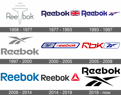
1958 – 1977
The name of the brand was written using thin lines and a sans-serif font. A zigzag, abstract drawing of a nail was going right through the middle of the name. It was quite basic without making a striking effect.
1977 – 1993
The name of the brand was accompanied by a Union Jack flag that symbolized the brand’s origins in England. It was the same height as the name itself. This was the first time the brand featured Motter Tektura font done in dark blue color. This version looks much bolder than the original one.
1993 – 1997
An abstract drawing of the Union Jack crossing the racing track has replaced the flag. The track lines were a blue color while the crossing line was red. The name also featured a different blue.
1997 – 2000
There was another redesign. The brand has not introduced anything new. Instead, it used the familiar emblem, which was now placed above the name. The font was slightly modified, mainly the first and last letters, but otherwise resembled the one used earlier. The whole emblem was done in light gray.
2000 – 2005
This version brought back the color palette introduced in 1977. The base was a deep blue parallelogram with rounded corners. Inside, it featured two similar shapes of a smaller size. On the left, there was a gray one with the familiar three lines done in blue. The right shape was white and had the name of the brand done in red using a different italicized font and all lowercase letters.
2005 – 2008
This time, the brand used an abbreviation of its name, Rbk. It added a white parallelogram with a thin blue frame and a blue illustration of the track lines to the right of it. The abbreviation was done in a red color already seen in its logos and using a sans-serif font similar to what the brand had before, which made the new logo more relatable to the previous brand image.
2008 – 2014
This is the simplest logo ever used by the Reebok company. It is simply its name in black. Nonetheless, it looks confident and the name speaks for itself.
2014 – 2019
An addition of a CrossFit Delta logo, which stands for three dimensions of human health, to the right of the name added some color and interest to the emblem.
2019 – Today
In 2019, the company brought back an already familiar logo. It was introduced back in 1997. The only difference was that the name was now at the top of the emblem and featured the Motter Tektura font seen in other logos. It was also black for a more timeless and powerful appearance.
Font and Color
One of the most recognizable fonts used by the Reebok brand is Motter Tektura, which was designed by an Australian Othmar Motter in 1975. Another font, which was used during the 2008 – 2019 period, resembles the Brokman Bold font. the color palette of the brand is rather classic. During some periods they simply stuck to black, sometimes with an addition of some red. For about twenty years intermittently, it used dark blue, scarlet red, and white as its main colors. They made the logo look bold and eye-catching.
