San Francisco Giants Logo
The San Francisco Giants, an esteemed baseball franchise in Major League Baseball, hail from San Francisco, California. Established in 1883, they originally played in New York City as the New York Giants before relocating to the West Coast in 1958. The Giants’ ownership landscape has evolved over the decades. As of the latest information, the team is principally owned by an ownership group led by Charles B. Johnson. With a rich history peppered with numerous championships, the Giants remain a cornerstone in the world of professional baseball, reflecting the passion and energy of their fanbase.
Meaning and history
The San Francisco Giants, an iconic baseball franchise, trace their origins back to 1883 as the New York Gothams. In 1885, they adopted the name New York Giants. Under this moniker, they amassed an impressive collection of National League pennants and World Series titles, fostering legends like Willie Mays and Christy Mathewson.
In 1958, the franchise shifted coasts, relocating to San Francisco. Despite initial struggles post-move, the 1960s saw a resurgence, notably with Willie Mays’ incredible performances. The subsequent decades were marked by highs and lows. The 1989 earthquake-interrupted World Series was a memorable event, even as the team suffered a loss to the Oakland Athletics.
The 2000s heralded a new era. With stars like Barry Bonds, who broke MLB’s home run record, the team remained in the spotlight. By 2010, the Giants clinched their first World Series title in San Francisco, repeating the feat in 2012 and 2014.
Throughout their journey, the Giants have displayed resilience and prowess, firmly establishing their legacy in MLB’s tapestry.
1883 – 1885
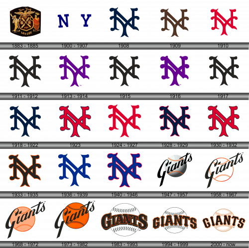
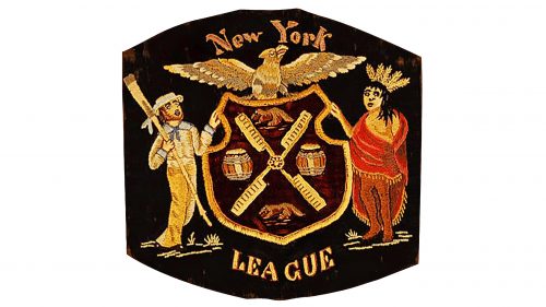
During the era when the squad bore the name “New York Gothams,” they opted for a distinctive approach. Rather than adorning their attire with a conventional logo, they chose an intricately stitched emblem to grace their team’s apparel. This embroidery reflected the team’s identity and commitment to detail, setting them apart in the world of baseball. It was an age where symbols held profound meaning, and the choice of a meticulously crafted emblem symbolized the team’s dedication to excellence both on and off the field. The decision showcased the club’s unique approach to branding during that period.
1900 – 1907
When the squad underwent a name change, becoming the “New York Giants,” they introduced a new emblem in 1900. This emblem prominently showcased the initials “NY” in a deep shade of blue, a tribute to the vibrant metropolis they represented. This bold choice of initials served not just as an abbreviation but also as an emblematic nod to the bustling spirit of New York City. The intertwining of sports and the essence of the city became evident through this design. By adopting these letters, the team aimed to resonate with the local fans, intertwining their identity with the city’s heartbeat, and underlining their commitment to represent the Big Apple on the baseball diamond.
1908
The emblem prominently features an intricately designed Old English “N” in a deep shade of blue, a nod to the team’s home turf – the bustling metropolis of New York. This letter, with its vintage and grand design, serves as a powerful representation, intertwining the team’s identity with the city’s rich history and cultural tapestry. Every curve and contour of the “N” is reminiscent of a bygone era, reflecting the timeless bond between the team and the city it represents. Through this choice, the team sought to echo the enduring spirit of New York, symbolizing its resilience, legacy, and pride on the sporting stage.
1909
The hue of the letter “N” underwent a transformation, shifting from a deep blue to a rich black-brown shade. Despite this color evolution, the typeface retained its original design. This subtle yet significant change in color palette added a new depth to the logo, infusing it with a touch of sophistication and maturity. The darkened tone resonates with a sense of gravitas and heritage, while the consistency in the font emphasizes the team’s commitment to preserving its iconic identity. Even amidst change, the choice to maintain the same typography stands as a testament to the team’s respect for tradition and its storied past in the ever-evolving world of sports.
1910
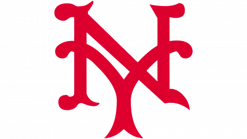
The iconic Old English-style “N” has undergone a transformation, now donning a vibrant shade of red. This change is not merely cosmetic; it symbolizes a renewed energy and passion. The fiery hue breathes fresh life into the logo, capturing the team’s fervor and dedication. As red often signifies intensity, power, and determination, this choice of color marks a bold new chapter in the team’s journey. While maintaining the elegance of the classic typography, this refreshing twist brings a modern flair, subtly conveying a blend of heritage and forward momentum. Such an evolution signifies an embrace of change while still paying homage to the storied past. The red “N” is now a beacon of the team’s bright future.
1911 – 1912
Once more, the hue of the emblematic letter undergoes a metamorphosis, transitioning from a fiery red to a deep, enigmatic black. This alteration is not just a mere visual shift; it mirrors a profound evolution in the team’s spirit and ethos. The black tone, often symbolic of strength, authority, and elegance, suggests a sense of renewed purpose and determination. While the vibrant red exuded passion and energy, the switch to black subtly signifies resilience, depth, and tenacity. By selecting such a powerful shade, the organization conveys a message of unwavering commitment to excellence and a deep-rooted sense of identity. This continual evolution in color palette pays homage to the team’s dynamic journey, ever-changing yet forever anchored in its rich legacy. The pitch-black hue now stands as a testament to the team’s steadfast resolve and ambition.
1913 – 1914
In the year 1913, the traditional Old English character ‘N’, emblematic of the bustling metropolis of New York, underwent a transformation. It adopted a deep black hue, enriched with delicate undertones of lavender. This fusion of colors, while seemingly simple, echoed a profound sentiment. The rich black symbolized strength and resilience, while the faint purple strokes added a touch of royalty and distinction. By incorporating these nuances, the organization showcased its ever-evolving identity, mirroring the dynamism of the city it represented. Such meticulous attention to detail highlighted the team’s commitment to staying rooted in tradition while embracing the contemporary. The blend of the commanding black with the regal hints of purple painted a vivid picture of a team that was not only grounded in its rich history but also looked ahead with hope and ambition. This emblematic change was not just a visual shift but also a representation of an era marked by growth and transformation.
1915
The style of the letter ‘N’ undergoes a subtle transformation. On this occasion, the strokes exhibit a more delicate and slender appearance. This shift in design hints at a renewed perspective and a gentle approach to representation. By refining the lines, the team perhaps intended to showcase a blend of elegance and precision. The leaner rendition of the ‘N’ can be seen as a metaphor for agility and adaptability, qualities that are essential in evolving times. This aesthetic choice speaks to the finesse and attention to detail that the organization values. By making such nuanced alterations, they emphasize the importance of both tradition and the willingness to adapt. The thinning lines, while seemingly a minor tweak, resonate deeply, reflecting an organization that values subtlety and sophistication in its journey forward.
1916
Once more, the hue of the letter subtly transitions, adopting hints of lavender. The shift towards this particular tint is evocative and brings to mind the gentle beauty of twilight skies. Violet, often associated with creativity and imagination, could symbolize the team’s innovative spirit and their constant quest for rejuvenation. This delicate balance between the past and the present suggests a harmonious blend of tradition with contemporary flair. By choosing such a refined shade, the organization might be conveying their appreciation for subtleties and the nuances that make up the larger picture. Lavender, with its calming connotations, also mirrors the team’s composed demeanor, indicating a serene approach amidst the competitive fervor. Such a color choice may very well be a statement of their distinct identity, showcasing elegance and a touch of uniqueness in a sea of standard hues.
1917
The traditional deep navy “N” remains emblematic of the bustling metropolis of New York. This hue, resonating with timeless elegance, paints a vivid image of the city’s grandeur. Drawing inspiration from the vast night sky or the deep oceans surrounding the vibrant city, the color choice is poignant. The letter “N”, standing tall in its regal blue, not only represents a simple alphabet but encapsulates the city’s spirit — its energy, its resilience, and its ever-evolving nature. New York, known for its blend of cultures, its iconic landmarks, and its indomitable spirit, finds a reflection in this single character. This choice reaffirms the bond between the team and its city, highlighting their shared history and collective aspirations. Choosing such a profound shade of blue, the organization pays tribute to the depth and richness of the city’s legacy and their deep-rooted affiliation with it.
1918 – 1922
Over the subsequent quartet of years, the emblem representing the New York Giants persisted as the letter “N”, crafted in the time-honored Old English script. This time, however, it donned a shade of deep navy blue. This shift in hue, albeit subtle, conveyed a renewed vigor and fresh perspective. The deep blue, reminiscent of the vast night sky or perhaps the profound depths of the ocean, encapsulated the team’s ever-evolving spirit and ambition. This shade not only symbolized the vastness of their aspirations but also echoed the legacy of the city they proudly represented. The classic design, paired with the fresh tint, served as a bridge between the team’s rich history and its future aspirations. This blend of tradition and innovation, represented by the Old English “N” in dark blue, reflected the team’s commitment to honor its roots while continuously striving for excellence.
1923
Once more, the hue of the letter undergoes a transformation, this time embracing a fiery red shade. Accompanying this vibrant change, a delicate black border is introduced, framing the letter meticulously. This vivid red, reminiscent of a blazing sunset or the intensity of a burning flame, breathes new life and energy into the emblem. The slender black outline serves as a contrasting frame, enhancing the letter’s visibility and adding depth. Such changes, though subtle, capture the essence of adaptability and evolution, showing a blend of tradition and renewed enthusiasm. The fresh infusion of color, paired with the tastefully added border, speaks volumes about the team’s ever-evolving identity and its perpetual quest for distinction and excellence in its journey.
1924 – 1927
The delicate border that once framed the emblem is now entirely absent, leaving behind only the traditional Old English “N” bathed in a rich crimson hue. This shift to a simpler design emphasizes purity and focus, allowing the letter itself to take center stage without any distractions. By removing the contour, the team’s identity emerges more boldly, with the classic “N” resonating its legacy and storied past. This stark red, reminiscent of passion and power, underscores the team’s undying spirit and relentless drive. The transformation, though subtle, emphasizes a back-to-basics approach, prioritizing core values and heritage. In this minimalist rendition, the emblem speaks volumes, symbolizing an unyielding commitment to excellence and a nod to the cherished history that has shaped its journey.
1928 – 1929
Over the subsequent 24 months, the emblem prominently features a deep navy “N” character, accentuated by a delicate crimson perimeter. This combination seamlessly fuses tradition with a touch of vibrancy. The boldness of the indigo hue resonates strength and legacy, while the subtle red contour injects energy and dynamism. This design choice may seem straightforward, yet it embodies the essence of a team that prides itself on a blend of heritage and forward-thinking. By integrating these two contrasting colors, the symbol speaks to the balance of honoring the past while eagerly looking to the future. This understated yet powerful emblematic change hints at a rejuvenation phase, melding time-honored traditions with modern aspirations, crafting a bridge between eras.
1930 – 1932
Once more, the vibrant hue of crimson makes a comeback, infusing energy and passion into the daily affairs. This time, the letter “N” is delicately framed by a sleek black contour, adding depth and distinction to its appearance. The juxtaposition of the bold red with the subtle black accent not only amplifies the emblem’s visual appeal but also signifies a blend of tradition and modernity. The choice of these contrasting shades showcases the dynamism and adaptability of the entity it represents. The slender black border serves as a reminder of the boundaries that are continuously pushed and expanded. This renewed design, rich in symbolism, is a testament to the evolving identity that consistently draws from its roots while embracing change and innovation. The merger of the past’s rich legacy with the present’s evolving trends creates a harmonious and iconic visual representation.
1933 – 1935
The time-honored letter “N” persistently graces the emblem of the Giants organization. On this occasion, its shade reverts to a profound black, juxtaposed with a vibrant red periphery. This fusion of colors not only amplifies the emblem’s visual allure but also signifies a harmonious blend of tradition and innovation. The bold black of the “N” symbolizes strength and determination, while the red contour adds an element of passion and energy. This redesigned motif subtly mirrors the club’s enduring legacy and its continuous drive towards excellence. The interplay between the deep black and fiery red captures the essence of a team that reveres its past while dynamically moving forward. The added layers and colors to the design are a testament to the organization’s adaptability and its ever-evolving identity, seamlessly merging historical roots with contemporary aspirations.
1936 – 1939
The character “N,” crafted in the timeless Old English style, is presented in a shade of blue. This particular letter is more than just a simple character; it stands as a symbolic representation of the iconic city of New York. The choice of blue encapsulates the vastness and depth of the city’s rich history and its vast cultural tapestry. By adopting this design, there’s an unspoken acknowledgment of the city’s influence and prominence. The intertwining of the Old English font with the modern vibrancy of blue paints a picture of a city that’s deeply rooted in history, yet constantly evolving and reinventing itself. Through this emblematic “N,” there’s a celebration of New York’s enduring spirit and its legacy that continues to inspire generations.
1940 – 1946
A delicate touch of refinement was introduced to the blue letter with the incorporation of a slender red trim tracing its contours. This embellishment was not just a mere addition; it enhanced the overall visual appeal, lending a contrast that made the letter pop. The choice of red acted as a fiery complement to the calm blue, reflecting a union of passion and stability. In design, sometimes, it’s the subtle enhancements that can make a significant impact. Here, the thin red outline wasn’t merely an afterthought; it was a conscious design decision to elevate the letter’s aesthetics. By intertwining these two colors, there’s an unspoken narrative of harmony, attention to detail, and a celebration of the artistry in everyday elements. Through this nuanced design approach, a simple blue letter is transformed into an emblem with depth and character.
1947 – 1957
Prior to relocating to San Francisco, the team’s emblem showcased a quintessential white baseball adorned with vibrant orange stitching and subtle gray shading. Superimposed diagonally atop this baseball was the word “Giants,” rendered in a bold black font. The design was simple yet symbolic, capturing the essence of the sport while proudly displaying the team’s name. This iconography served as a fitting representation of the club’s heritage before embarking on a new chapter on the West Coast.
1958 – 1967
In 1958, the team embarked on a significant transition, relocating to San Francisco and adopting the name San Francisco Giants. While designing their fresh emblem, they drew inspiration from their prior insignia. However, modifications were evident: the baseball now radiated a pristine white hue, and the “Giants” inscription was elevated slightly on the ball’s surface. This subtle transformation not only honored the club’s storied past but also signified their exciting new beginning in a different city, blending legacy and contemporary touches seamlessly. The change reflected the team’s journey and evolution while staying true to its roots.
1968 – 1972
Nine years later, the emblem underwent a subtle transformation. The once pristine white baseball began to adopt a faint orange hue. This change was more than just a color adjustment; it symbolized a new era for the team, hinting at growth and evolution. The orange infusion gave the logo a fresh energy, capturing the spirit of the team and its ever-evolving journey. It was a testament to the club’s adaptability, reflecting its commitment to staying contemporary while honoring its rich history. The new design radiated vibrancy, aligning with the team’s dynamic spirit and capturing the essence of constant progress.
1973 – 1982
The emblem undergoes another transformation, showcasing its ever-evolving identity. The previously subtle hue of orange on the baseball takes on a more vivid and bold tone, reflecting the team’s vibrant spirit and passion. Meanwhile, the iconic orange stitches that held the baseball together undergo their own metamorphosis. They transition to a stark black, introducing a contrast that is both visually striking and symbolic. This change exemplifies the team’s ability to adapt and reinvent, blending the traditional with the new. The deeper, more intense orange paired with the black seams creates a harmonious balance, encapsulating the team’s rich history while paving the way for future triumphs. This renewed design echoes the club’s dedication to excellence and their unwavering commitment to stand out in the league.
1983 – 1993
The Giants, ever-evolving, subtly tweak their emblem, yet the foundational idea stays intact. The baseball’s orientation is adjusted to position the stitch lines centrally, bringing focus to its core. Moreover, the sphere reverts to its pristine white shade, a nod to the classic baseball look. The team’s name, “Giants,” occupies the central space, but this time it flaunts a fresh typeface, signaling a renewed sense of identity. The characters are inked in a deep black, contrasted beautifully with a surrounding halo of vibrant orange. This redesign harmoniously combines tradition with innovation, reflecting the team’s continuous journey of growth and their commitment to both their roots and the future. The revamped aesthetics encapsulate the team’s spirit, uniting fans old and new.
1994 – 1999
In the latest rendition of the logo, the baseball element has been noticeably downsized compared to its predecessor. Similarly, the team’s moniker, “Giants,” has undergone a transformation, sporting a subtly altered typeface. The intention behind these modifications seems to be steering towards a more minimalist and modern approach, likely to align with contemporary design trends. By making these tweaks, the team might be aiming for a refreshed and sleeker brand identity while maintaining the essence of their iconic symbols. This change reflects the balance of tradition and innovation, underscoring the club’s commitment to evolving while honoring its storied past. Such adaptations, though seemingly minor, can profoundly impact the way fans perceive and connect with the team’s brand.
2000 – Today
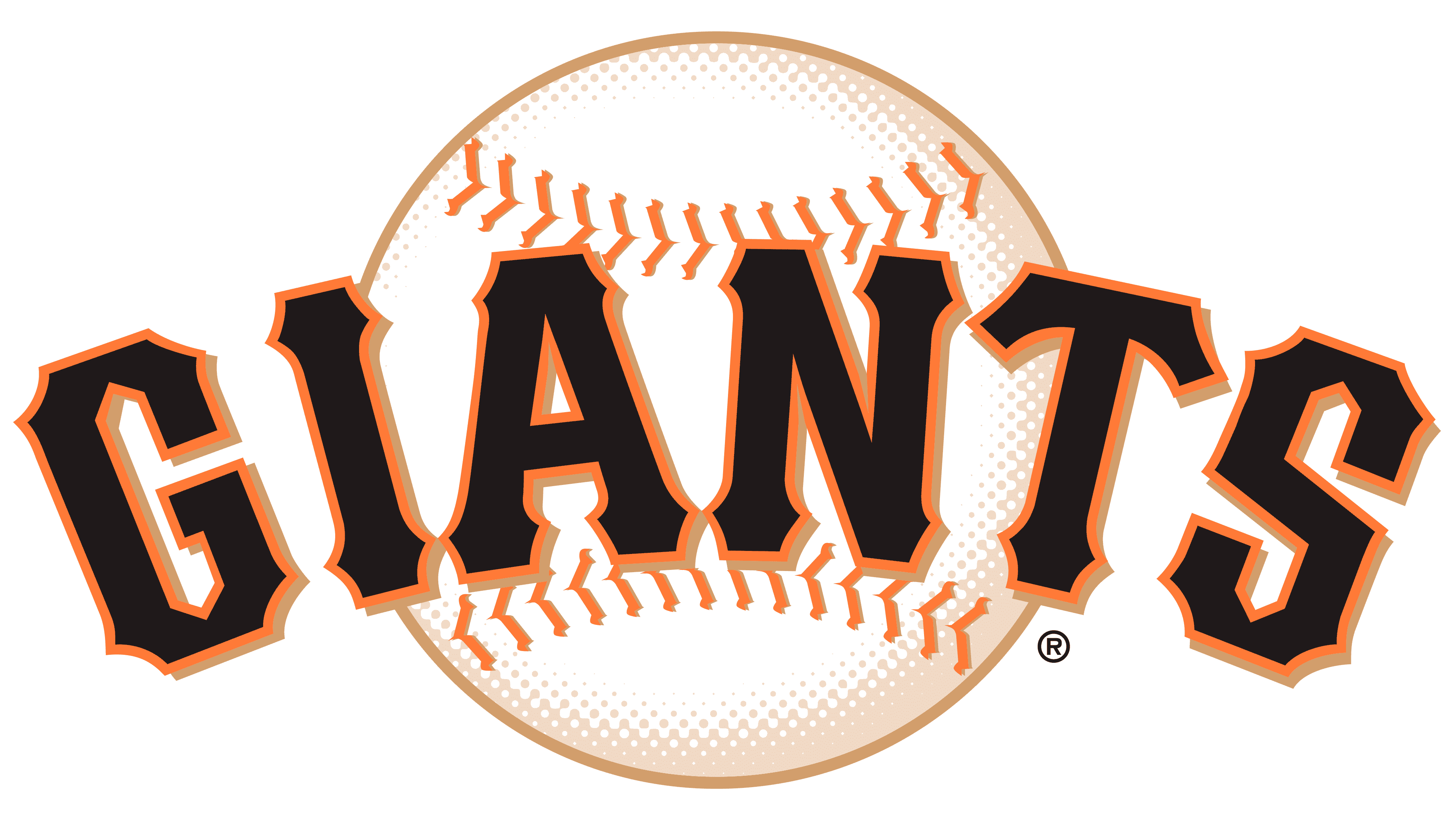
The latest emblematic representation for the San Francisco Giants mirrors its predecessor, but with distinct differences. This iteration introduces a beige undertone, bestowing a tactile quality that results in a 3D illusion, preventing the logo from appearing two-dimensional. The ball, while retaining its primary white hue, now integrates subtle cream touches, adorned by a pair of orange stripes at both its zenith and nadir. Its stitches have transitioned to a vivid red. Meanwhile, the team’s moniker dons a rich brown hue with striking orange accents. Furthermore, the chosen typeface exudes elegance with its intricate curls and sharp-edged detailing, demonstrating a fusion of classic and contemporary design elements. This refreshed aesthetic not only pays homage to the Giants’ legacy but also highlights the club’s forward-thinking vision, ensuring relevance in a dynamically evolving world of sports branding.
