SpongeBob SquarePants Logo
“SpongeBob SquarePants” is a vibrant, animated TV show created by marine science educator and animator Stephen Hillenburg. Born in the USA, this series dives into the underwater city of Bikini Bottom, where SpongeBob, a cheerful and optimistic sea sponge, embarks on various adventures with his friends. Launched in 1999 on Nickelodeon, it was designed to entertain while subtly educating about marine life. Its blend of humor and heart has made it a beloved icon across generations.
Meaning and history
SpongeBob lives in a pineapple under the sea. His best friend, Patrick Star, is a starfish. They embark on quirky adventures. Their neighbor, Squidward, often gets annoyed by their antics. SpongeBob works at the Krusty Krab. He loves his job as a fry cook. The boss, Mr. Krabs, loves money. Plankton, Mr. Krabs’ rival, constantly schemes to steal the secret Krabby Patty formula. Sandy Cheeks, a squirrel, is SpongeBob’s friend who lives in an air dome. Together, they explore the ocean’s wonders and face challenges. Their adventures teach about friendship, persistence, and the joy of life under the sea. SpongeBob’s optimism shines brightly in Bikini Bottom.
What is Spongebob Squarepants?
SpongeBob SquarePants is an animated marvel set beneath the waves in the whimsical Bikini Bottom, where a joyous sponge named SpongeBob turns everyday tasks into extraordinary adventures. Alongside a cast of underwater characters, he navigates the ebbs and flows of undersea life with unfailing optimism and a penchant for hilarity.
1996 – 1997
The logo features whimsical, bold lettering with a playful, porous texture, mimicking the surface of a sea sponge. The word “SpongeBoy” dominates, with the “S” and “B” notably larger, enhancing its playful, nautical theme. “Ahoy!” is jauntily placed below, suggesting adventure and greeting in a seafaring context. The entire text appears in a carefree, hand-drawn style, with splashes and dots scattered around, as if underwater bubbles are rising to the surface. The black and white palette adds a classic comic strip feel.
1997
This logo radiates with the character’s iconic color, a zestful orange, encapsulating the essence of the sponge’s square pants. The letters dance with a dynamic, blocky form, capturing a cartoonish charm. Each character of “SpongeBob SquarePants” is uniquely contoured, giving the impression of a 3D effect that pops. The use of bold, outlined letters against a stark background ensures the name commands attention, embodying the show’s energetic spirit. Unlike its predecessor, this logo bursts with a brighter, more definitive identity, mirroring the show’s lively underwater world.
1999 – 2016
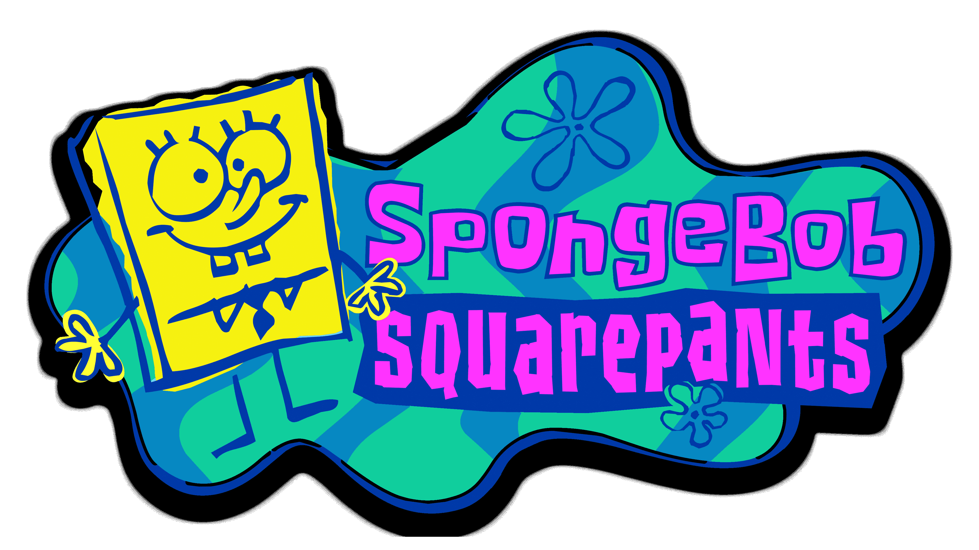
This vibrant logo leaps into full color, with SpongeBob himself beaming beside his name, outlined in bold pink against a blue splash. The splash’s shape and flower patterns channel an underwater motif, while SpongeBob’s image adds an extra layer of character recognition. The lettering’s playful tilt and the vivid colors mirror the animation’s dynamic energy and whimsy. This design steps away from simplicity, embracing a more intricate and representative visual of the show’s fun-filled, aquatic universe.
2016 – Today
This logo version sharpens its core design, presenting a crisper image. A subtle drop shadow now accompanies SpongeBob’s illustration, lending it a delicate 3D flair. Artists have refined the gradient of the blue backdrop, smoothing the color transitions for a richer underwater ambiance. Moreover, the pink outline surrounding the text stands out more boldly, offering a vivid contrast that brings the title to life. The logo’s progression reveals a visual refinement, yet it preserves the original’s spirited, marine charm.


