The J.M. Smucker Company Logo
Smucker is a sizeable American company mostly notable for producing jams, jelly and other products made from fruit. In fact, a lot of the generally popular products among Americans are prerogative of the Smucker’s. Moreover, they are believed to be more natural and healthy overall than their more industrialized colleagues.
Meaning and History
The company was launched in 1897 by one Jerome Monroe Smucker – hence the initials on the full name of the brand. The enterprise was since ruled by this family, and even now both CEO and chairman positions are occupied by the Smuckers, to the better or worse.
1897 – 2020
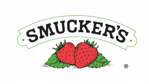
For the longest time and throughout the entire 20th century, Smucker had this logo: two strawberries lying on top of the twin green leaves, surrounded by text. This text was represented by two parts: the governing company’s name simply called ‘Smucker’ and the name of the company proper – ‘The J.M. Smucker Company’.
One was on top, and the other below the emblem proper. They were both written in a rather plain, old-fashioned typeface, and both painted black. However, the top part was also arched and put inside a likewise arched green plaque.
2020 – today
The long-enduring logo was changed in 2020. It was now a collection of variously painted pellets – red in front, and other, smaller ones behind it. The full name below the emblem persisted, although it was redesigned. The founder’s name became highlighted by a bolder tone, and the ‘company’ part became abridged to just ‘co’.
Emblem and Symbol
Whenever they have to put the identifying symbols onto a label on one product or the other, they usually just go with the old plaque symbol, even though the official logo doesn’t have it since 2020. They put it somewhere in the top of the label space, and the frames are colored to suit the color of the product itself.


