Ubuntu Logo
As of now, Ubuntu, developed by Canonical Ltd., is a free, open-source operating system based on the Linux kernel. It is widely used for cloud computing, with OpenStack being a prominent example. Its user-friendly design also makes it a popular choice for desktop and server environments. In terms of ownership, Canonical Ltd., founded by Mark Shuttleworth, is the company behind Ubuntu, driving its development and providing commercial support. The main markets for Ubuntu include enterprises, developers, and general consumers seeking a reliable, user-friendly Linux distribution.
Meaning and history
Ubuntu’s journey began in 2004 when Mark Shuttleworth, a South African entrepreneur, founded Canonical Ltd. to support the project. The name “Ubuntu” comes from a Southern African philosophy that emphasizes shared humanity and interconnectedness.
The initial goal of Ubuntu was to offer an accessible and user-friendly Linux distribution, free of charge. Its earliest releases, such as Warty Warthog in 2004, started gaining traction due to the system’s ease of use. Unlike other Linux distributions, Ubuntu aimed to provide a more streamlined experience, reducing the technical barriers for newcomers.
In 2005, Canonical initiated the ShipIt service, sending Ubuntu CDs worldwide for free. This strategy further increased Ubuntu’s visibility and helped establish a global community.
Throughout the years, Canonical introduced several offshoots, including Kubuntu (using KDE), Xubuntu (with XFCE), and Lubuntu (LXDE). These versions catered to users with varying preferences and hardware capabilities.
Around 2007, Ubuntu ventured into the server market. Its server editions, with built-in cloud functionalities, particularly the integration with OpenStack, appealed to businesses, solidifying Ubuntu’s presence in the cloud computing arena.
In 2011, Canonical made a significant change by introducing Unity, a new desktop environment, with Ubuntu 11.04. The goal was to unify user experience across devices, but Unity received mixed reactions. Some praised its modern look, while others preferred the traditional GNOME interface.
Seeking to expand its footprint, Canonical unveiled plans for Ubuntu Touch in 2013, targeting mobile devices. The idea was ambitious: a single OS for PCs, tablets, and smartphones. However, by 2017, Canonical decided to halt its phone and convergence efforts, citing market challenges.
That same year, Ubuntu made another pivotal decision: it reverted to the GNOME desktop, dropping Unity. This shift was partly due to community feedback and the need to focus on profitable ventures.
Ownership and production of Ubuntu have consistently remained under Canonical. Mark Shuttleworth, who had stepped down as CEO in 2009, returned to the role in 2017. Under his leadership, Canonical continued to drive Ubuntu’s growth, especially in the enterprise and cloud sectors.
Today, Ubuntu stands as one of the most popular Linux distributions. Its commitment to open-source principles, combined with Canonical’s innovations, has ensured its influential position in the computing world.
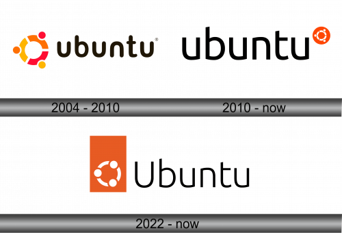
2004 – 2010
The initial badge unveiled on October 20, 2004, stands for liberty, dependability, precision, and collaboration. Presently, this design is seen in the Mahjongg game. The insignia is composed of three distinct parts encircled together, each showcasing a pronounced circular dot.
Adjacent to the artistic symbol lies the term “ubuntu” in a deep shade of black. Every letter is designed with sleek curves and soft edges. Particularly, the alphabets “u” and “n” appear strikingly similar, resembling a reversed reflection of each other.
2010 – Today
In 2010, alongside the Lucid Lynx release, the emblem underwent a transformation. While retaining core components from its predecessor, modifications were evident. The brand name now holds a central position, with the illustrative symbol shrinking and nestling atop the text. The typography appears more defined, with vertical lettering contrasts. Notably, the “t” character is truncated halfway through its horizontal stretch.
This emblem carries a concealed narrative. Each division and dot within the circle artistically portrays a trio of individuals, their hands interlinked, evoking the essence of a communal dance.
Consistently, both renditions utilize lowercase for textual elements. The font is distinct and bespoke. Vibrancy marks the color palette: the introductory emblem flaunted shades of gold, crimson, and tangerine; meanwhile, its successor predominantly showcases a bold hue of orange.
2022 – Today
The updated Ubuntu emblem stems from the same visionary behind its predecessor, Marcus Haslam, a pivotal figure at the UK-based firm Canonical. Post the revamp, the moniker of this Linux-centric OS was shifted to the right flank. The typeface remains reminiscent of its earlier version, albeit with the inaugural “U” being uppercase. The emblematic ‘Circle of Friends’, delineated as a trio of curved stripes with nodes, now finds its place on the emblem’s left. This motif is no longer centralized within an amber sphere, instead situating at the lower spectrum of a vertical quadrilateral. The four-sided configuration introduces a heightened dynamism and intricacy. Paired with the circle, it accentuates a juxtaposition of geometrical facets.
Despite its renewed design, the emblem’s core essence remains untouched. The symbolic figures, intertwined by hands, echo the very name of the OS. Rooted in its namesake, “ubuntu” embodies a Southern African doctrine, championing values of mutual esteem, benevolence, inclusivity, and a profound affinity towards fellow beings.


