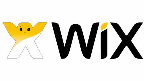
Wix Logo
Wix is a popular website-building service created in 2006. On Wix, you’re able to construct pages and blog posts from pre-made parts by dragging the elements out of the catalogue menu and onto your page. This way, users get to build whole website without sweating too much.
Meaning and History
Although the name can be roughly translated from Hebrew (the native language of the founders), it actually doesn’t mean anything, except that the creators liked how this word sounds. They particularly liked the letter ‘W’, which may be derived from ‘WordPress’ – the biggest site builder ever created.
2006
The first logo variant featured a peculiar mascot – a creature with legs wide apart and arms high in the air, as well as a head with a happy face on it. All of these extremities were rectangular. Although the mascot is a joyful welcoming sight, they also fitted parts of the name in it.
The head and both arms represent and ‘W’ letter, and the legs and arms together resemble the letter ‘X’. And they also colored the upper parts yellow just to let it stand out a bit.
Right below it was the name of the service itself. It’s actually very close to the modern design: fluid, rounded and thin letters, all colored in black, with just a small yellow dot over the ‘I’.
2007
Some changes were due. For instance, they rearranged the order of the imagery. Now, the mascot was on the far left, while the name part moved to the right of it. They were also more proportionally sized now.
The minor additions include the simpler face on the mascot’s face, as well as ‘.com’ part that moved from right below the ‘X’ to its immediate right. It also dropped the dot and went vertical.
2008
It’s pretty much the 2006 design all over, except for several additions.
Once, they put the entire image over the bright blue rectangle. For some reason, they decided to change the coloring on the logo itself, which resulted in the grayed name part and brightened yellow on the mascot.
Secondly, the mascot itself tilted to the side a bit. This was probably done to make it look even more cheery and ‘alive’.
2009
In 2009, they realized that all those changes did them little good, and they pretty much scrapped all the additions they made in the 2008 design, except for the blue rectangle. It was now wider and became a fully-fledged square, as well as got brighter. Bizarrely, they even returned the slight grey outline the mascot had in 2006.
2010 – 2011
For about 3 years, starting in 2011, they decided to remove the mascot from the logo. This time, the logo was simply ‘WIX.com’ writing made in white (except for the yellow dot) put inside a blue rectangle (horizontal now).
2012 – 2013
In 2012, they removed the blue and went with just the name part, except without the ‘.com’ moment. In fact, they took this design almost completely from the 2008 variant, when it was grey. They added a bit of saturation and outlined the whole thing with some black.
Then it was elevated, and the white space below it slightly mirrored the text as if the floor was polished.
2013 – 2015
To continue the trend of reanimating old attempts, they decided to bring back the 2007 design (the one with the vertical ‘.com’), but without that vertical ‘.com’ part. Otherwise, it was completely as it was, except for some color changes.
2015 – 2023
In 2015, the designers decided to bank on simplicity and removed everything from the previous attempt apart from ‘WIX’ itself. Because this logo is the longest lived yet, it was likely a successful step.
2015 – today
Emblem and Symbol
The mascot (called ‘wix’ sometimes) is actually used elsewhere in promotional purposes, even though it’s no longer on the logo. There is Wix merchandise with this guy on, there are cryptocurrencies represented by him, and so forth. In fact, even some variations of the logotype still use the creature.


