Xfinity Logo
Xfinity emerges as Comcast Cable Communication’s flagship brand, pushing consumer cable TV, internet, voice, and mobile services across America. This refresh paints Comcast in a light of innovation, symbolizing a leap towards tomorrow’s telecommunication technologies. From its Philadelphia roots, Comcast Corporation has crafted Xfinity to transform digital interactions and elevate user experiences in media and tech realms.
Meaning and history
Since its establishment in 1981, Comcast has grown into a leading telecommunications force. Xfinity, launched in 2010, was a strategic rebranding to signal Comcast’s focus on innovative technology and improved services. The move to Xfinity sought to modernize perceptions and expand market influence, with significant developments like Internet Essentials in 2011 aiding low-income families. The introduction of Xfinity Mobile in 2017 further diversified Comcast’s offerings, despite facing scrutiny over network practices. These changes underline Comcast’s progression from a regional cable operator to a dominant industry player prioritizing connectivity and customer experience.
What is Xfinity?
Xfinity, the consumer-facing brand of Comcast Cable Communications, brings a suite of telecommunications services into American homes, including high-speed internet, cable TV, telephone, and wireless services. Launched in 2010, it stands as Comcast’s initiative to revamp and modernize its service offerings, focusing on delivering advanced technology and connectivity solutions to its customers.
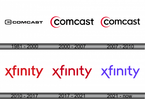
1981 – 2000
The logo in the image is a bold, linear arrangement of the name “COMCAST” in uppercase letters. The initial ‘C’ forms a distinct, circular enclosure, giving an impression of unity and focus. The typeface is heavy, with a sans-serif font that conveys solidity and reliability, reflecting the company’s presence in the telecommunications industry. The simplicity of the black and white color scheme denotes a classic, timeless approach in their branding.
2000 – 2007
The updated Comcast logo maintains the sans-serif font but now features a dynamic red swoosh encircling the letter ‘C’. This design introduces color and a sense of motion, suggesting innovation and a forward-thinking approach. The rest of the letters are in black, maintaining a professional and sleek look, but with added vibrancy and life through the red element. This logo reflects a more modern, approachable, and customer-focused brand identity.
2007 – 2010
The logo’s sleek font signals Comcast’s modern professionalism. Its red accent adds energy, symbolizing innovation. This symbolizes a commitment to digital-era customer service.
2010 – 2017
The logo for Xfinity represents a significant shift from Comcast’s previous branding. It showcases a vibrant red color with the letter “X” boldly leading the brand name, giving a sense of dynamism and modernity. The typeface is more streamlined and contemporary, reflecting Xfinity’s focus on innovation and technological advancement in the telecommunications sector. The use of red evokes energy, passion, and connection, aligning with the company’s mission to provide high-speed, reliable service.
2017 – 2021
The logo appears to be a more streamlined version of the Xfinity brand. It showcases the company’s name in bold, red, uppercase letters, with a slant on the initial “X” that adds a dynamic feel. This design choice conveys a sense of speed and efficiency, aligning with the brand’s promise of fast and reliable telecommunications services. The typography is simple yet powerful, with a focus on readability and brand recognition.
2021 – Today
The Xfinity logo has transitioned from its previous red to a striking purple hue, keeping the design consistent with the slanted ‘X’ yet introducing a new vibrancy. The color change represents a fresh, creative edge, possibly hinting at innovative horizons for the brand’s identity.


