Yamaha Logo
Yamaha started as a manufacturer of musical instruments but later expanded into other industries, including motorcycles, snowmobiles, jet skis, boats, and sports equipment. Today, Yamaha is the only company in the world that produces almost all musical instruments. They are known for their impeccable sound, reliability, ease of use, and relatively low price. Yamaha also manufactures high-end professional audio equipment. Yamaha is considered a single company but is divided into two independent areas – Yamaha Corporation and Yamaha Motor.
Meaning and History
Yamaha Corporation was founded in 1897 and was originally called Nippon Gakki Co., Ltd. The company was founded by entrepreneur Thorakusu Yamaha, who was known as a passionate tech lover and jack of all trades. In his honor, the company was renamed “Yamaha Corporation” one hundred years later. In 1955, in connection with the sharp expansion of the production of motor vehicles, Yamaha Motor Company Limited (a division) was founded. The first overseas location was opened in 1958. The company created several subsidiaries and acquisitions. The name literally means mountain and blade (Yama + Ha). The two words are associated with samurais and have a deep meaning for the Japanese.
What is Yamaha?
Yamaha is a company that was born a long time ago. In its nearly 130-year history, it has grown from a small manufacturer of musical instruments to a world-renowned company operating in several industries.
1898 – 1927
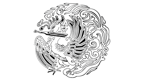
A very detailed black and white drawing of the Chinese “Ho-oh” (phoenix) served as the basis for the original logo. It was holding a tuning fork in its beak, which was very symbolic. Just like the Ho-oh is believed to rule over all the other birds, Yamaha would be the leader in its industry.
1927 – 1937
For ten years, the company used three tuning forks as its brand image. They overlapped each other in the center and created a symmetrical pattern. The black color gave the logo a classic, timeless look.
1927 – 1934
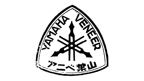
A “Yamaha Veneer” mark was added to the tuning fork emblem. It was placed on a triangular shield with the two words going diagonally and a Chinese inscription going along the bottom of the triangle. This was another simple, yet sophisticated emblem of this brand.
1934 – 1937
The company used a fortepiano as the centerpiece of the emblem. Across the piano, it stated the name of the brand in white letters. The three tuning forks were placed right above the name and looked relatively small. The whole emblem was framed by a thin black line forming a circle. The emblem looked very grand.
1937 – Today
The three-fork emblem introduced back in 1927 was redrawn to give it a more even look. Both ends were approximately the same length from the center.
1955 – 1959
A bold illustration of three knobbed batons was accompanied by a small drawing of the three forks seen earlier. The whole emblem had a thin circle framing.
1967 – 1980
The name of the company was the main element of the logo. It was done in all uppercase letters of black color. To the left, there was a round symbol with musical tuning forks that represented the company’s technology, production, and sales. The standard version had a black background and a white border that had a thin black outline to stand out. The reverse version was white with a solid black circle around the forks.
1980 – 1987
The company decided to make its “reverse” version the main version, while the other one became secondary. Otherwise, the logo stayed the same.
1987 – 1998
For a little over ten years, the company used just its name without the round symbol.
1998 – 2016
The round symbol was brought back. This time, the black and white versions were flipped once more.
2016 – Today
In 2016, Yamaha decided to use only one design for the round fork element. It went for the one with the white background and a thick black border that framed the tuning forks. The wordmark remained the same, just like it looked back in 1967.
Font and Color
Yamaha logo stayed almost the same throughout all the years, including the black and white color palette. These formal, classic colors are a great way not only to make a company look solid and powerful but also to help it have a truly timeless look. When it comes to the font, the company used the same one since its foundation. It is similar to Helvetica Bold Condensed, but with the “M” having a shorter center.
