Zara Logo
ZARA is part of the Spanish textile empire Inditex Group. It has revolutionized the fashion world and the textile industry, giving birth to the fast fashion concept. It helps Zara always keep abreast of fashion and be one of the first to respond to new trends and customer wishes. The brand has a huge, or rather gigantic collection, which allows anyone to dress from head to toe without leaving one store. Zara has everything from outerwear to accessories. Each line has several “sub-lines”.
Meaning and History
![]()
Before opening the first store in 1975, Amancio Ortega and his wife owned a tailoring workshop. Spanish businessman realized that it was possible to copy famous couturiers and sell goods several times cheaper. The idea proved successful, and Zara stores opened throughout Spain at an incredible rate. In 1985, the Inditex Corporation, which Zara is part of, was opened. Three years later, the first Zara store was opened abroad. It should also be noted that Zara, unlike its competitors, did not transfer all production to countries with cheap labor. They account for only about 20% of the production. A couple of years ago, Zara launched an online store. Originally, the brand was supposed to be called Zobra, which is the hero of the movie by Mahalis Kakoyanis, but the Ortega could not register the trademark. The name Zara was accidental. It was put together from ready-made prints of letters for Zobra.
What is Zara?
Zara is a brand of fashionable and affordable clothing and footwear for men, children, and women. With over 6,000 stores on every continent, Zara is one of the largest clothing retailers in the world. Today, both ordinary people and show business stars wear clothes from Zara.
1975 – 198?
![]()
Zara logo designers created a sophisticated and minimalistic logo from the very start. It featured a diagonally placed black tagline with a thin white line at the bottom and top and the brand name in the center. The tagline had a realistic-looking string and a shadow behind it. The name was done in bold, white letters with rounded serifs. Under the brand name, there was a tagline in smaller white letters that said “Tiendas de Moda”, which means “Fashion Stores” in English.
198? – 2008
![]()
A new logo appeared in the 80s and featured a stylish, more confident brand name. It still had serifs, which changed to an edgier style, and all uppercase letters. The emblem had a classic appearance thanks to the black inscription and white background without any other elements.
2008 – 2019
![]()
The logo was modernized while preserving that original feel of style and confidence. It featured stylish hairline serifs the same width as the thinner strokes in the rest of the letters. In addition, the letters were wider. Such relatively small changes gave the logo a completely different impression.
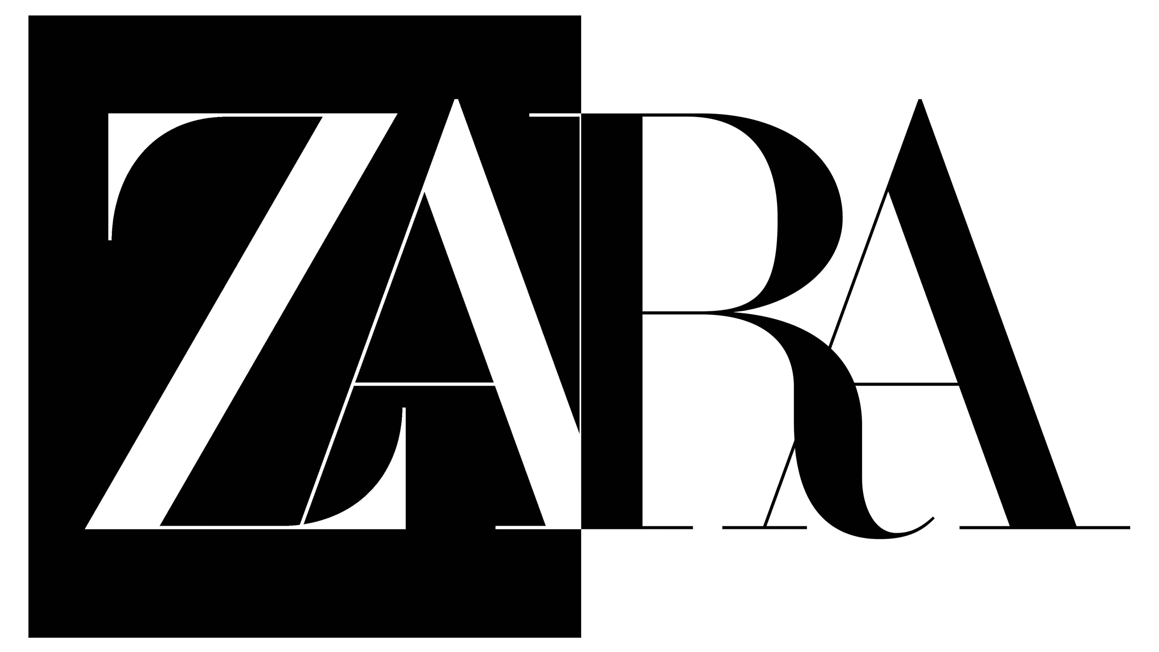
2017 – Today
![]()
The designers played with serifs once again, this time changing them to a combination of pointed bracketed and hairline serifs. This version was used along with the previous one for some time. Thin strokes in the letters got even thinner, making the logo look very elegant and sophisticated. Overlapping letters were a unique feature of this emblem.
Font and Color
The original logo had a simple font with old-style serifs. A unique feature of the font used in the logo introduced back in the 80s was a different thickness of strokes in each letter. It also had elegant transitional serifs and resembled TT Tsars Bold and Calmius Semi Bold font. In 2008, the logo changed font to Compass TRF. When a new logo was created in 2017, it featured a font designed by Baron & Baron and called Didot. The brand always stuck to black and white color palette, which is a sophisticated and timeless choice.


