7 Eleven Logo
7-Eleven is the largest chain of stores. What is so special about 7- Eleven? It was the first convenience store to operate around the clock every day of the week. In addition, it was 7-Eleven that became the first grocery outlet where ATMs began to be installed. These convenience stores sell items that are always in demand. These include groceries, drinks, household essentials, non-prescription medicine, office supplies, and such. The assortment includes a minimum of perishable products.
Meaning and History
The company was originally called The Southland Corporation and was founded in 1927 in Texas. One day, Joe S. Thompson, manager of the company, came up with a brilliant idea to sell products directly from the warehouse. The products, which were placed on top of ice sold by this company, stayed fresh. In 1946, the stores were renamed from “Tote’m” to “7-Eleven” to reflect the company’s new, extended hours of operation, which was unusual in the United States. In the 1950s, it quickly expanded and began to flourish throughout the country. The expansion and purchase of over 100 more outlets in 1964 led to franchising. 7-Eleven gained a lot of popularity in Japan, so in 1991, the Japanese company bought a majority stake in its partner. In November 1999, the corporate name of the American company was changed from “The Southland Corporation” to “7-Eleven Inc.”.
What is 7-Eleven?
7-Eleven is the largest chain of small supermarkets, which consists of a thousand of its own stores and close to 100 thousand franchised outlets, mainly in Asia. In addition to shopping, visitors can grab fast food dishes, and fresh pastries and drink coffee or carbonated drinks using self-service machines.
1927 – 1945
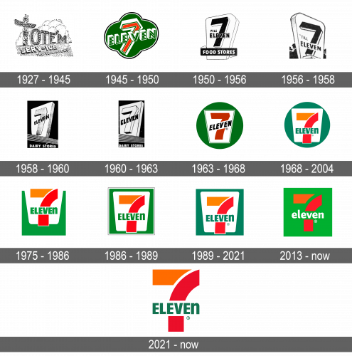
The first logo was in line with the brand image and the name of the company at the time. The stores had actual totem poles in front. They are also part of its logo with the first letter being the largest and most detailed element. The name has clouds behind it and the grass has the inscription “Serv-ice” and “The Year Round” on the second line.
1945 – 1950
After multiple outlets were united under one name, a new logo was a must. It had the new name placed on a green four-clover leaf with a thin white and black outline. Number “7” was placed behind and showcased a red color with a thin green outline followed by a thick white. The unusual lines made it look bold and grabbed the attention. It had “Eleven” printed over it. The inscription was placed on a diagonal and had a 3D appearance thanks to multiple outlines.
1950 – 1956
The new logo was not as fancy, yet it was easier to read. The modifications made it clear that the “Food Stores”, as it stated on the banner at the bottom, worked from “7 till Eleven”. The emblem was done in black and white, with the brand name and the color of the banner being black. A white trapezoid with black outlines that gave it a 3D appearance served as the base for the whole logo.
1956 – 1958
This version looks very similar to the previous one. It has no “Food Stores” banner anymore. The name has been redrawn, but no major modifications have been done.
1958 – 1960
The company further fine-tuned the brand image, removing the “till” inscription. The word “Eleven” was now placed on a diagonal and higher than previously. In addition, the trapezoid background was flipped and now repeated the shape of the number, which seemed more logical.
1960 – 1963
It was not long before new edits were introduced. The “7” had a more defined, three-dimensional shape and was lighter in color. The word “Eleven” also featured a bolder, bigger font.
1963 – 1968
The new emblem had a saturated, pleasant color palette. A large, grassy green circle served as the base for a white trapezoid. The latter had a decorative border and the brand name, which was done in a similar way as in the earlier versions. The number, though, was now red and no longer three-dimensional. The word “Eleven” was done in black and had a white banner behind it to make it stand out.
1968 – 2004
For the first time in the logo history, the number was going behind the white trapezoid. An orange was used for the horizontal line in the number “7” while red was used for the vertical line. The sharp, curved strokes added dynamics. The second part of the name was placed straight and printed the same green as the circle. Interestingly, the designers printed the “N” as lowercase but gave it the same height as all the other letters.
1975 – 1986
The circle turned into a square of a lighter green. Although the other elements stayed the same, the square was placed slightly lower than the horizontal bar of the “7”. This made the top of the white trapezoid blend with the background. The brand was surely thinking out of the box.
1986 – 1989
It was decided to have the green square serve as a solid background for the main elements of the emblem, which are no longer going beyond it. Moreover, it now had a white followed by a thin black border to make it look complete.
1989 – 2021
The logo looks almost unchanged. The only difference is the green color, which now is closer to turquoise than grassy green.
2013 – Today
A creative update was done in 2013. It not only brought back a lighter shade of green, similar to the one used in the late 70s and early 80s. The white background was gone, while the gap between the horizontal and vertical bars in the number got bigger. For the first time in history, the word “Eleven” was printed in all lowercase letters.
2021 – Today
Another version introduced in 2021 did not bring about anything new. It simply took the brand name elements from the logo introduced in 1989 and used them without the green and white background. This version looked more minimalistic, modern, and versatile.
Font and Color
7-Eleven is recognized for its green, orange, and red color palette. The white color is also used for the background in some versions. Although the company uses a relatively simple font, which somewhat resembles Humanist 521 Extra Bold Condensed, there is one unique detail. All the letters are uppercase and have the same height but the last letter is lowercase and printed larger to match all the other letters.
