Guardians of the Galaxy Logo
“Guardians of the Galaxy” is a vibrant sci-fi superhero team in the Marvel Comics universe, first appearing in 1969. Created by Arnold Drake and Gene Colan, it features a diverse cast of characters including Star-Lord, Gamora, Drax, Rocket Raccoon, and Groot. They’re intergalactic adventurers, often dealing with cosmic threats. The team’s stories blend action, humor, and heart, focusing on themes of family and redemption. They gained immense popularity with their 2014 film adaptation, directed by James Gunn, which expanded their appeal to a global audience.
Meaning and history
“Guardians of the Galaxy”, initially conceptualized in 1969 by Arnold Drake and Gene Colan for Marvel Comics, began as a team of heroes set in the 31st century. Each member hailed from a different planet, a reflection of the diverse and vast universe they protected. The original lineup included Vance Astro, an astronaut from Earth with psychic powers, Martinex T’Naga, a crystalline being from Pluto, Captain Charlie-27, a soldier from Jupiter, and Yondu Udonta, a blue-skinned noble warrior from Centauri-IV.
Over the years, the concept evolved significantly. In 2008, writer Dan Abnett and Andy Lanning reimagined the team in the contemporary setting. This new iteration brought together an eclectic mix of characters: Star-Lord (Peter Quill), a half-human, half-alien leader; Gamora, the last of her species and a skilled assassin; Drax the Destroyer, a powerful warrior with a personal vendetta; Rocket Raccoon, a genetically engineered raccoon with a knack for tactics and firearms; and Groot, a sentient tree-like creature with a limited vocabulary but profound strength and loyalty.
Their stories often revolve around themes of misfits finding family in one another, battling cosmic threats, and navigating the complex moral landscapes of interstellar societies and politics. The Guardians’ adventures are marked by a unique blend of humor, action, and heart, setting them apart from traditional superhero narratives.
The team achieved mainstream popularity with the 2014 film adaptation directed by James Gunn, part of the Marvel Cinematic Universe (MCU). The film introduced a broader audience to the quirky, less conventional side of the Marvel cosmos, highlighting the team’s comedic dynamics and deep emotional connections. The success of the film and its sequels further cemented the Guardians as key figures in both comic lore and popular culture, appealing to a wide range of audiences with their relatable themes and distinctive style.
What is Guardians of the Galaxy?
“Guardians of the Galaxy” refers to a fictional, interstellar superhero team in the Marvel Comics universe, known for their unconventional dynamics and humorous adventures. Comprised of characters like Star-Lord, Gamora, Drax, Rocket Raccoon, and Groot, they tackle cosmic threats while exploring themes of family and belonging in a vast, often chaotic galaxy. Their story extends from comic books to a highly popular film series within the Marvel Cinematic Universe.
2012 (pre-release)
The logo showcased is a striking emblem for the “Guardians of the Galaxy,” rendered with a robust, metallic sheen that captures the essence of this cosmic saga. Set against a backdrop speckled with stars, the typeface exudes a sense of futuristic strength, each letter standing bold and broad. The color scheme is a gradient of silver and steel tones, hinting at interstellar adventures. This design melds the allure of space exploration with the gravity of a blockbuster release, promising epic narratives and visual spectacle.
2014
The logo is a golden emblem for the “Guardians of the Galaxy,” rendered in a bold, serif font that exudes confidence and strength. Each letter is crafted with a three-dimensional effect, suggesting depth and solidity, with subtle textures that give the impression of a relic from an ancient, advanced civilization. The color palette is monochromatic gold, evoking the preciousness and rarity of the team within the Marvel universe. Above the title, the Marvel logo in its iconic red color asserts the franchise’s identity, creating a visual anchor. This design communicates a fusion of classic heroism with the enigmatic charm of galactic adventures, embodying the spirit of the series with a timeless elegance. It’s a logo that stands at the crossroads of past glory and future promise, encapsulating the epic saga of these cosmic protectors.
2014 (pre-release)
This iteration of the “Guardians of the Galaxy” logo introduces a notable evolution in style and texture, distinguishing it from its predecessor. The typography retains its boldness but adopts a golden hue, reminiscent of aged artifacts and otherworldly relics. This color shift from metallic silver to antique gold suggests a narrative steeped in history and legend. The surface of the letters appears weathered and textured, further enhancing the feel of ancient grandeur. The Marvel insignia sits atop, its presence smaller yet still prominent, signaling the logo’s allegiance to the broader universe of superheroes. A striking “2” slashes through the text, its sleek and dark form creating a stark contrast to the golden letters, signaling a sequel that promises deeper explorations and darker turns in the narrative. This logo is not just a title; it’s a visual promise of adventure, legacy, and the timeless allure of space-bound odysseys.
2017
This version of the “Guardians of the Galaxy” logo evolves with a distinct number “2” slashed across it, creating a visual cue that signifies its sequel status. The numerals are in a dark, contrasting color, perhaps to underline new challenges or a darker theme in the storyline. The rest of the logo maintains its golden, textured appearance, carrying over the legacy of the original branding. The addition of the sequel number in such a stylized manner adds a layer of intrigue and hints at a continuation of the team’s adventures with increased stakes and intensity. The Marvel insignia remains constant, a reminder of the constant within the ever-expanding universe. This design change speaks to the growth of the franchise, suggesting new horizons and uncharted territories that await in the narrative’s progression.
2021 (pre-release)
The logo for “Guardians of the Galaxy Vol. 2” offers a refreshing visual transformation from its forerunners. The text now sports a duo-tone color gradient of cool blues and warm yellows, imparting a sense of dynamism and energy. “Vol. 2” is playfully added, suggesting a new chapter that retains the essence of its origin while promising growth. This sequel indicator is styled differently, emphasizing its significance with a red, paint-like splash, injecting a bold, almost rebellious flair into the design. The Marvel Studios logo replaces the simple Marvel mark, reflecting a cinematic upgrade in the brand’s presentation. This logo’s design encapsulates the franchise’s evolution, blending the nostalgia of classic comic aesthetics with the modernity of the cinematic experience. It stands out as a beacon of the series’ continued vibrancy and its promise to deliver stories filled with color, life, and adventure.
2023
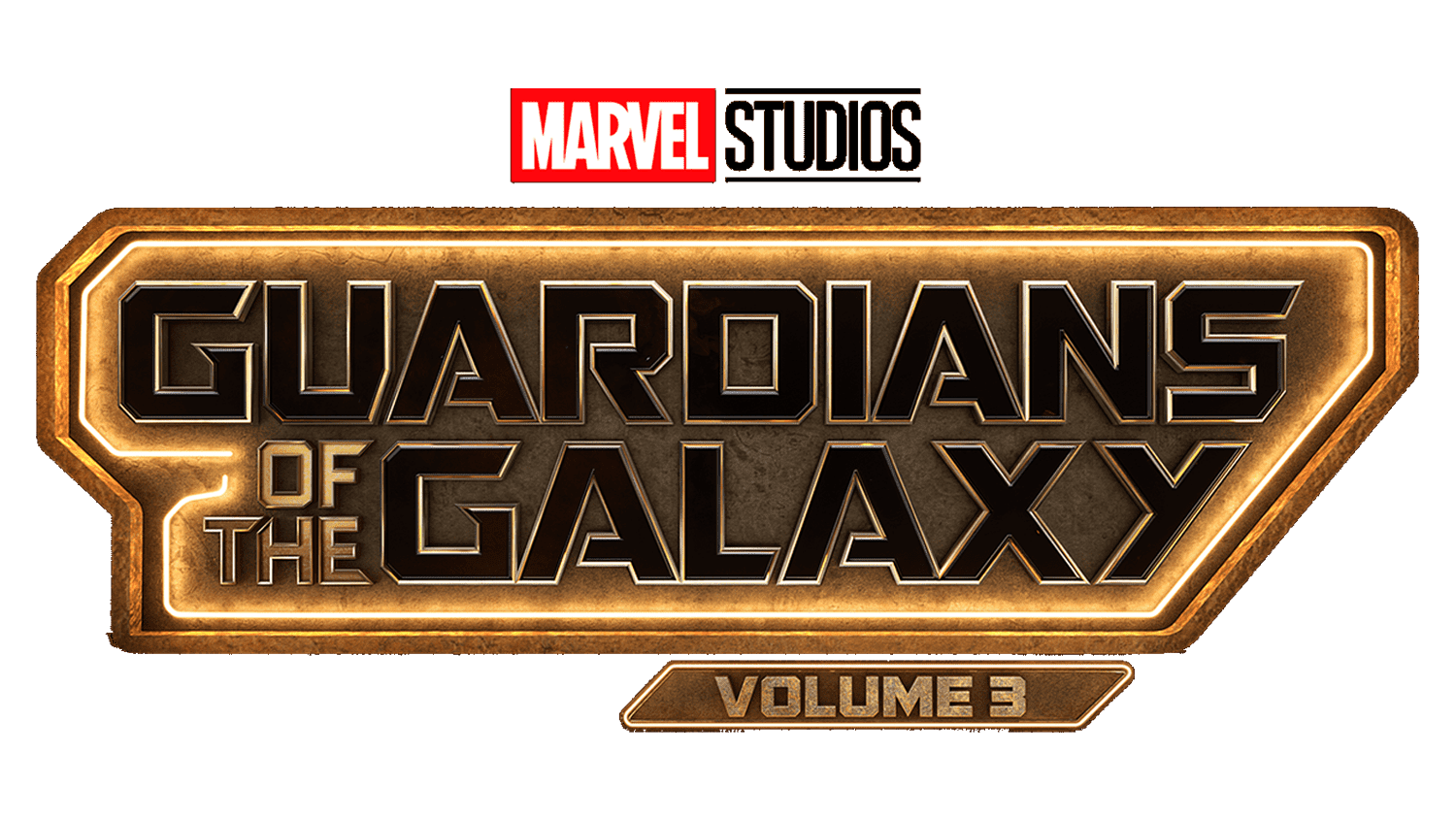
The “Guardians of the Galaxy Volume 3” logo has undergone a distinct transformation from its predecessor. The metallic sheen has shifted to a deeper, almost bronze-like tone, suggesting a maturity and richness that comes with the unfolding saga. The logo’s structure is now framed within a hexagonal border, giving it a more pronounced, badge-like quality that could imply a stronger sense of unity or mission. “Volume 3” is spelled out in a clear, elongated font at the bottom, a departure from the previous numerical stylization, which may denote a new era or chapter in the narrative. The Marvel Studios logo remains at the top, its consistent presence anchoring the franchise’s identity. This design iteration embodies a progression, an evolution that respects the past volumes while carving out its distinct chapter in the Guardians’ legacy.


