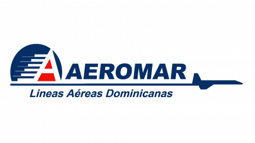
Aeromar Líneas Aéreas Dominicanas Logo
Aeromar was a primary airline company of the Dominican Republic, a small country in the Caribbean. They mostly conducted regional flights between the United States and island countries of the Caribbean. They had a fleet sufficient for that, but they don’t go beyond that task.
Meaning and History
The company was started in 1998, and it was established right away as one of the primary airlines in the country. They didn’t live long, shutting down operations just 5 years later. Their name is pretty complex, as you might notice. Well, it basically translates to ‘Aeromar Dominican Airlines’.
1998 – 2003
The logo used by Aeromar when they briefly operated consisted of several parts: two text elements divided by a line, as well as a symbol.
The upper text part was just the word ‘Aeromar’ in blue, bold letters – all in uppercase. The lower text part featured the rest of the long name, although they were written with capital letters as proper, were much thinner, as well as tilted to the right.
Between these two parts was a line, stylistically portrayed as a plane’s trail. The plane proper was just on the right end of this line. However, right over its left edge was the symbol of the company – a capital white ‘A’ with several lines streaking out of its left side. The background was a blue circle, while the inner space of the letter was red.
These are national colors of the Dominican Republic.
Emblem and Symbol
In addition to the ‘A’ symbol used extensively by the company, they also portrayed a lone white palm tree surrounded by red and blue as a sort of secondary symbol. For instance, it was the usual way to paint the tails of the planes with it. The main symbol was also there, but on the front side of the plane.


