Air India Logo
Air India is the major airline organization, transferring people and cargo across India and outside world. Founded in 1946, now, The company manages an assembly of 127 Boeing and Airbus vehicles, flying towards 102 worldwide and domestic directions. Since 2014, Air India occupies a post in Star Alliance. The company holds almost a fifth of the country’s market in India, which makes it the flagman air transportation company in India. The Air India’s hub spot is Indira Gandhi IA, placed in New Delhi.
Meaning and history
![]()
The first iteration of Air India was Tata Air Services, established by Tata brothers. It was later retitled Tata Airlines. They were best known for mail delivering under the royal warrant across India via their fleet of Puss Moth vehicle and a de Havilland Leopard Moth. They started transferring passengers in the late 30s, first en Bombay-Trivandrum route, then to other destinations.
Shortly after the WWII, Tata got the PLC status and changed the name to Air India. By the 1953, most of the stakes were bought by the Indian state. The first Bombay-London flight was carried in June 1948, which turned the company into the transnational level. In the decades to come, they would operate services to most of the Asians cities, as well as provide flights to Europe. They also became the first Asian company to enter the reactive aircraft age in the 60s.
What is Air India?
Air India is an air cargo, mail, and passenger transporter headquartered in New Delhi. This is the country’s largest airline, occupying 18% of the Indian air market and controlling the fleet of 127 jets. Air India links the country with outside world, flying to 102 directions. Their main airport is Indira Gandhi in New Delhi.
1932 – 1946
![]()
In the 30s, the company had used a simple name caption with italicized uppercase characters, which stood on a beige rectangle.
1946 – 2007
![]()
After the official establishment of the Air India Company, they made a logotype, used for years. It showed a minimalistic centaur, put inside an oval, reflecting the wheel of Konark. The personage was shooting an arrow somewhere in the sky. Below the image was the brand’s nameplate in a capitalized sans-serif script, having italicized letters.
1946 – 1960
![]()
Alongside the centaur, they made the nameplate in red letters. The ‘Air-India’ name stood above the handwritten ‘international’ word. It wasn’t written in all caps only the first ‘i’ was uppercase. The name was bolder, longer, and darker than in the centaur logo.
1960 – 1970
![]()
In 1960, they’ve taken down the ‘international’ portion in beneath, changing it with the company’s small name note in Hindu.
1971 – 1972
![]()
The 1970 design employed the sign similar to the centaur emblem in the primary logo, but the image was a bit straightened. To the right, they wrote the name both in Hindu and English. The typeface used for the words was italic as previously, and it has received bold blocky letter forms.
1972 – 1989
![]()
But this logotype was probably too large, so the brand designers refreshed it, placing the words in a single level, and drawing the insignia between them. They also painted the elements richer red.
1990 – 1991
![]()
Since 1989, the marketers from Air India had been working on the logotype for the brand. The initial concept was a red parallelogram showing a sun with bronze rays. The star was placed inside a circular frame, barely visible on the red background. At its bottom right corner, they wrote the name caption, both in Hindu and English.
1992 – 2007
![]()
During the 90s and 2000s, Air India was using the old 1972 logotype.
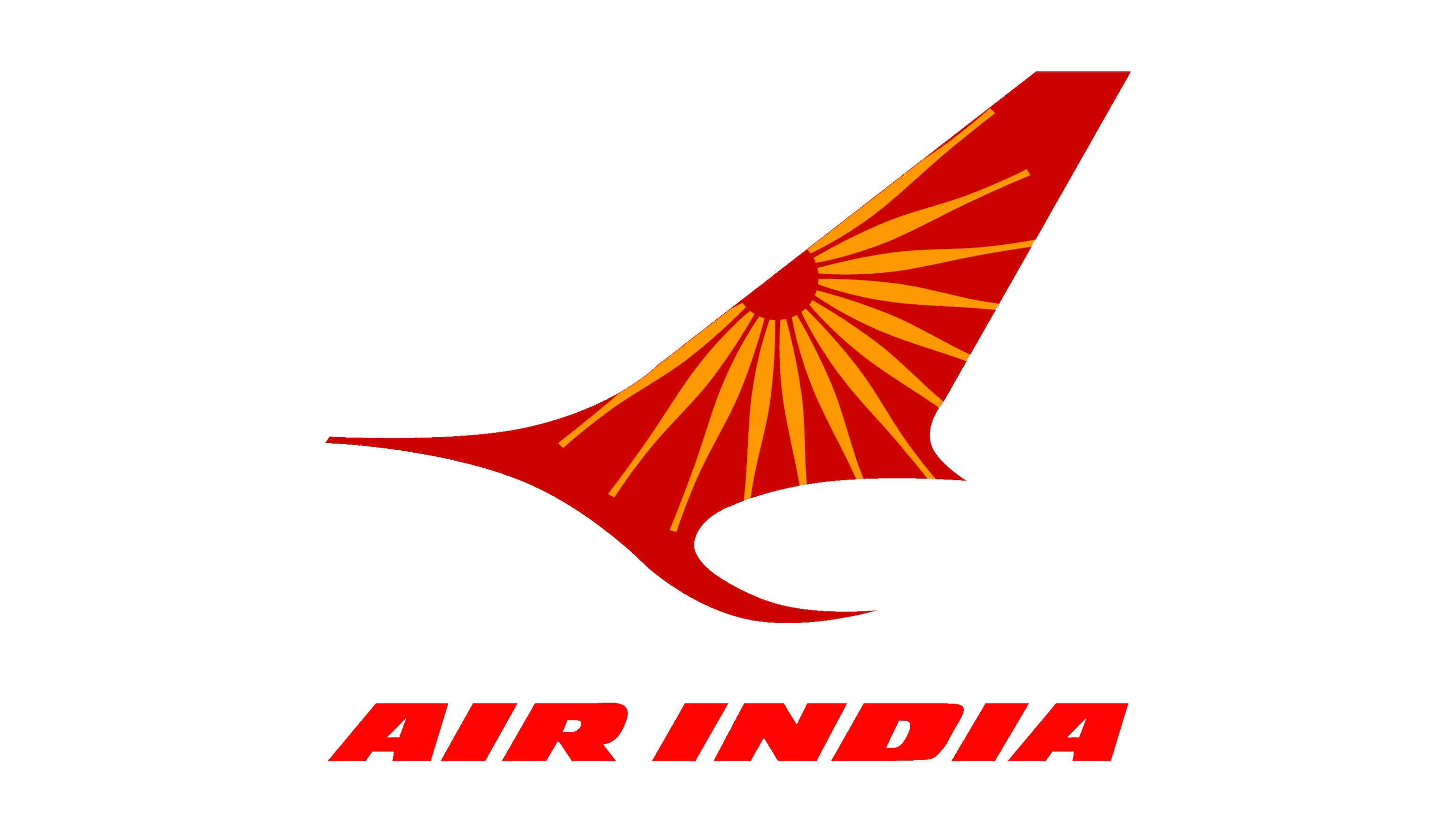
2007 – today
![]()
The modern corporate logotype shows a red swan with the orange ‘Konark Chakra’ image on it. To the left, the Hindu and English variants of the nameplate show up. Commonly, the sawn logotype is put on the tail part of the aircraft, owned by the company. This logotype has been transformed from the iconic centaur’logotype, used for nearly 70 years before.
2023 – Today
![]()
On 11 August 2023, Air India unveiled a fresh aesthetic and revamped aircraft paint scheme, marking a new chapter in the airline’s visual identity and embracing the future while honoring its rich heritage. This transformation not only redefines the brand’s image but also represents the company’s commitment to continuous evolution in the aviation industry.
Font
The official typeface, used to write the nameplate, has received blocky characters with very bold forms. The italic letters are uppercase, and they have small intervals in between. All this makes a powerful image for the company logotype. The script, closest to these characteristics, is probably Loft Extra Bold Italic.
Color
The corporate identity of Air India has been composed of red and orange shades, whereas the inscriptions and swan are red, and the chakra is orange. These shades represent action, power, and courage. Due to the thoughtful choice of colors, the logotype is distinctive and recognizable.


