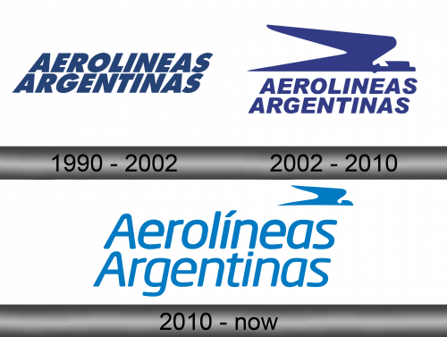
Aerolíneas Argentinas Logo
Aerolíneas Argentinas is a major Argentine air carrier with a large number of international flights. The airline is headquartered in Buenos Aires. In 2021, the air carrier had 78 aircraft at its disposal, including 10 Airbus A330-200s with a large capacity. The company is a member of the SkyTeam aviation alliance. As of 2012, almost all of the company’s shares are owned by the state.
Meaning and history
Aerolíneas Argentinas was founded in 1950. For a long time, the company did not have a single logo that would be constantly used as the main one for the promotion of an air carrier. Different variants were used with the name of the company and an eagle, symbolizing the strength and power of the transport ships used.
1990 – 2002

The airline used just their wordmark as the logo in the earlier years. They arranged the words in two lines and used a basic sans-serif font. The letters themselves were tilted and colored dark blue.
2002 – 2010

In 2002, they modified the wordmark, mostly in the font department. It’s similar, but not as heavily tilted. Moreover, they added a big emblem above the name. It’s some sort of fusion between a plane and a bird, and it was used even after 2010. The coloring changed for the entire logo from dark blue to a paler shade.
2010 – now
In 2010, a logo was developed, which began to be used constantly. It used all the ideas that were previously associated with the company in one way or another. The designers have chosen a suitable font. The two words in the name of the company Aerolíneas Argentinas are almost identical in length, so they are conveniently located under each other. There was also a place for an eagle, it is located in the upper right corner of the logo above the last letters of the word Aerolíneas.
Font and color
The use of shades of blue in airline logos is a traditional solution used by Aerolíneas Argentinas. The inscription and the bird are drawn in the same color, light blue is chosen as it. The font has good readability. The inscription is quite long, so the ability to read it comfortably at a distance plays an important role.
In the Aerolíneas Argentinas logo, blue does not only mean a cloudless sky. For decoration, a color identical to the color on the flag of Argentina is used. This is an extremely good decision, given that the company is actually owned by the state. Nationalization was carried out in 2008. When creating the logo, this fact was of great importance.


