Aeropostale Logo
Aeropostale, a vibrant fashion brand, originated in the U.S., offering trendy apparel and accessories primarily for a young audience, including teens and young adults. It was founded with a vision to provide affordable, yet stylish and high-quality clothing. The brand resonates with casual wear and easy-going styles, embodying the spirit of youthful energy and a carefree lifestyle. Aeropostale’s creation was aimed at filling the gap in the market for fashion-forward yet accessible clothing.
Meaning and history
Aeropostale, launched in the 1980s, initially captivated youths with trendy, affordable attire. It quickly became a staple in American malls, symbolizing vibrant teen fashion. Ownership evolved, reflecting shifts in the retail landscape.
In 2016, financial hurdles led to bankruptcy, prompting a significant shift. A consortium, including mall giants, acquired it, aiming to rejuvenate the brand. The focus shifted towards digital platforms, adapting to changing consumer behaviors. Despite challenges, Aeropostale persisted, innovating in design and marketing. It embraced sustainability, appealing to eco-conscious consumers.
Aeropostale continues to evolve, blending tradition with modern retail strategies.
What is Aeropostale?
Aeropostale stands as a beacon of youthful fashion, offering a blend of casual apparel that echoes the vibrant energy of its teenage and young adult audience. Born in the bustling streets of America, it crafts a narrative of affordable style and spirited individuality, thriving amidst the ever-evolving fashion landscape.
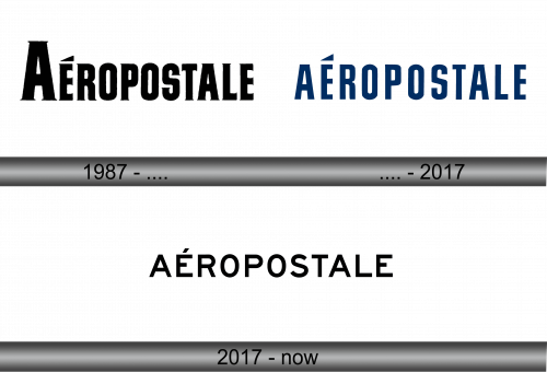
1987 – ….
The logo showcases bold, black lettering with a distinctive diacritical mark, the ‘é’, lending it a touch of flair. Its typeface is sturdy, with a hint of classical strength, yet the logo maintains a modern simplicity. The capital ‘A’ stand assertive, anchoring the design firmly in the realm of contemporary fashion. This emblem is not just a name, but a statement of style, mirroring the brand’s ethos of youthful exuberance and affordability.
…. – 2017
This iteration of the Aeropostale logo dons a deep navy shade, instilling a sense of confidence and reliability. The accented ‘é’ remains, a signature element, adding an air of sophistication. There’s a uniformity in color, stepping away from the stark contrast of black, suggesting a seamless identity that’s both modern and classic. The font presents a slightly condensed form, reflecting a more streamlined and contemporary brand image that speaks to a universal audience.
2017 – Today
Transitioning from navy to a classic black, this version of the Aeropostale logo conveys a timeless elegance. The accent on the ‘é’ remains a distinctive touch, adding a cosmopolitan flair to the otherwise straightforward, sans-serif font. The black hue imparts a universal appeal, suggesting a return to basics and a nod to the traditional, yet with a sleek, modern finish that appeals across generations. The simplicity of the design speaks to the brand’s confident identity in the fashion realm.


