Arizona Diamondbacks Logo
The Arizona Diamondbacks, often abbreviated as the D-backs, are a professional baseball team based in Phoenix, Arizona. Established in 1998, they compete in Major League Baseball (MLB) as a member of the National League (NL) West division. Known for their iconic sedona red and black colors, the team quickly made an impact by winning the World Series in 2001, becoming the fastest expansion team in MLB history to win a championship. Their home games are played at Chase Field, notable for its retractable roof. The Diamondbacks are recognized for their spirited fanbase and contributions to the Arizona community.
Meaning and history
The Arizona Diamondbacks, an American professional baseball team, were founded in 1995 as part of Major League Baseball’s (MLB) expansion plan. They began playing in 1998 and are based in Phoenix, Arizona, as part of the National League (NL) West division. The team’s name, inspired by the state’s native diamondback rattlesnake, reflects Arizona’s wildlife and culture.
The D-backs made an impressive entrance into MLB, reaching the playoffs in just their second season (1999) under manager Buck Showalter. However, their most notable achievement came in 2001 when they clinched the World Series title, defeating the New York Yankees. This victory, led by star players Randy Johnson and Curt Schilling, marked the Diamondbacks as the fastest expansion team in MLB history to win a championship.
The team’s colors, sedona red and black, are iconic and symbolize Arizona’s desert and sunset hues. They play home games at Chase Field, previously known as Bank One Ballpark, recognized for its unique retractable roof and air conditioning system, a necessity in Arizona’s hot climate.
Throughout their history, the Diamondbacks have been known for their strong pitching staff, including Cy Young Award winners Randy Johnson and Brandon Webb. They have seen periods of both success and rebuilding, reflecting the dynamic nature of professional sports.
Off the field, the Diamondbacks are actively involved in the community. The team’s charitable foundation, the Arizona Diamondbacks Foundation, has been instrumental in supporting education, homeless, and children’s programs in Arizona.
The Arizona Diamondbacks continue to be a prominent team in MLB, known for their competitive spirit, community involvement, and the fast success they achieved in the early years of their existence.
1998 – 2006
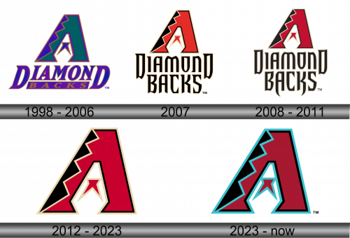
The emblem represents the iconic Arizona Diamondbacks baseball team. It features an avant-garde capital ‘A’, evoking the silhouette of a towering mountain peak, a nod to Arizona’s rugged landscape. The letter transitions from a deep forest green at the base to a vibrant turquoise at the pinnacle, suggesting the dynamic play of light and shadow across desert terrain. Its right edge is fashioned with sharp, zigzag contours, mirroring the distinctive patterns of a rattlesnake’s back, a tribute to the team’s namesake.
Beneath this central figure, the words “DIAMOND BACKS” are scribed in regal purple, selected for its royal connotations and desert sunset echoes, encapsulated by a slim, copper-toned outline reminiscent of Arizona’s famed copper mines. The font’s serifs add a classic touch to the otherwise modern motif. The entire image is bordered by a stark outline, giving the logo a pronounced and assertive presence that reflects the bold spirit of the team and its connection to Arizona’s natural grandeur and cultural heritage.
2007
This iteration of the Arizona Diamondbacks logo showcases a bold, red ‘A’, outlined in black and sand hues, exuding a strong, earthy presence that symbolizes Arizona’s desert heartlands. At its center, a smaller white ‘A’ with a red star creates a layered effect. This design is a pivot from the previous logo’s more complex gradients, opting for solid, confident blocks of color that convey stability and power. The team name “DIAMONDBACKS” below is in a black, blocky font, with a sand-colored outline that echoes the resilience of the region’s canyons. The stark contrast between the two logos reflects an evolution from a multifaceted aesthetic to one of bold simplicity.
2008 – 2011
The logo features an ‘A’ with a sleek design, incorporating a dark maroon and black color palette, with a white and sand outline that gives a crisp, modern aesthetic. This contrasts with the previous version’s more vivid red and solid outlines, presenting a refined, contemporary look. The ‘A’ harbors a stylized star, adding a subtle touch that distinguishes it from earlier iterations. Beneath, “DIAMONDBACKS” is written in an edgy font with a shadowed effect, projecting depth. This logo evolves from the earlier, simpler design, embracing a sharper, more stylized graphic that reflects modernity and progress.
2012 – 2023
The logo features a prominent ‘A’ in a rich red, accented with black and highlighted by sand-colored outlines, creating a striking visual. This design is a departure from previous iterations, focusing on a more streamlined and bold silhouette. The inner ‘A’ and star remain, but are more integrated into the overall design, reflecting a blend of tradition and modernity. This evolution presents a sharper and more assertive identity, capturing the essence of the Arizona Diamondbacks with a contemporary twist.
2023 – Today
The logo displays a bold ‘A’ in a deep red, flanked by black with a distinctive teal outline, conveying a fresh, vibrant energy. This design iteration introduces teal, which sets it apart from the previous logo’s earthy sand accents, giving it a cooler, more contemporary feel. The black segments within the ‘A’ add a touch of sleekness, and the inner white ‘A’ with the red star maintains the team’s identity while blending seamlessly with the new color scheme. This logo variation signifies a modern and stylish evolution of the team’s brand.
