Billabong Logo
Billabong, a renowned Australian surfwear and lifestyle brand, was founded in 1973 by Gordon Merchant. Merchant, a passionate surfer, started the company to address the needs of surfers with durable and functional boardshorts. Today, Billabong has evolved into a globally recognized brand, synonymous with the surfing culture and lifestyle.
Meaning and history
Billabong was established in 1973 on the Gold Coast of Queensland, Australia, by Gordon Merchant and his partner, Rena. The company’s initial focus was on producing high-quality, durable boardshorts designed specifically for surfers. This niche focus helped Billabong quickly gain a loyal following within the surfing community.
Over the years, Billabong expanded its product range to include a wide variety of surfwear and lifestyle apparel. The company’s innovative approach to design and marketing, coupled with its deep roots in the surf culture, propelled it to international fame. Billabong became synonymous with professional surfing, sponsoring major events and top surfers around the world. It also ventured into other action sports, diversifying its brand portfolio and reach.
In recent years, Billabong has faced challenges due to changing market dynamics and increased competition. However, the company continues to hold a significant place in the surf and lifestyle apparel industry. It remains dedicated to its core values of innovation, quality, and deep connection with the surf culture, while adapting to the evolving preferences of its global customer base.
What is Billabong ?
Billabong is an iconic Australian company primarily known for its surfwear and lifestyle brand. It caters to the surfing community and those inspired by the surf culture. The company’s products range from boardshorts to lifestyle apparel, reflecting a commitment to quality, innovation, and the spirit of surfing. Billabong’s global presence and enduring popularity make it a staple name in the world of action sports and casual wear.
1973 – 2008
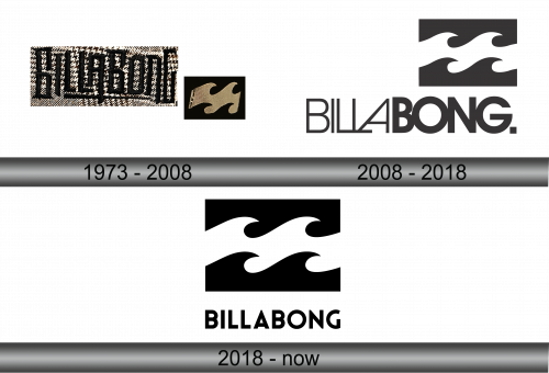
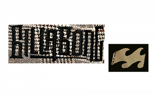
The initial emblem of this label, birthed in the early 70s, unveiled a dynamic arrangement of capital letters paired with a singular, monochrome symbol featuring an ethereal white cresting swell, nestled within a stark black quadrilateral. The deep-hued script unfurled in a robust, condensed typeface, its outlines keenly chiseled, giving rise to an impression of crisp precision. Central to the logotype was a petite underscore, bridging the word’s midpoint, beneath which the letters seemed to oscillate slightly, as if mimicking the ocean’s perpetual motion. This artistic fusion of text and image encapsulated the essence of both elegance and untamed energy, a visual ode to the adventurous spirit of the coastal lifestyle.
2008 – 2018
This image presents a crisp, monochromatic logo for the Billabong brand. It features a dual composition; the upper portion is segmented into two parts showcasing a graphic that abstractly interprets the fluidity and grace of ocean waves, each crest and trough captured in a stylized, rhythmic motion against the backdrop of a bold, rectangular block. Beneath this, the brand name ‘BILLABONG’ is spelled out in a modern, clean sans-serif typeface that gives a nod to minimalist design. The full stop at the end of the brand name punctuates the logo with an air of finality and confidence. Together, the elements of wave and word convey the brand’s essence: timeless, yet forward-thinking, anchored in the heritage of surf culture yet poised for the future.
2018 – Today
The logo is a study in bold contrasts and fluidity, a graphical representation of Billabong’s identity. Two ebony blocks with undulating white lines suggest the mesmerizing motion of sea waves. Beneath this, the company’s name is spelled in stark, unembellished capitals. The current emblem, in its simplicity, seems to return to the roots of the brand—emphasizing the elemental relationship between the surfer and the sea, distilled to its essence.


