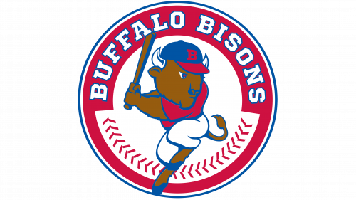
Buffalo Bisons Logo
The Buffalo Bisons are a professional Minor League Baseball team based in Buffalo, New York. They are the oldest continuous team in minor league baseball. The team was created to participate in the National League, and over the years, it has played in various leagues. The Bisons currently compete in the Triple-A East division, acting as the top affiliate for the Toronto Blue Jays. They play their home games at Sahlen Field. The creation of the team was driven by the city’s passion for baseball and desire to have its own professional team.
Meaning and history
Buffalo Bisons, established in 1877, hail from Buffalo, NY. They began in the National League. Now, they’re in Triple-A East. Their home is Sahlen Field. Over decades, affiliations changed; currently, they’re with the Toronto Blue Jays. Early years saw fluctuating success. The 20th century brought stability, then challenges. Post-1970, revival efforts succeeded, bolstering fan support. Historic achievements include winning titles in various leagues. The team has seen baseball legends come and go. Community engagement remains strong, with Bisons deeply rooted in Buffalo’s sports culture. Their journey reflects resilience, adaptation, and passion for baseball.
What is Buffalo Bisons?
The Buffalo Bisons serve as the heartbeat of minor league baseball in Buffalo, NY, donning their caps since 1877. Embedded within the fabric of the city, they stand as a testament to the enduring love for baseball, currently showcasing their talents in Triple-A East, closely linked with the Toronto Blue Jays.
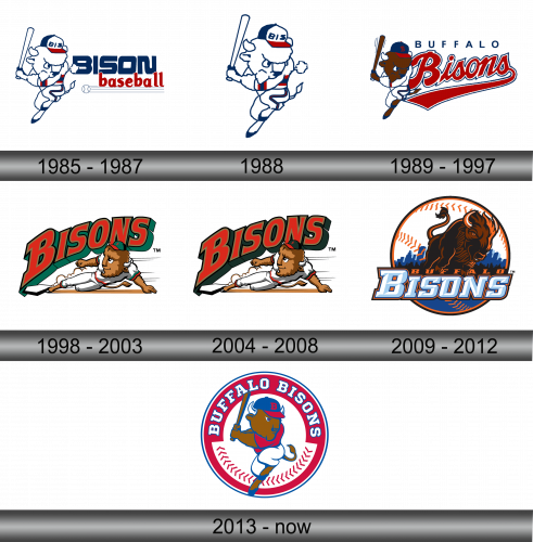
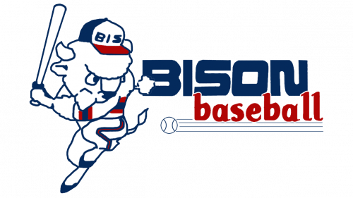
1985 – 1987
A dynamic bull charges forward, bat in hoof, epitomizing the Buffalo Bisons’ spirit on their emblem. Clad in a classic cap, its determined gaze reflects competitive zeal. The backdrop, bold “BISON baseball” in blue and red, anchors the design firmly within America’s favorite pastime, echoing cheers of a bygone era. The flying baseball adds a touch of action, suggesting mid-game excitement. Each element combines, creating a nostalgic yet lively tribute to the team’s enduring legacy.
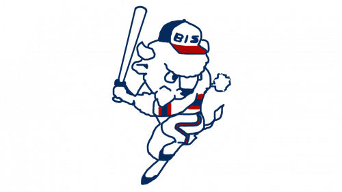
1988
Stripped from its text, the Bisons’ mascot stands alone, its essence captured purely in form and motion. Wielding a bat, ready for action, the bull’s athletic posture is in the spotlight, sans words. Devoid of the previous logo’s background, this version speaks silently but firmly of the team’s identity. It’s a cleaner, more focused representation, allowing the mascot itself to become an unmistakable icon of Buffalo’s cherished baseball legacy. Simple, yet potent, the image carries the Bisons’ story forward.
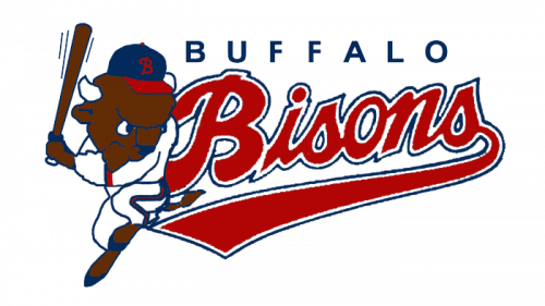
1989 – 1997
This iteration of the Buffalo Bisons’ emblem reintroduces text, with the team name boldly sweeping behind the determined buffalo. The mascot, now a brown bull in full stride, sports a cap emblazoned with a “B”, signaling a return to classic baseball iconography. The dynamic swoosh underlining “Bisons” adds a sense of speed and progress, implying forward motion and unstoppable momentum. This logo marries the action-packed imagery of the mascot with the assertive presence of the team name.
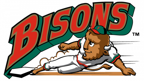
1998 – 2003
In this evolution, the Bisons logo leaps into a vibrant scene with the mascot in mid-slide, adding dynamic action. The word “BISONS” now looms large, angled upward in bold, layered text, giving a 3D effect. Vivid green borders the letters, injecting energy and a modern twist. The buffalo sports a determined expression, capturing the thrill of the game. This design emphasizes movement and excitement, aligning with the energetic atmosphere of baseball.
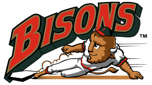
2004 – 2008
The logo remains unchanged from the previous iteration, retaining its energetic imagery with the sliding buffalo and prominent “BISONS” text. The color scheme and 3D effect of the lettering continue to give it a contemporary edge. This consistency reflects a period of stability and recognition in the team’s branding. The bull, characterized with animation-like detail, and the prominent display of the team name exemplify the spirit and excitement of Buffalo Bisons baseball.
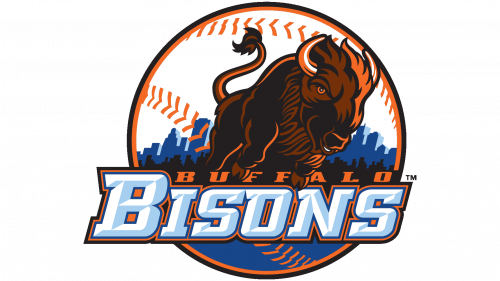
2009 – 2012
This version of the Bisons logo marks a bold departure, featuring a fierce bison head-on within an orange circle. The city skyline silhouette at the bottom grounds the team in its Buffalo home. The baseball seams arc over the top, framing the design, while “BUFFALO BISONS” encircles in strong, shadowed lettering. This emblem shifts focus to a more majestic and powerful representation of the team’s namesake, infusing a sense of pride and formidable presence.
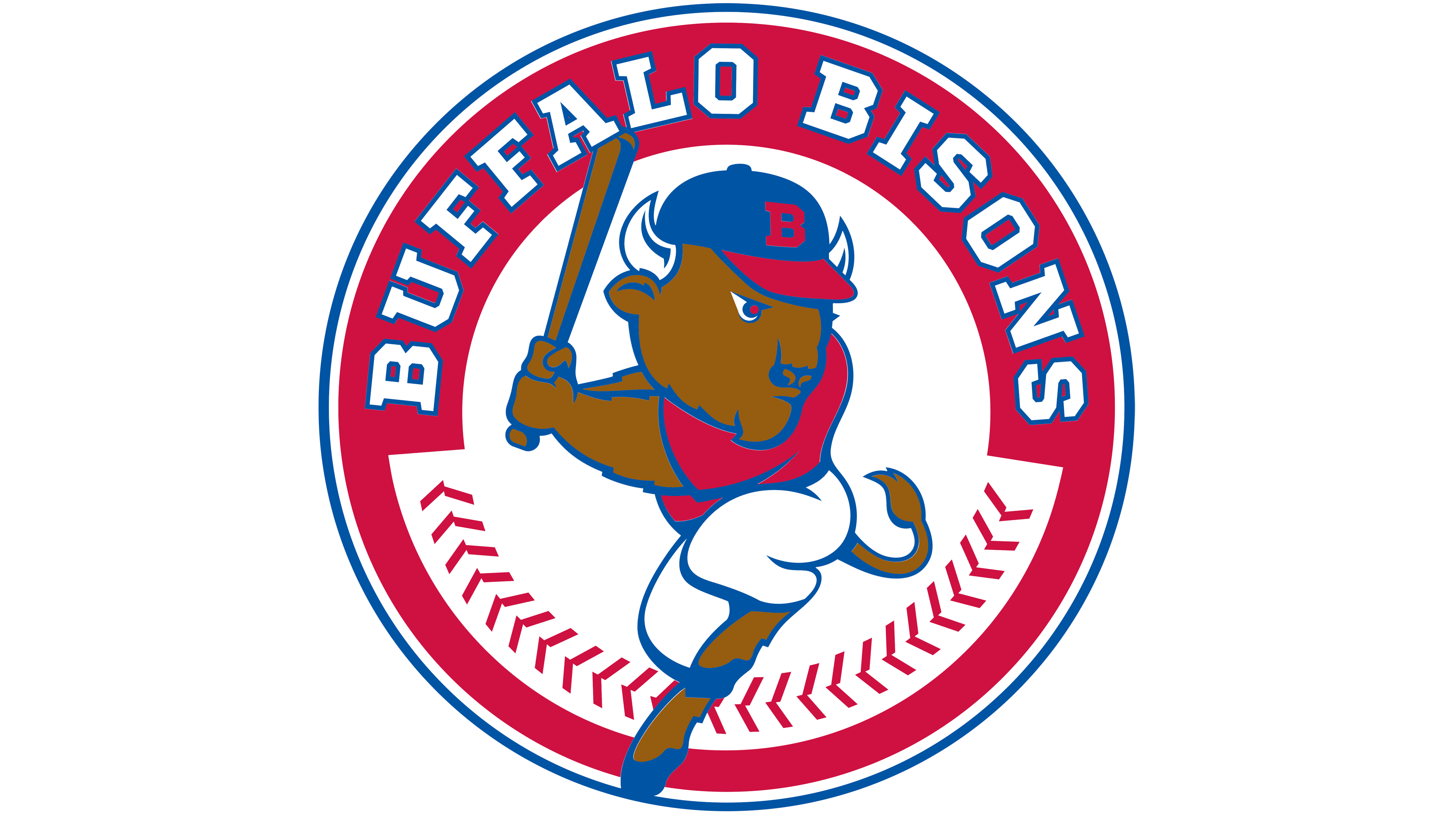
2013 – Today
Transitioning from the previous design, the new logo frames a charging bison within a classic baseball circle. The buffalo, illustrated in mid-pitch, is dynamic, encapsulated by the circular arc with “BUFFALO BISONS” in bold, red lettering against a white background, edged with baseball stitching. The blue and red color palette hearkens to traditional baseball motifs, symbolizing energy and fervor. This logo simplifies and streamlines its predecessor’s complexity, focusing on the core baseball theme.
