Cincinnati Bengals Logo
In 1967, the world got a new professional football club known as “Cincinnati Bengals”. It was brought to life by Paul Brown, who also coached this team for the first three seasons. In 1991, Mike Brown inherited a controlling interest and later purchased other Cincinnati Bengals shares to become the majority owner of the franchise.
Meaning and History
In 1967, Paul Brown along with other investors obtained an AFL franchise in Cincinnati. The name “Bengals” was taken in memory of another team that played football there earlier and was added to the name of the city. The football players were members of the AFL for only two seasons before the league merged with the NFL.
What is Cincinnati Bengals?
This is a football team that plays professionally as part of the NFL. Paul Brown was the head coach from its inception in 1967 until 1975. The team had its ups and downs but missed their opportunity to win the championship when they went to SuperBowl twice in the 80s.
1967 – 1969
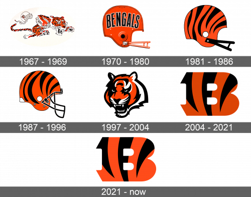
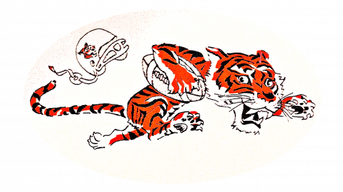
A detailed cartoon drawing of a leaping tiger with a ball in its right hand was the first emblem. The head was big relative to the body. The helmet with a tiger’s head image on it fell off the tiger’s head and was drawn flying behind it slightly above the tail. The tiger seems to be full of determination to win. It had a black, orange, and white palette.
1970 – 1980
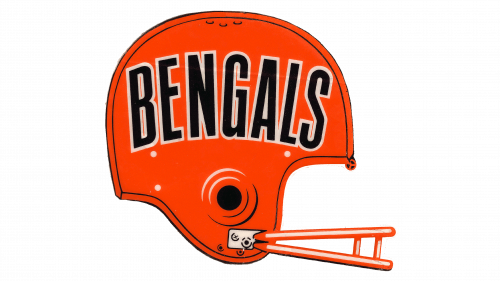
There is no more tiger, but the color palette was preserved. Now, the logo displayed a side view of an orange helmet. The details and outline were drawn in black. The word “Bengals” is written in simple capital letters across the helmet and is slightly arched. It is black and has a thin off-white outline. There is not much detail.
1981 – 1986
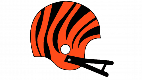
The helmet emblem was redesigned in 1981. The team’s name is gone. The helmet slightly change its shape and had a deeper shade of orange. What made it memorable were the black stripes that resembled a tiger pattern. The chin strap had less detail and was colored black.
1987 – 1996
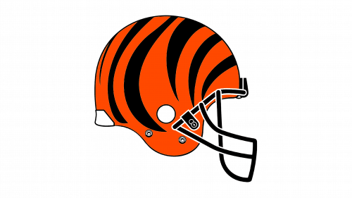
The team’s emblem was changed once again. The helmet had a more modern look and the shape of the already familiar tiger stripes has slightly changed. A face mask was black with white outlines, while the helmet had a thin black outline.
1997 – 2004
The helmet remained as the team’s emblem. However, it still had a tiger theme and now it was a tiger’s head. The animal looks aggressive and is drawn in detail using a black, orange, and white pallet. The head is slightly turned sideways, but we still see both eyes. It features tiger jaws wide open.
2004 – 2021
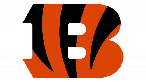
Although the tiger’s head emblem remained as a secondary emblem, another logo was drawn by the Verlander. It featured the first letter of the name. With symmetrical top and bottom, the letter “B” was bright orange in color with tiger stripes going down, which reminded of the helmet design previously used by the team. There is no outline.
2021 – Today
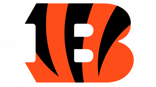
In 2021, Cincinnati Bengals made a barely noticeable change to their logo. The colors did not look as bright anymore. All the other details remained the same.
