Dead by Daylight Logo
Dead by Daylight is a computer game in the genre of multiplayer survival horror. The players are inserted into a vast open-space location riddled with various objects and natural environments. The can either play as survivors, whose goal is to escape the place, or as hunter, whose goal is to kill the survivors.
The game was the first in this genre, where human players are pitted against one another in a survival horror scenario. The game is organized in a session-based matchmaking, with 1 hunter and 4 survivors. Perks, characters and helpful items can be earned and upgraded.
Meaning and History
![]()
The game was released in 2016. Developed by the Canadian studio Behaviour Interactive, it was released to various platforms by different published. The title is considered one of the most successful horror games on Steam, and it still supports a numerous and lively community.
What is Dead by Daylight?
Dead by Daylight is the multiplayer horror videogame released by the Canadian studio Behaviour Interactive in 2016. In the game, you can either play as one of the survivors or a hunter. Your goal would be to activate all the generators powering the way out and escape or to hunt down all the survivors, respectively.
2016 – 2021
![]()
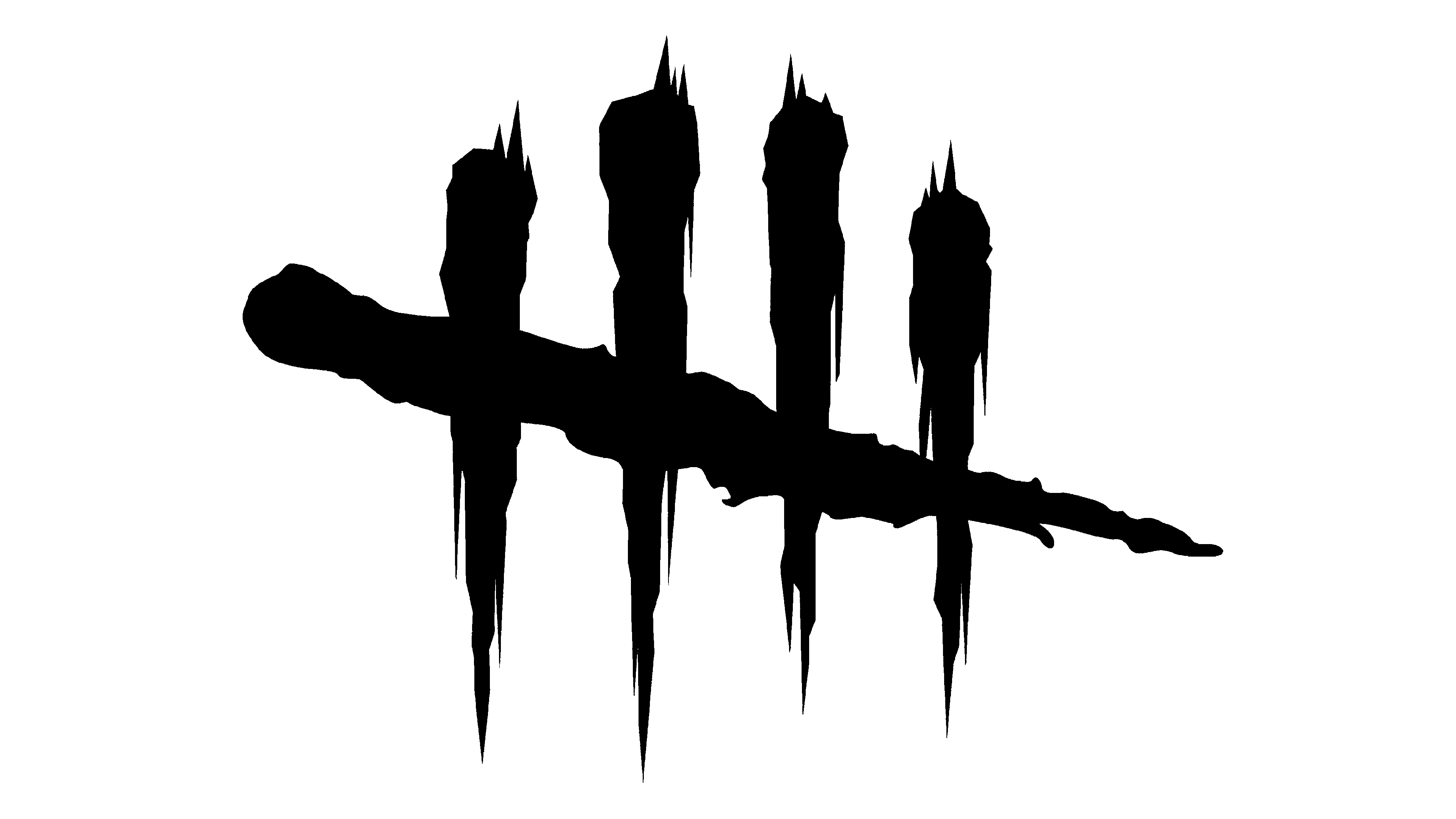
In 2016, they introduced the now-iconic emblem, which depicts four vertical strokes crossed by a single horizontal one. They represent four survivors and one hunter respectively. Upon closer examination, the vertical strokes appear to be human skulls on spikes, surrounded by the effects that resemble blood. The single horizontal stroke doesn’t have a skull in it.
Beneath this emblem, they’d typically write the name of the game, ‘Dead by Daylight’ in capitalized black letters. They would be small, thin and written in just one line.
2021 – today
![]()
The logo fragments remained largely intact by 2021, although the appearance and positioning were reshuffled. The regular variant of their main logo now demonstrates both the emblem and the game’s name depicted in the same line, with height adjusted to match.
In terms of appearance, the letters became a lot bolder and, obviously, larger compared to the emblem. The emblem is now just a small speck on the left from the name, at least usually. It’s a lot simpler, there’s a lot less nuance. They essentially made the entire image black without any skulls and other bits that were white previously.
The old style is still used on occasion, and it wasn’t replaced on many old promotional materials.
Font
Dead by Daylight used two fonts in their history. Both were simple sans-serif styles, and the main difference between them is the boldness. The earlier sample uses very thin characters, as thick as a common line. The later style is a lot bolder and wider, although the general appearance hasn’t changed much.
Color
The main two colors in this color scheme are black and white. The 2021 logo uses black exclusively, both for writing and the emblem. Alternatively, they are colored completely white when placed against a darker background. The earlier logotype was more complex and thus used the two colors together.


