Dickies Logo
Dickies, founded in Texas, USA, has evolved from a small bib overall company to a global leader in performance workwear. Renowned for its durable, comfortable, and functional clothing, Dickies offers a wide range of products including work pants, shirts, and outerwear. Initially popular among blue-collar workers, the brand has gained a cult following in street fashion, blending utility with style. Emphasizing quality and toughness, Dickies apparel is designed to withstand the rigors of daily work and has also become a staple in skateboarding and youth culture, symbolizing a blend of reliability and urban cool.
Meaning and history
Dickies originated in 1922 in Fort Worth, Texas, founded by C.N. Williamson and E.E. ‘Colonel’ Dickie. Initially, it was a small bib overall manufacturer named U.S. Overall Company. In 1924, the company was renamed Williamson-Dickie Manufacturing Company. The Great Depression hit, but Dickies survived by securing contracts to produce millions of uniforms during World War II.
Post-war, Dickies expanded globally, turning from workwear to popular casual wear. In the 1950s, Texas oil boom workers favored Dickies for their durability. By the 1960s, American youth adopted Dickies as a fashion statement. The 1990s skateboarding scene embraced Dickies for their functionality and toughness. Dickies entered the 21st century as an iconic brand, blending work functionality with street style.
It’s a global leader in performance workwear, known for quality, comfort, and durability. Beyond work clothes, Dickies now influences fashion trends worldwide. The brand symbolizes a blend of grit, utility, and urban cool, appealing to diverse cultures and industries.
What is Dickies?
Dickies, originally a small Texas-based bib overall manufacturer, has evolved into a renowned global brand known for durable and comfortable workwear. Embraced by various cultures, from blue-collar workers to street fashion enthusiasts, it symbolizes a unique fusion of practicality and urban style.
1920 – 1930s
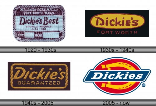
The logo showcases a textured logo with a vintage flair, featuring the name “Dickie’s Best” prominently in bold, dark lettering. The background’s off-white hue contrasts with the text, giving the logo a classic, timeless feel. This emblem encapsulates a blend of tradition and assurance of excellence.
1930s – 1940s
In this logo, “Dickie’s” is written in a fluid, dynamic script set against a yellow oval, edged with a rustic maroon border. Beneath, “Fort Worth” is presented in solid, straightforward letters, grounding the logo with a sense of location and heritage. The color scheme radiates warmth and energy, a stark contrast to the previous logo’s cooler tones and simpler design. This iteration conveys a more casual and approachable brand identity, reflecting a shift towards a broader, more inclusive appeal.
1940s – 2005
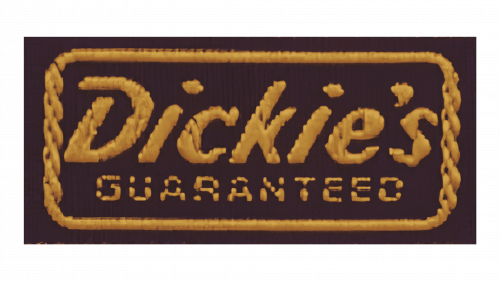
This logo transitions to a more robust, emboldened aesthetic, with “Dickie’s” rendered in a thick, golden font surrounded by a chain-like border. The word “GUARANTEED” is featured underneath, emphasizing the brand’s commitment to quality and customer satisfaction. The design is assertive and resonates with a sense of assurance, moving away from the playful script of the previous version to convey reliability and strength. The dark background contrasts sharply with the golden text, creating a sense of depth and prominence.
2005 – Today
The logo leaps into a modern era with a sharp, contemporary design. “Dickies” is set in a clean, bold font, encapsulated within a navy blue elongated oval, intersecting a vibrant red circle. The red and yellow hues are vivid, imparting an energetic and fresh look, a significant shift from the former logo’s monochromatic scheme. This design embodies a more polished and professional image, reflecting the brand’s evolution and its embrace of a more modern, dynamic identity.
