Fendi Logo
Fendi is a world-famous Italian brand. The history of the successful brand began in Rome when in 1925 a young married couple decided to open an atelier for tailoring products made of genuine leather and fur. Gradually, a small Fendi shop grew into a large enterprise specializing in the production of leather and fur products, clothing, accessories, and perfumes. It is considered the standard of classic Italian fashion. The company is part of the LVMH holding.
Meaning and History
The Fendi Empire was created by Adele Fendi in 1925 from a small workshop and shop in Rome, where Adele and her husband Eduardo traded in leather goods. In the late 1990s. LVMH and Prada bought a 51% stake in the Fendi brand, and in 2001 LVMH became the sole owner.
What is Fendi?
This Italian brand is widely known all over the world. Under this logo, a wide variety of fashion products are produced. Fendi brand clothes are popular not only on the catwalks and in everyday life, but also on the set.
1925 – 1965
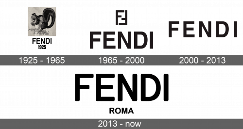
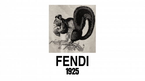
The original logo featured a detailed black and white drawing of a squirrel standing on a branch with a nut. It was done by the founder of the brand, Eduardo Fendi, as a present to his wife who was always busy like a squirrel. The name of the company was written under the image in capital turquoise blue letters. Under the name, the logo had a foundation date.
1965 – 2000
The double Latin F logo, designed by designer Karl Lagerfeld, became quite recognizable in the late 90s. It was written in black with the second “F” being upside down and facing the other letter to form a rectangle. Under this element, there was the brand name also printed in straight sans-serif typeface but using a slightly larger size of the font. All letters were capital and also black.
2000 – 2013
The brand decided to remove the double F element and only left the brand name. It looked almost unchanged and only the letters were slightly more spaced. The logo had a very professional look.
2013 – Today
The logo was changed once again. It was not much different from the previous version. The letters acquired a more round and smooth look and were written closer to each other. Under the company’s name, there was a tagline that said “Roma”. It referred to the city where the history of the brand started and was written using a much smaller font size.


