Friendster Logo
Friendster emerged as a pioneering social networking service. Jonathan Abrams stands credited for its creation. The development took place in Mountain View, California, aiming to connect friends and family online. This platform allowed users to share profiles, photos, and messages, facilitating a virtual community environment. Unique for its time, Friendster was the precursor to many social media innovations.
Meaning and history
Founded in 2002, Friendster quickly gained popularity, becoming a staple in the digital social landscape. By 2003, it saw explosive user growth, but faced scalability challenges. The platform underwent several reinventions, notably shifting towards entertainment and gaming in Asia by 2011. Despite these efforts, Friendster officially ceased operations in 2015, marking the end of an era. Its legacy, however, paved the way for the next generation of social networking sites.
What is Friendster?
Friendster was an early social networking site designed to connect people through friend networks. Users created personal profiles, connected with friends, and shared content. This innovative platform laid the groundwork for future social media developments, despite its eventual closure.
2002 – 2009
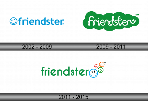
The logo presents a friendly, approachable image with its sky-blue text and cheerful smiley face. The word “Friendster” is written in a clean, sans-serif typeface, which conveys modernity and simplicity. A happy face infuses the design with warmth and a personal touch, reflecting the network’s social nature. This emblem, with its minimalist aesthetic and inviting iconography, encapsulates the essence of connection and community.
2009 – 2011
The logo takes on a new personality with its vivid green hue, embodying energy and growth. “Friendster” is enveloped in a cloud-like shape, suggesting openness and expansiveness. White, playful lettering with soft edges adds a casual, whimsical character. The ‘r’ ending in a friendly wink, adding a human touch. This rendition stands out for its more organic, lighthearted feel.
2011 – 2015
The newest logo iteration radiates a joyful simplicity with its bold green lettering, signaling freshness and vitality. The word “friend” in “Friendster” now stands in a stronger, darker shade, underscoring the concept of friendship. The addition of a quartet of smiley faces in a playful dance of colors—blue, green, orange, and red—above the text adds a vibrant, welcoming touch. These emotive faces convey a diverse and joyful community, highlighting the social aspect of the platform.
