Twitter Logo

Being one of the most visited social networks alive, Twitter has accumulated millions of constant users since its launch in 2006. By sheer size, it’s just second to Facebook. Unlike on Facebook, however, everything on this platform is published in just a limited number of symbols. It’s perfect for sharing opinions or updates from your life.
Meaning and History
![]()
Because Twitter was, from its inception, meant for short and concise messages that can be accessed by virtually anyone, ‘twitting’ was the perfect word to describe the process. That’s the sound birds produce, and if you ever saw a bunch of birds chirping together on a tree, you get why they’d call it that.
2005 – 2006
![]()
Back when Twitter (or ‘twttr’, back then) was just in development, and haven’t yet created an iconic bird logo. This variation differed very much from the emblem we know, and there really isn’t an explanation why.
The initial logo looked like goo – the letters naturally looked viscous, and it didn’t help that the entire image was dark green (except for the letter ‘w’, it was light green). In addition, there were bubbles all over the place, and one seems to have popped, judging by the splashes coming out of the right end.
2006 – 2010
![]()
When the network came to be, they finally decided upon the name ‘Twitter’. Styled like ‘twitter’, the name was the central piece of the logo. The font the chose was pretty minimalistic, fluid and round. Each letter only consisted of a few strokes, sometimes even just one.
They also sometimes used a blue bird alongside the text, although it wasn’t like the bird we have now. It was a realistic depiction of a sparrow bird, although the entire thing was painted light blue (like the rest of the logo, anyway). Because the image never belonged to them, Twitter owners decided to draw their own bird soon after.
2010 – 2012
![]()
The name design didn’t change at all, and the entire focus was to make a bird mascot unique to Twitter. The work started some years before, and the first drafts were rather more detailed than today. They birds had distinct eyes, tails, beaks and feathers (even though they were very cartoony), and wore different shades of blue for various parts.
In 2010, the design was finalized. Just like the first bird version, this one was painted completely blue. Design-wise, its body looked like a horizontal comma symbol – bloated body with a large round head.
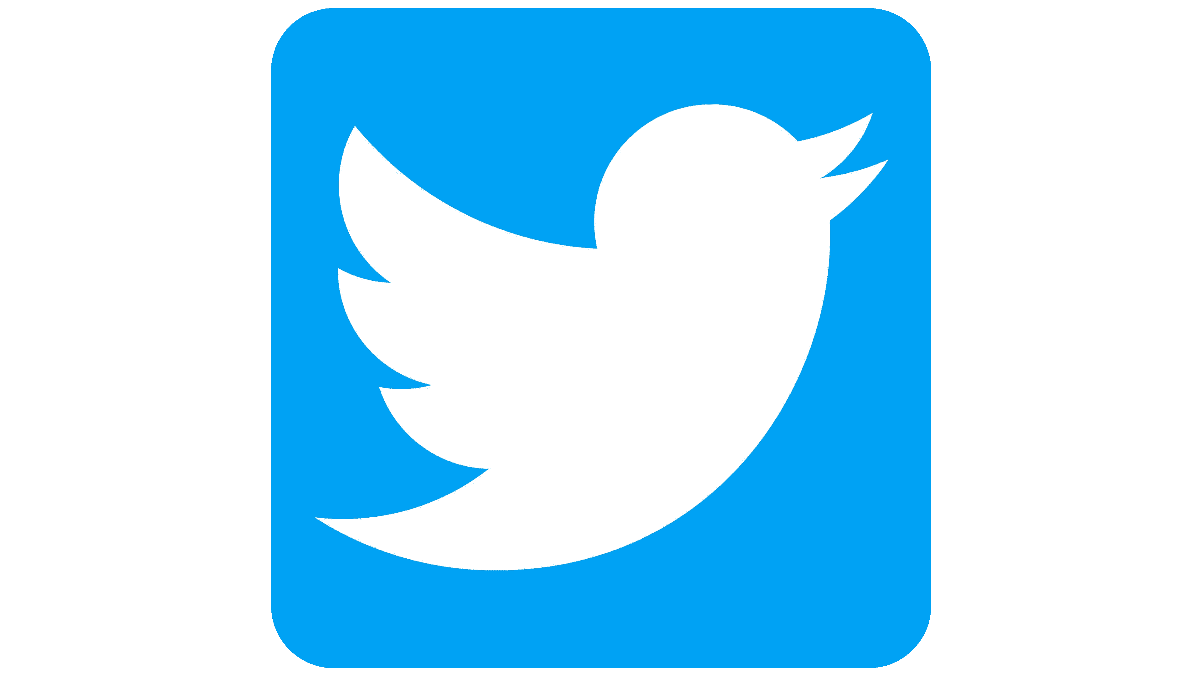
2012 – 2023
![]()
This logo has been in use for the longest time. They basically scrapped the text part and just focused on the bird. It didn’t changed much, except for turning about 45° counter-clockwise and making the coloring a big brighter.
Other changes included making the tail and the wing more harmoniously rounded upwards and getting rid of minor details in favor of uniform shapes.
2023 – Today
Elon Musk has intended to change the company’s logo and brand identity since the acquisition of Twitter in October 2022. Twitter changed its official logo in 2023, just like he wished. Instead of a blue bird, a white letter X with a black outline appeared. It is displayed in the header of the website, as well as when updating pages. The rebranding was announced by its owner Elon Musk. The new design, he says, represents “the imperfections that make us unique.”
Emblem and Symbol
The bird emblem was generally always blue, although it can change colors. For some promotional materials, it can be black, of course, but if you use Twitter on mobile, the bird would be white. Usually, it’s surrounded by a blue square of the same color. The text, meanwhile, is not in use at all anymore.


