Indian Car Bands
The automotive industry, a dynamic and ever-evolving sector, is not just about the machines but also about the brand identities that resonate with their audiences. One of the key elements of this identity is the logo, a symbol that encapsulates the ethos, heritage, and aspirations of the brand it represents. In the context of India, a nation with a rich tapestry of culture and history, these logos are not just emblems of identity but also reflections of the country’s journey in the automotive world.
This article delves into the fascinating world of automotive logos produced in India, exploring how these symbols merge cultural elements with modern design philosophies to create a unique identity. From the elegant simplicity of Tata Motors’ emblem, symbolizing trust and reliability, to the dynamic and innovative spirit captured in the TVS Motor logo, each emblem tells a story.
India’s automotive logos stand out for their ability to blend traditional motifs with contemporary aesthetics. They often incorporate elements that pay homage to India’s rich heritage while aligning with global design trends. This confluence of the old and the new is a testament to the country’s position as a growing automotive hub, bridging gaps between different eras and geographies.
The logos also reflect the diversity of the Indian automotive market. From luxury cars and robust SUVs to efficient two-wheelers and electric vehicles, these logos represent a wide spectrum of the automotive industry, each catering to different segments while upholding a unique brand identity.
Furthermore, these logos embody the stories of growth and ambition of Indian automobile companies. They stand as symbols of progress, illustrating how these brands have evolved over the years, adapting to changes in technology, consumer preferences, and environmental considerations.
In this exploration, we will uncover the stories behind these iconic logos, understanding their design, evolution, and the deep-seated meanings they carry. This journey through India’s automotive logos is not just about the aesthetics; it’s a deeper dive into the heart of India’s automobile industry and its vibrant culture.
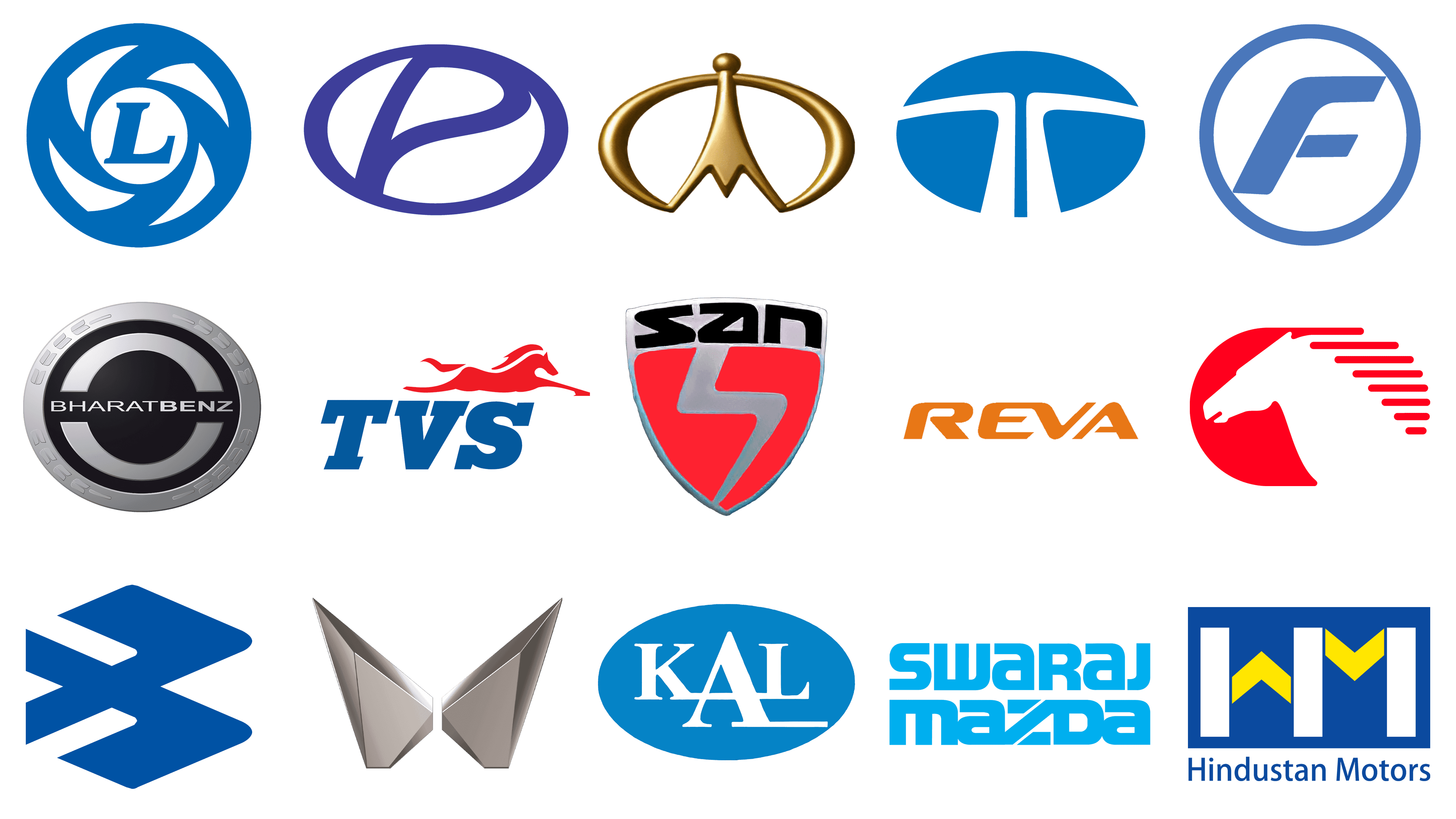
Ashok Leyland
![]()
Ashok Leyland, established in the heart of post-independence India, has grown to become an integral player in the country’s economic engine, particularly in the realm of commercial transportation. With a legacy spanning over seven decades, this stalwart of the Indian automotive industry has cemented its position as a manufacturer of robust commercial vehicles, including a versatile range of trucks, buses, and vehicles for defense purposes. Its contributions have been pivotal in propelling India’s growth in the commercial vehicle domain. The emblem of Ashok Leyland, bathed in a deep shade of azure, interweaves the rich heritage of India with the strides of contemporary design. The centerpiece ‘L’ is framed by an orbit of dynamic shapes, evoking the motion of wheels – the foundational element of travel and progress. These shapes also pay homage to the chakra, an element deeply rooted in Indian spirituality, symbolizing the eternal cycle of time. The logo’s palette is a testament to the company’s depth and the stability it brings to the industry, while the integrated design reflects the brand’s holistic approach to innovation. In every curve and contour of the logo, the spirit of Ashok Leyland’s dedication to advancing the industry is palpable.
Bajaj
![]()
In the annals of India’s automotive narrative, Bajaj Auto Limited emerges as a pivotal chapter, with its inception dating back to the mid-20th century. As a pioneer in the production of two-wheelers and three-wheelers, Bajaj has etched its signature across the roads of India and beyond. Renowned for its motorcycles, scooters, and the quintessential auto-rickshaws, Bajaj has woven itself into the very fabric of daily life, becoming synonymous with affordable and reliable transportation. The brand’s logo is a study in precision and purpose – a solid ‘B’ rendered in royal blue that captures the viewer’s gaze with its striking geometric silhouette. The logo, with its forward thrust, speaks volumes of Bajaj’s ethos of perpetual advancement and its relentless pursuit of innovation. The singular use of color embodies professionalism, while the clean lines ensure the logo’s lasting imprint on the memory. This emblem is not just a marker of identity but a declaration of Bajaj’s relentless quest for perfection and its unwavering resolve to maintain a vanguard position in the global market.
BharatBenz
![]()
BharatBenz, the relatively young entrant in the Indian commercial vehicle market, has swiftly risen to prominence since its launch by Daimler India Commercial Vehicles Pvt. Ltd. The brand, with its clear-cut emphasis on high-performance trucks and buses, has dedicated itself to redefining standards of reliability and efficiency within the industry. The BharatBenz insignia radiates industrial sophistication, combining metallic shades of grey and black to fashion a visual that speaks of robustness and precision engineering. The outer circle of the logo, with its strategic cut-outs, resembles the sturdiness of a tire, while the bold typeface of the brand’s name stands out against the stark black background, asserting its presence with confidence. The overarching circle mirrors the brand’s global perspective, and the design encapsulates the core values of strength and endurance. The essence of BharatBenz’s commitment to elevating the heavy-duty vehicle sector is embodied in the meticulous composition of its logo – a symbol of the brand’s pledge to ongoing improvement and its embrace of cutting-edge innovation.
Eicher
![]()
Since its inception in the late 1940s, Eicher Motors has carved a niche for itself in the Indian automotive landscape, emerging as a significant contributor to the sector with a diverse portfolio that includes robust commercial vehicles and the timeless motorcycles. Its strategic alliance with Volvo and the stewardship of the Royal Enfield marque has reinforced Eicher’s stature in the global market. The company’s emblem is a dynamic, crimson steed in mid-gallop, a testament to its spirit of resilience and swiftness. The trailing streaks create a visual metaphor of speed and progression, while the red hue embodies the fervor and zest that Eicher pours into each of its endeavors. Encapsulated within a circular badge, the logo is a powerful declaration of Eicher’s enduring heritage and its bold foray into the future of automobility.
Force Motors
![]()
Tracing its lineage back to the late 1950s, Force Motors has established itself as a formidable presence in the automotive sector, known for its versatile array of utility vehicles and tractors. As an Indian brand with a global footprint, Force Motors has demonstrated an unwavering dedication to meeting the needs of its varied clientele. The brand’s symbol, a blue ‘F’ ensconced within a circle, embodies reliability and fortitude. The logo’s sleek design language and contemporary font are indicative of the brand’s ethos of continuous innovation and engineering prowess that stand at the core of its philosophy.
Hindustan Motors
![]()
With roots stretching back to the early 1940s, Hindustan Motors stands as a venerable institution in India’s automotive chronicles. The manufacturer captured the hearts of a nation with the Ambassador, a vehicle that became more than a car—it became a cultural icon. The company’s insignia, set against a rich blue backdrop, prominently features the ‘HM’ initials in a contrasting palette of white and yellow. This emblem is not just a mark of identity but a testament to the brand’s deep-rooted legacy in the Indian automotive saga. It symbolizes a journey of trust and stability, with the chevron-shaped ‘M’ pointing upwards, signifying a trajectory of continual advancement and growth. In every aspect, the logo encapsulates Hindustan Motors’ foundational contribution to India’s automotive narrative and its commitment to mobility for all.
ICML
![]()
Emerging in the bustling landscape of the Indian automotive industry, International Cars & Motors Ltd (ICML), part of the illustrious Sonalika Group, established itself in 2006. ICML quickly became known for crafting versatile multi-utility vehicles that seamlessly blend rugged construction with adaptable functionality. Their emblem, a regal golden insignia, radiates sophistication and warmth, inviting onlookers into the world of ICML. The upward-pointing apex at the heart of the logo represents the company’s dedication to growth and reaching new heights, while the encompassing orb denotes a sense of community and integrity. The choice of gold in the logo embodies a sense of opulence and time-honored quality, resonating with ICML’s mission to deliver premium yet attainable vehicles, synonymous with durability and excellence.
Kerala Automobiles Limited
![]()
Positioned as a pivotal player in India’s push towards more sustainable transportation options, Kerala Automobiles Limited, established by the government in 1978, specializes in the manufacture of both electric and diesel-powered three-wheelers. Their logo is a testament to the brand’s ideology, featuring a bold, cerulean circle that encapsulates their commitment to completeness and reliability. The ‘KAL’ acronym, set against this backdrop in stark white, stands out as a beacon of simplicity and integrity. This visual juxtaposition of colors not only highlights the company’s dedication to straightforward and environmentally conscious transport solutions but also underlines their promise of transparency and purity in design and intent. Kerala Automobiles Limited’s emblem is more than just a corporate badge—it’s a symbol of their pledge to a greener, cleaner future in mobility solutions.
Mahindra Mahindra
![]()
Mahindra & Mahindra, colloquially known as M&M, stands as a colossus in the Indian automotive sector, boasting a vast array of products that cater to a myriad of needs from utility and commercial vehicles to two-wheelers, and even extends into agribusiness. Renowned for driving innovation and embracing sustainable practices, M&M’s insignia is a testament to this ethos. The ‘M’ depicted as wings in their logo symbolizes not just the ability to soar to new heights but also the expansive vision of the brand. Rendered in a metallic finish, it reflects the brand’s commitment to crafting vehicles that are both resilient and elegant. The equilibrium and upward ascent of the wings resonate with Mahindra & Mahindra’s dedication to balance and excellence, underpinning their relentless quest to push the boundaries of automotive technology and service.
Maruti Suzuki India
![]()
Maruti Suzuki India Limited, a venerated entity in the realm of Indian automakers, was established in the early ’80s and rapidly ascended to a position of prominence, especially noted for its comprehensive selection of cars and hatchbacks that cater to a vast demographic. The company’s emblem is a harmonious blend of colors and shapes, embodying the synergy of Maruti’s reliability and Suzuki’s dynamism. The emblematic ‘M’ is enveloped in a trustworthy blue, while the ‘S’ in a fiery red delineates the zest and innovation Suzuki contributes to the partnership. This emblem, encased in a geometric square, articulates a partnership poised on the pillars of innovation and dependability, a reflection of Maruti Suzuki India’s dominant presence as an automotive titan in the national market.
Premier
![]()
Premier Ltd., once recognized as Premier Automobiles Limited, occupies a storied chapter in the annals of the Indian automotive industry. Celebrated for iconic models such as the Premier Padmini, the brand has since ventured into diverse engineering realms. The Premier emblem is a dance of geometric forms encircled within the continuity of a ring, rendered in a rich, regal blue that speaks of depth and sophistication. The emblem subtly acknowledges the brand’s initials, the ‘P’ melding seamlessly into a design that evokes openness and dynamism. This distilled simplicity of the design encapsulates Premier’s enduring legacy and pioneering spirit within the Indian automotive narrative.
Reva
![]()
Reva Electric Car Company emerged in the mid-90s as a frontrunner in India’s nascent electric vehicle market, introducing the Reva, an emblematic electric car that signaled the country’s shift towards sustainable and eco-conscious commuting. The brand’s logo mirrors this pioneering spirit; it’s bathed in a vivid orange hue that speaks to the vitality and ingenuity at the heart of Reva. The logo’s typeface is a blend of modernity and substance, a visual echo of the company’s dedication to crafting vehicles that marry compactness with efficiency. Notably, the interlinked ‘E’ and ‘V’ in the logo add a layer of movement, indicative of Reva’s role in sparking a revolution in the electric vehicle space.
San Storm
![]()
San Motors’ foray into the Indian automotive arena brought with it the San Storm, a sports car distinguished by its distinctive aesthetics and featherlight architecture. The brand’s emblem encapsulates the vivacity and allure of its sports car with a kinetic shield contour and an emphatic red ‘S’, seemingly caught in perpetual motion. The emblem’s design and color palette convey the vigor and zeal that define the San Storm, crafting an indelible mark in a segment that’s still a novelty in the Indian context, with a dash of panache and performance.
Swaraj Mazda
![]()
In the realm of light commercial vehicles, Swaraj Mazda has etched its mark as a prominent manufacturer with a history that dates back to the early ’80s. The company’s association with Isuzu Motors has bolstered its reputation for quality and endurance. Swaraj Mazda’s logo, rendered in an arresting blue, is a beacon of the brand’s authoritative stance in India’s commercial vehicle sector. The typeface is deliberate and pronounced, with each character designed to convey solidity and dependability—qualities that Swaraj Mazda has become synonymous with, especially among its fleet of trucks and buses that navigate the diverse and challenging Indian topographies.
Tara International
![]()
Tara International has made a name for itself within the automobile manufacturing sector in India, particularly noted for its strides in the electric vehicle market. The company’s commitment to sustainable and eco-friendly transportation is reflected in its innovative product line. The logo of Tara International is a graphic representation of the company’s ethos, with a ‘T’ that transitions from a profound blue to a lighter hue, symbolizing a journey from the strength of tradition to the light of innovation. This gradation is more than a design choice; it’s a narrative of Tara International’s growth and its aspiration to make a global impact, as underscored by their motto, “Touching the Global Edge.” The emblem encapsulates the company’s dedication to blending established business values with a progressive, ecologically-conscious approach.
Tata Motors
![]()
Tata Motors, a cornerstone of the Tata enterprise, has been a titan in the global automotive sector from its origins in the mid-1940s. The company’s vast array of vehicles, spanning the spectrum from personal cars and SUVs to commercial buses and trucks, coupled with its expansion into the high-end market following its acquisition of esteemed brands such as Jaguar and Land Rover, has solidified its standing as an international powerhouse. The brand’s emblem, dressed in a distinctive blue and white color scheme, projects a robust and dependable image, reflecting Tata Motors’ dedication to continual innovation. The ‘T’ at the heart of the Tata Motors emblem, frequently depicted with an elegant gradient, articulates the brand’s layered and comprehensive approach to automotive distinction, symbolizing its pledge to forge a future where creativity and sustainable practices drive the automotive industry forward.
TVS Motor
![]()
TVS Motor Company has rapidly risen to prominence since its establishment, becoming a major player not just in the Indian market but on the global stage as well. The company’s emblem, featuring a red horse in mid-gallop, epitomizes the agility and strength that TVS Motor embodies in its range of two-wheelers. Beneath this powerful image, the bold ‘TVS’ lettering in blue stands as a testament to the company’s engineering prowess and the trust it has garnered over the years. This logo is not just a brand identifier—it’s a symbol of TVS Motor’s commitment to delivering performance, quality, and enduring value in the competitive world of automotive manufacturing.
Vazirani Automotive
![]()
Vazirani Automotive, though a newer entrant in the Indian automobile market, has quickly established itself as an innovator in the field of luxury electric vehicles. Founded with a vision to harmonize performance with eco-friendliness, the company’s logo mirrors this mission. The sleek ‘V’ in the logo is emblematic of Vazirani Automotive’s dedication to design and technological excellence, while the sophisticated and forward-looking typography underscores the brand’s commitment to luxury and high performance. This emblem is a visual promise of the brand’s pursuit to merge high-end automotive engineering with sustainable practices, paving the way for the future of luxury electric mobility.