Kenzo Logo
Kenzo stands as a distinct name in the fashion realm. Japanese designer Kenzo Takada founded it. Paris, France, became its birthplace. Initially, it focused on creating unique, vibrant clothing. The brand seamlessly blends Japanese styles with European fashion craftsmanship. It caters to men, women, and children, offering a wide range of apparel and accessories.
Meaning and history
Kenzo, a brand infused with the essence of Paris and the heart of Japan, emerged in 1970. Its creator, Kenzo Takada, harnessed vibrant patterns, infusing them with European haute couture’s sophistication. With audacious designs, the label quickly stood out in the Paris fashion scene. It expanded from women’s wear into men’s and eventually fragrances. The 1993 LVMH acquisition catapulted Kenzo to global prominence. Kenzo remains synonymous with cross-cultural fashion innovation, known for its iconic tiger motif and fearless prints. Each piece narrates a story of diversity, blending colors, and boldness, underlining Kenzo’s continuous evolution in the fashion tapestry.
What is Kenzo?
Kenzo is a luxury fashion brand known worldwide for its fusion of Japanese aesthetics and European haute couture. It offers a broad array of clothing, perfumes, and accessories. The brand stands out for its innovative designs, vibrant patterns, and cultural blending.
1983 – 2013
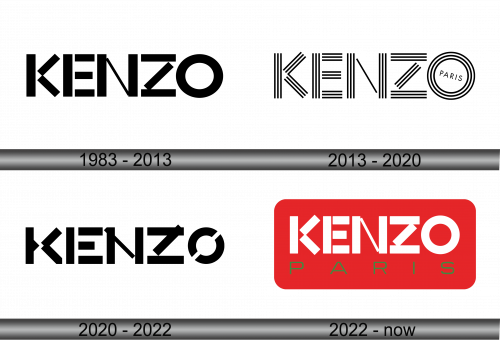
The logo presents a bold statement in stark black and white. Capital letters spell out “KENZO” with a playful twist on typography. This design choice echoes the brand’s innovative spirit. The letters, despite their size variations, unite to form a cohesive, impactful visual. Each character’s stark lines stand in contrast to their background, ensuring instant recognition. The logo’s simplicity makes it versatile, resonating with the brand’s diverse and eclectic identity.
2013 – 2020
Intricate lines craft the name “KENZO,” each letter a masterpiece of parallel and intersecting stripes. The “K” and “Z” mirror each other with their dynamic angles, while the “E” and “N” contrast with horizontal serenity. To the right, “PARIS” encircles itself, a subtle nod to the brand’s cosmopolitan essence. This logo marries complexity with elegance, echoing the fashion house’s innovative and global ethos. It’s not just a name; it’s a graphic celebration of Kenzo’s stylistic DNA.
2020 – 2022
The logo unfolds in a bold, monochromatic palette, with each letter of “KENZO” boasting a distinct architectural form. The “K” and “Z” strike with angular precision, the “E” showcases a steadfast symmetry, and the “N” bridges the letters with a firm diagonal line. The “O” closes the sequence with a circular gap, a modernist touch to the overall geometric harmony. This design captures Kenzo’s commitment to artful, assertive fashion. Each character’s solidity commands attention, encapsulating the brand’s confident aesthetic.
2022 – Today
The logo pops with a vibrant red backdrop, foregrounding the stark white “KENZO” text. Below, “PARIS” is etched in a contrasting green, symbolizing freshness and vitality. The typeface of “KENZO” is clean, modern, and precise. This red canvas symbolizes passion and energy, attributes at the core of Kenzo’s identity. The color choice reflects the brand’s boldness and its Parisian roots of high fashion. This emblem is a striking blend of simplicity and statement, much like the fashion it represents.


