Los Angeles Chargers Logo
Los Angeles Chargers is an American team that plays professional football in California. They had good times and not-so-good times and even played in San Diego for a large portion of its existence. Their team image has undergone changes over time, just like its success during games, location, and coaches.
Meaning and History
The team’s name and emblem reflect the name of the city where its history began in 1959. Right away, Chargers played on the field as one of the AFL teams. Next year, San Diego became their new home base and they became a well-known winning team called San Diego Chargers. Due to a merger in the 70s, the Chargers joined the National Football League. After playing for a very long time away from its home city, they made it back to LA.
What is Los Angeles Chargers?
This is a Los Angeles-born football team that returned to its birthplace in 2017. They began their career in 1960 and were one of the American Football League teams. LA was their home base only for the first season as they stayed in San Diego for a larger portion of their existence.
1960
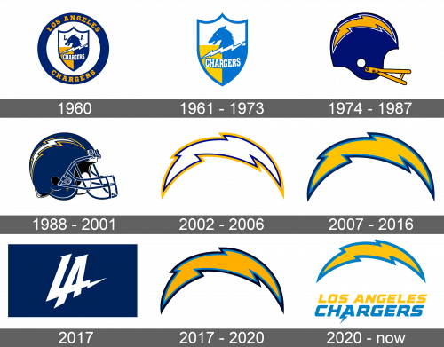
A shield outlined by a blue contour represented the team’s logo. A dark blue horse adorned the shield against a white background with a white lightning bolt right underneath and letters “L” and “A” to the right and left of the horse head. The word Chargers popped up against yellow and blue background in capital white letters in the bottom half of the shield.
1961 – 1973
With a change in location, the world also saw a change in its logo. The letters “LA” on the emblem, which referenced Los Angeles, were gone. The deep blue was switched to a lighter shade of the same color.
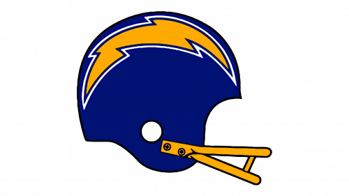
1974 – 1987
The logo used during this period retained only the key element used before, which is a lighting bolt. A helmet drawing with very few details became the base of the logo. A gold lightning bolt was at the top of the helmet and had a blue and white outline. The facemask was in contrasting color gold, while the helmet itself was drawn in deep blue. The helmet and facemask had a relatively thin black outline.
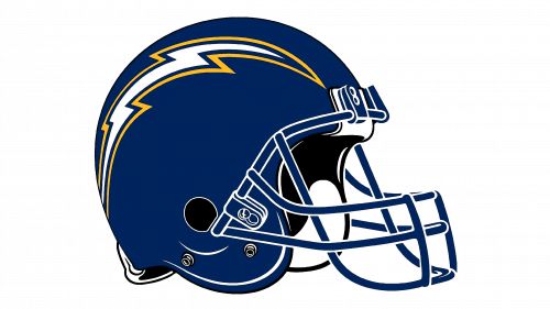
1988 – 2001
The new logo acquired more details and a facemask was modernized. The helmet and facemask were a darker shade of blue with white outlines. With black inside, the helmet looked very realistic. The helmet still had a lighting bolt, only now it was white accented by a blue and gold border.
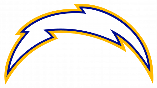
2002 – 2006
The helmet Chargers had for so many years was gone altogether and they left only the lighting bolt. The zigzag bolt had an arch shape. The color palette was kept unchanged – white with thick dark blue and gold outline.
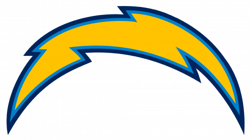
2007 – 2016
The logo changed once more, but this time it was only the colors of the lighting bolt. They kept the gold color to reflect the energy of the football players. The border was changed to blue jeans and navy blue lines.
2017
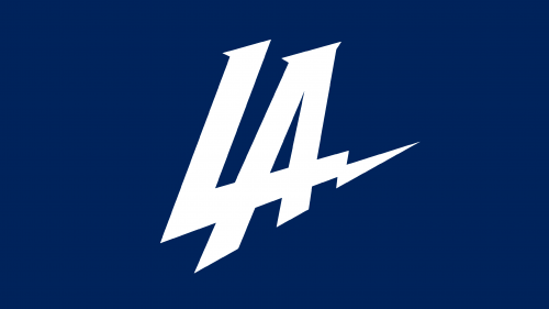
As the team started playing in LA, it wanted the logo to reflect it. It simply stated “LA”. An interesting feature about this logo was that the “L” crossed the other letter with a zigzag line and served as the horizontal line for “A”. The white letters were printed on a blue background for contrast.
2017 – 2020
The team changed its location back to LA. After introducing a different logo and seeing that it was frowned upon, it quickly brought back the previous logo. The bolt kept its arched shape and had blue jeans, navy blue, and gold color scheme.
2020 – Today
Although the new logo presented to the public still featured a golden lighting bolt, it did not resemble the previous logo much. A thicker blue jeans border replaced the previously used navy blue outline. Under the bolt, which was less arched, its original location was written in simple capital gold letters and Chargers right under in the same color as the border of the bolt.
