LSU Tigers Logo
The LSU began its history in 1853. Over its long history, the university has established itself as an institution that provides the highest quality of education. It is well known both in the United States and across the world. The LSU occupies high places in national rankings. LSU Tigers is a collegiate American football team that this university had since 1893.
Meaning and History
Louisiana State University is a US public educational institution. The university is represented by its mascot Mike the Tiger, who has been named in honor of an athletic trainer back in 1986. So, it is no wonder the LSU Tigers is the name of its football team that began to represent the university. In fact, this team is also referred to as the Fighting Tigers and has been playing since 1893. Almost 30 years later, it has become part of the Southern Conference. In 1932, the Tigers joined the SEC and later played in its Western Division.
What is LSU?
This is a football program at Louisiana State University. The team of football players standing for this great research university has a total of 47 National Championships to be proud of. Moreover, their home stadium is named to match the name of the team it was built for and is one of the largest college stadiums in the United States.
1955 – 1966
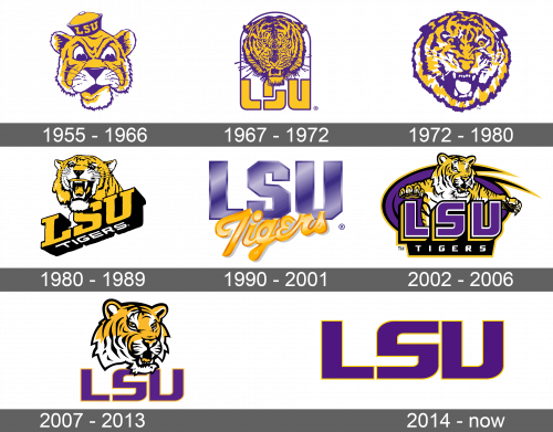
The original emblem was a cartoon drawing, which was done in the well-recognized colors of the university – purple and gold. It was the face of the university’s mascot with a cap that has “LSU” written in yellow against a purple background. The tiger had a funny frown with purple eyes, nose, and other features, including a purple outline. Yellow and white were used as filler colors.
1967 – 1972
The next logo had a similar theme and colors. This time, though, the tiger looked very realistic and had a more aggressive expression. Purple was used for all the contouring and details, including the bristles, while yellow filled in all the gaps. The bottom of its head slightly overlapped an inscription below, which stated “LSU” in uppercase, bold yellow letters. The letters were outlined by a thin purple border, which extended to form an arch around the head with the ears and bristles slightly sticking out of the frame.
1972 – 1980
The emblem was redesigned shortly after and had only the tiger’s head. It had a very round shape with purple, white, and yellow being used once again to draw the emblem. The mascot had an even more aggressive and determined look with a wide-open mouth and visible teeth. It looked more like an abstract drawing in comparison to previous realistic depiction of the animal, but still had a lot of details.
1980 – 1989
The wordmark has returned. It was a 3D acronym of the university and was drawn as if one is looking from the bottom at it. The word “Tigers” was written in capital letters across the bottom. It contrasted very well against the black bottom and outline of the “LSU”. The tiger was as if peaking from the top of the “LSU” and used the same yellow as the acronym. The animal still looked aggressive with a wide-open mouth and visible white fangs. It depicted that a team was ready to fight and win. The wild animal had black stripes and outline, while white has been added around the mouth, eyes, and inside the ears.
1990 – 2001
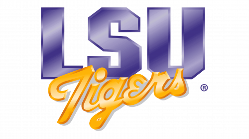
For slightly over 10 years, the team used a logo that did not have its mascot on it. It was a simple wordmark with “LSU” written in large capital letters using a different shade of purple with a visible outline. The team’s name is positioned below and slightly overlapped the other. It used a yellow color with an almost orange border and was written in cursive with the first letter being capitalized. Both words had a diagonal linear gradient, which gave it some motion, and appeared to have volume. The word “Tiger” had been written on a diagonal and followed the direction of the linear gradient.
2002 – 2006
The beloved tiger was seen on the emblem once again. The drawing style and colors were replicated from the tiger that was seen in 1980. This time, it was jumping from behind the “LSU” acronym with its front legs widely spread and open mouth and claws and instilled fear in all its opponents. “LSU” had some volume with purple being used as the main color and white, gold, and black as the outlines that gave that 3D look. Underneath, “Tigers” was written in white uppercase letters against black. A purple swirl with black and gold details was drawn behind the tiger.
2007 – 2013
A simpler version was introduced in 2007. It featured a very similar drawing of a tiger’s head that was turned a little to the right. There were no more legs as in the version seen before. The jaw overlapped an acronym “LSU”. The latter was done in purple with a thin gold outline. There were no extra elements, but it was clear who the logo belonged to.
2014 – Today
Sometime later, the team simplified the logo even more. In fact, it was just the acronym taken from the previous logo. It looked neat and professional.

