Mailchimp Logo
Mailchimp is a web-based email marketing service that helps businesses manage their email campaigns and newsletters. It offers tools for designing emails, automating email sending, and analyzing campaign performance. Mailchimp is known for its user-friendly interface, customizable email templates, and integrations with various e-commerce and CRM platforms. It supports list segmentation and personalization, enhancing targeted marketing efforts. Additionally, Mailchimp has expanded its services to include advertising and analytics, making it a comprehensive tool for digital marketing strategies.
Meaning and history
Mailchimp, a renowned email marketing solution, emerged in 2001 from the creative minds of Ben Chestnut and Dan Kurzius in Atlanta. Initially a subsidiary venture of their web design firm, Mailchimp aimed to offer streamlined email services tailored for small-scale enterprises. The founders’ vision prioritized ease of use, setting Mailchimp apart in a market filled with intricate alternatives.
Originally a premium service, Mailchimp revolutionized its market approach in 2009 by introducing a ‘Freemium’ model. This strategic shift, offering essential services at no cost, significantly widened its user reach and market presence, establishing it as a beacon for small businesses and solo entrepreneurs in email marketing.
Mailchimp’s evolution has been marked by constant innovation. It broadened its scope beyond mere email dispatch, weaving in e-commerce integrations, automation, data analytics, and customer relationship management functionalities. This expansion redefined Mailchimp from a basic email dispatch tool to a versatile marketing platform.
The brand’s unique marketing approach, characterized by its quirky, approachable personality, and epitomized by its iconic mascot, Freddie the chimp, also played a pivotal role in its growth narrative.
In a landmark move in 2021, Intuit, a leader in financial software, acquired Mailchimp for approximately $12 billion, a testament to Mailchimp’s monumental impact in the digital marketing arena.
Mailchimp today stands as a key influencer in digital marketing, celebrated for its pioneering tools, its dedication to fostering small business growth, and its user-focused philosophy that has demystified complex marketing tactics for a diverse user base.
What is Mailchimp?
Mailchimp is a dynamic digital marketing platform renowned for its intuitive email marketing services. It equips businesses with tools for crafting, managing, and analyzing email campaigns, while also offering advanced features like audience segmentation and automation. The platform has evolved to encompass a broader range of marketing functionalities, including advertising and analytics, making it a versatile asset for digital marketers.
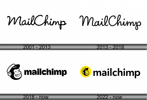
2001 – 2013
The logo features a stylized rendition of the Mailchimp brand name, showcasing a fluid, cursive script that conveys a sense of accessibility and friendliness. The first letter is capitalized, drawing attention with its larger size and prominent placement. Each character is crafted with a flowing continuity that suggests ease and efficiency, key attributes of the Mailchimp service ethos. The overall design balances a professional demeanor with a playful edge, encapsulated in the whimsical twist of the ‘M’ and the ‘p’ tail, hinting at the brand’s approachable and user-centric philosophy. The logo’s monochromatic scheme adds a layer of simplicity, ensuring versatility and clarity across various mediums.
2013 – 2018
The logo depicts the name “MailChimp” in a fluid, continuous stroke, suggesting a seamless user experience and the cohesive services the platform offers. Unlike its predecessor, this iteration favors a more refined and sleek design, with uniformity in the thickness of the lines, giving it a modern and professional appearance. The characters are connected in a manner that implies connectivity and integration, core aspects of MailChimp’s service. The letter “M” stands tall at the beginning, asserting the brand’s prominence in the market, while the rounded forms of the “a”, “i”, and “l” provide a visual balance, softening the overall look. The tail of the “p” loops back, subtly nodding to the idea of feedback loops and recurring communication. This design maintains a playful charm, seen in the whimsical curl of the “h”, yet it conveys a sharper sophistication, mirroring the evolution of the company’s capabilities and its growth into a comprehensive marketing tool.
2018 – Today
The logo showcases the word ‘mailchimp’ in a lowercase, bold sans-serif typeface, conveying a modern, approachable vibe. Adjacent to the text is the brand’s mascot, a cheerful chimp’s face adorned with a cap, personifying the service’s friendly and accessible nature. This mascot adds a playful character to the logo, reflecting Mailchimp’s commitment to making email marketing fun and easy for its users.
Compared to previous iterations, this design introduces the mascot, infusing personality directly into the visual identity. The typeface change from a script-like to a sturdy, clean font represents a shift towards straightforwardness and efficiency. The black and white palette remains, ensuring the logo’s versatility across various applications while maintaining brand recognition. This evolution speaks to Mailchimp’s growth and its desire to maintain a balance between professional services and a whimsical brand persona.
2022 – Today
This rendition of the Mailchimp logo features the mascot, a smiling chimp face within a bright yellow circle, adding vibrancy and visual pop. The word ‘mailchimp’ is rendered in a bold, lowercase, sans-serif font beside the emblem, maintaining a clean and modern aesthetic. This design represents a significant shift from earlier versions by incorporating color, which injects energy and increases the logo’s visibility.
Comparatively, this logo retains the playful yet professional juxtaposition, with the chimp’s cheerful expression symbolizing user-friendly service, and the stark font communicating simplicity and reliability. The introduction of the yellow circle is a strategic move, encapsulating the mascot in a shape that universally signifies caution and attention, thereby enhancing the brand’s memorability. The evolution of the logo reflects Mailchimp’s ongoing commitment to combining a lighthearted brand voice with serious business tools.


