Martini Logo
Martini is an Italian brand of vermouth – a type of reinforced spicy wine primarily produced in this country. It’s the most popular and celebrated brand of this type of drink, and it even gave its name to the famous cocktail that includes vermouth (preferably Martini) and gin.
Meaning and History
![]()
The brand introduced in 1863 when a man called Alessandro Martini bought a share in the local Turin distillery. Under his leadership, the company started making vermouths. Soon, most of the previous owners left, leaving only Martini and Rossi (the other new arrival) in charge. The company still holds this name, ‘Martini & Rossi’.
1904 – 1925
![]()
The very first logo depicted a beige rectangle plaque with many darker rays radiating from its bottom. Onto its center, Martini added the company name (‘Martini & Rossi’) in red. The letters were strangely shaped, but were recognizably some sort of serif typeface. They also placed the word ‘Torino’ (‘Turin’) in the same style in bottom right.
1925 – 1934
![]()
The 1925 logo was much like the contemporary design – a red circle with a wide black rectangle piercing its middle. On this black figure, they added the word ‘Martini’ – now in the ordinary, blocky style and colored in white.
1934 – 1944
![]()
The 1934 design was rather similar. They did add a continuous black outline some distance away from both the circle and the rectangle, added ‘Rossi’ to the black part and ‘Vermouth’ directly below the emblem proper. While the text inside changed to a thin sophisticated typeface, the bottom text still used the also blocky font.
1944 – 1949
![]()
By 1944, they decided to reuse the old 1925 logo. Now, it was still used for bottle labeling even through the 1934-1944 period (that logo was just for corporate needs), but this time they needed something new both for labeling and the company. They took the same thing and colored the circle green, after their iconic bottle color.
1949 – 1995
![]()
In 1949, they reused the old 1925 emblem again, except this time they widened the black part and accordingly enlarged the letters inside.
1995 – 2003
![]()
The only thing that was added here is a thick gold-colored frame that extended throughout the edges of the entire logo.
2003 – 2015
![]()
In 2003, the coloring of this new frame instead shifted to brown/bronze.
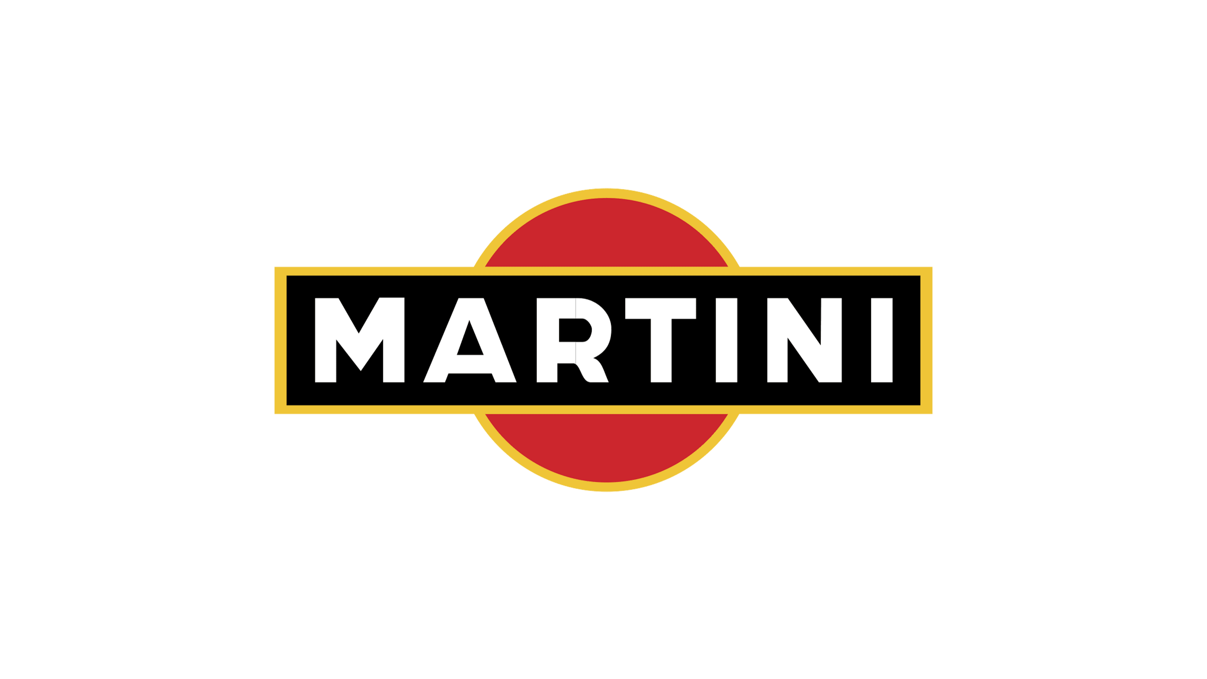
2015 – today
The color change happened again in 2015, but this time to yellow. Additionally, the sections of the outline that lay along the rectangle became thinner.
Emblem and Symbol
The label used for the Martini bottles uses the logo as seen above and puts them onto a grayish-white circle. This circle includes, among other things, the location of the distillery (‘Torino, Italia’), an angelic figure above, the year of founding, as well as the alcohol content numbers and volume numbers.


