Bud Light Logo
Bud Light is the popular subtype of Budweiser – the flagship drink of the Anheuser Company. Basically, it’s the same beer, except with 16% less alcohol and a much smaller caloric value. It is a popular drink for those who don’t want to get wasted, especially amongst Americans, but Budweiser is obviously much more beloved.
Meaning and History
Bud Light was introduced in 1982 and was originally called ‘Budweiser Light’. Obviously, that’s where the name came from, but the decision was made simply because ‘Budweiser Light’ sounded too long and complex, which doomed it to obscurity right away. The final name, adopted 2 years later, sounds much more pleasant.
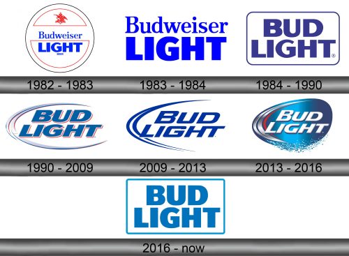
1982 – 1983
The original logo featured the early full name – Budweiser Light – in the middle white circle with two red-outlined semicircles inside. The ‘Budweiser’ part occupied the middle ground between, and it pretty much looked like the Budweiser inscription at the time, except blue instead of red.
The word ‘Light’ (in the lower semicircle) didn’t change much since the 1982. It was also blue; the letters were all capital and had a sturdy, inflated look. The other semicircle featured the Anheuser logo, except colored completely in red.
1983 – 1984
In 1983, they decided that a lot in this logo was excessive, and they took used the written parts and put them together one over the other.
1984 – 1990
In 1984, the ‘Budweiser’ was supplanted with just ‘Bud’. Following this change, they decided to remodel the first word with the style they used for the second one. So, both parts of ‘Bud Light’ were now the same big, inflated script. These were then surrounded by a rounded rectangular outline and repainted a less saturated blue.
1990 – 2009
This time, the letters were skewed to the right, given a brighter (but still a pale) variation of blue, as well as some red shading behind them (after original Budweiser). The rectangle frame was replaced with to curves that made up a sort of crescent moon shape around most of the logo, except the right side.
2009 – 2013
The 2009 logo was the same concept, but with a few changes. Firstly, everything turned a bright blue. Secondly, the letters became rather thinner and more orderly. Lastly, they weren’t just capital letters any longer. Most of them are the same size, but if you look closely, you’ll see that all except the first characters are now lowercase.
2013 – 2016
Again, they decided to reuse the previous design with some additions. Most of the previous elements became white or silver, the crescent was given a slight red tint on its right, and they also added a background – a giant gradient circle of the color blue.
2016 – today
The 2016 logo also reused the previous design, although this time they took inspiration from the 1984 one. Everything was the same, except the colors (now turquoise) and the shape around (now just a rectangle, no rounded angles).
Emblem and Symbol
All the background and outlining frames were actually just for corporal and marketing uses. The cans pretty much just used the written parts throughout the entire history. Moreover, because the cans were completely blue, they had to repaint the letters white so that they could stand out.
