MGM Logo
Metro-Goldwyn-Mayer is a major film company in the US. They are known as a firm responsible for several famous movie franchises, like the Bond series of films. But most of their iconic products came out in the 20th century. Nowadays, it’s mostly a distribution company with some big movies coming out every few years.
Meaning and History
The company started in 1924 after two movie production – Metro Pictures and Goldwyn Pictures – were merged in one. These companies were then purchased by Mayer Productions, another big producer at the time. The resulting company came to be known as Metro-Goldwyn-Mayer.
What is MGM?
MGM (short for Metro-Goldwyn-Mayer) is a major movie company from USA. They still make high-budget movies, although their peak was in the later 20th century. The company still holds rights to many iconic movie franchises, like G.I. Joe, James Bond and more.
1924 – 1964
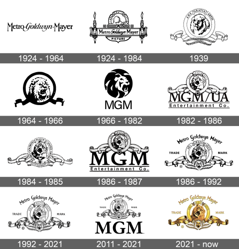
The very first logo was just the name of the new company, written in black, slim letters. The two words on the side used a pretty regular sans-serif style, but the central piece was given a calligraphic sort of font with some tilt.
1924 – 1984
There was an additional logo they adopted in the same year, which used the wordmark from the first design, but placed it into a long rectangular strip. It was actually styled as a scroll, with something resembling torches on the sides. The word ‘pictures’ were written in a semicircle below the main name. Above it, there was a podium, crowned by an arch. Inside of it, they placed a lion, drawn in a pretty simplistic manner.
1939
The 1939 design had a ring frame, made from what seemed like a movie film. There were two more strips of it coming out of the bottom on each side, as well as laurel wreaths (straightened out) in its base. Inside the ring, there was a more detailed head of a lion. Along the top, they wrote ‘art for art’s sake’ in Latin.
1964 – 1966
This was a simpler execution of the same idea. They had a lion’s head in the middle, depicted mid-roar with more detail about it. Around it, there was again a ring of film, except black this time. No Latin motto was seen.
1966 – 1982
The 1966 design also uses a roaring lion, but depicted with white lines inside a black circle. Below it, there was just a ‘MGM’ acronym in this black letters.
1982 – 1986
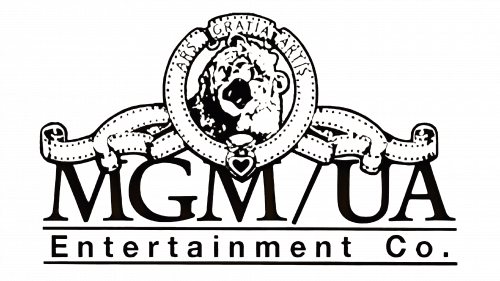
They continued with the movie film-lion composition. In this logo, there was more sprawling film along the bottom of the logo, the Latin motto came back and there was a slightly different variation of the lion. Below, they wrote the then-name of the company, ‘MGM/UA Entertainment Co.’ in two lines of different fonts.
1984 – 1985
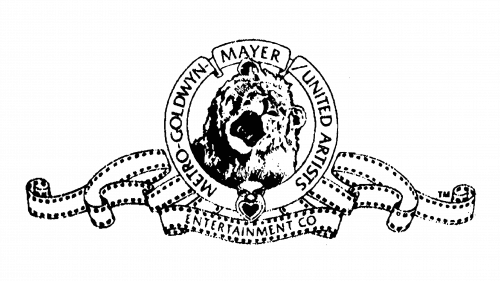
It’s the same design, but the name is now put in full (except for ‘Entertainment Co’) onto the frame. They added another ribbon of film beneath the circle, and that’s where the last piece of the name was placed.
1986 – 1987
The 1982 logo largely made a comeback in 1986, except the dropped ‘UA’ from the name.
1986 – 1992
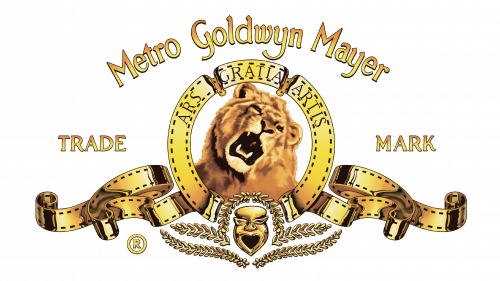
The 1986 design, for its part, largely returned to the 1984 logo version. That being said, they added some wreaths to below the emblem, put the motto back and extracted the name ‘Metro Goldwyn Mayer’ to above the logo. Their design was reminiscent of the very first wordmark, except without dashes and slightly curved.
1992 – 2021
It’s the same design, but slightly cleaned and improved in quality.
2011 – 2021
The 2011 variation added the letters ‘MGM’ beneath the main logo. They were bold, big letters, written in a classy serif font.
2021 – today
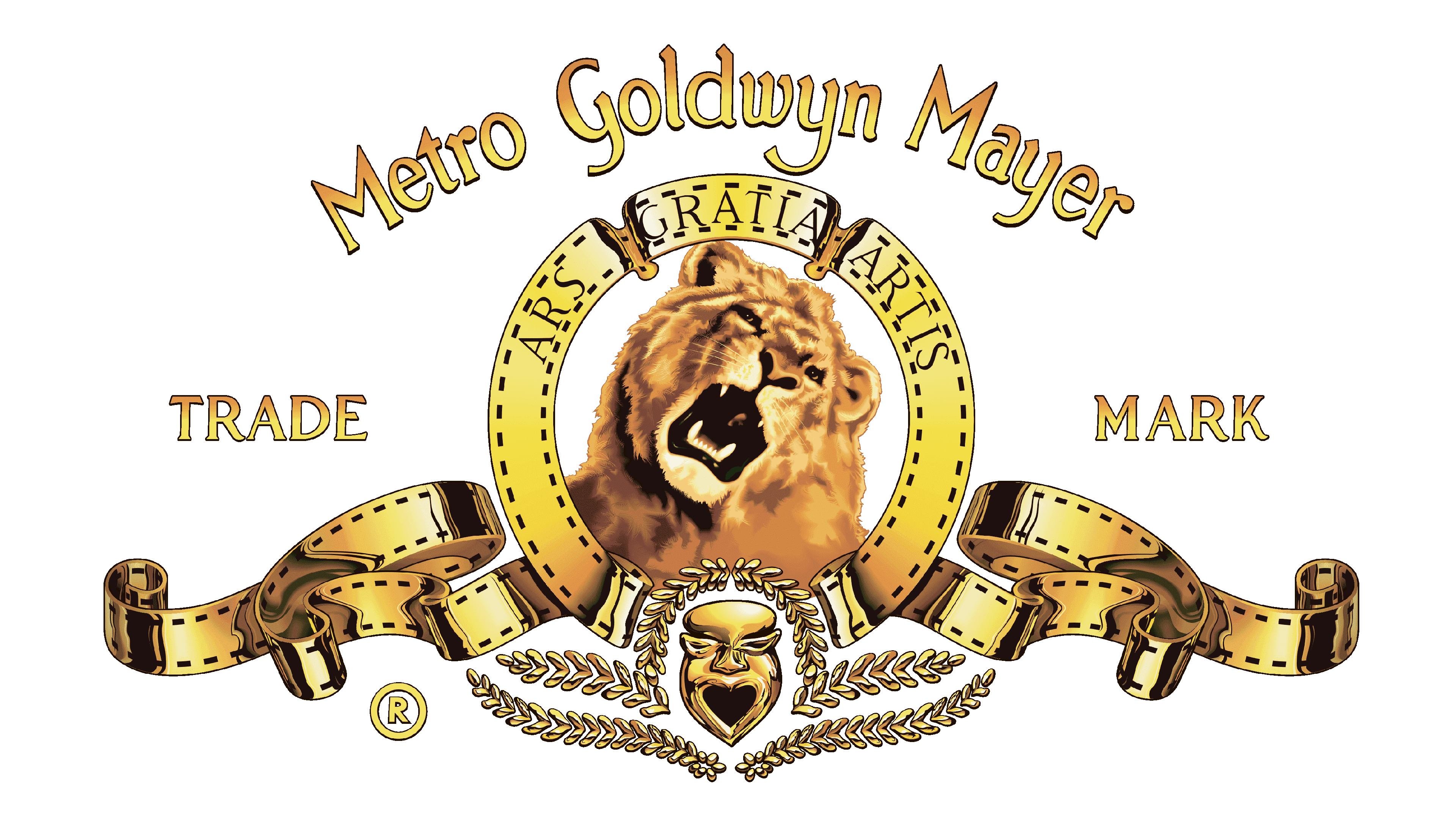
The 2021 logo is a colored version of the 1992 emblem. They colored most things gold and gave the lion its natural colors. They put a lot of effort into this color scheme, meaning there are a lot of shading, lights and other effects to make it realistic.
