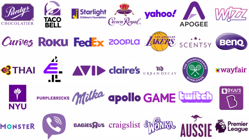
Most Famous Logos in Purple
The incorporation of purple often denotes sophistication and a high-end aesthetic. This vibrant colour is emblematic of prestige and aspiration, qualities that are desirable in luxury branding. Employing it within a logo suggests that the company is progressive and distinguished, promising an exceptional experience or product.
Purple is known to inspire creativity and spark the imagination. It can invoke a sense of enchantment and spirituality, attributes that allow a company’s branding to resonate in an overcrowded marketplace. When used in logos by beauty, fashion, or tech firms, purple can convey an impression of state-of-the-art or opulent charm. The spectrum of purple, from gentle lilac to intense plum, offers a range of tones to suit the desired brand persona and attract.
Nonetheless, opting for purple in logo design comes with certain considerations. It’s a less common natural colour, potentially giving a synthetic look if not applied with finesse. Brands should analyse their target demographic closely; while some may interpret purple as elegant and deluxe, others might perceive it as excessively flamboyant. It is essential to select an appropriate tint of purple and to balance it with fitting colours to refine the logo’s visual impact.
Adaptability is crucial in the dynamic landscape of brand identity, and purple offers this feature. It goes well in gradient combinations, providing a modern twist that can give a logo a three-dimensional feel. It’s particularly effective for digital platforms where visual impact is paramount. Strategically, a purple hue can make a brand luxurious and innovative, appealing to a clientele that values quality and uniqueness.
Finally, the perception of purple in branding can differ widely across cultures. While some people might link purple with bereavement, others may associate it with prosperity and social rank. Thus, international brands should navigate their use with sensitivity to match the cultural values and beliefs of varied audiences. When integrated thoughtfully, purple can convey an elite and unique brand identity, reinforcing its role as an influential element in logo design.
Apogee Electronics
Apogee Electronics has been a trailblazer in digital audio recording quality since the 1980s, making significant contributions with its anti-aliasing filters. Today, its cutting-edge audio interfaces, microphones, and converters are essential in professional studios globally, showcasing its dedication to sound excellence and innovation. The Apogee logo, with its peak-like ‘A’ and modern typeface, integrates a lightning bolt, symbolizing speed and dynamism. Presented in deep purple, the logo reflects the brand’s sophisticated approach to audio technology solutions.
Apollo
Apollo, developed by Universal Audio, stands at the forefront of the audio recording equipment field with its audio interfaces. Known for real-time analog processing, superior audio conversion, and compatibility with UAD plug-ins, Apollo products are highly sought after for studio-grade recordings. The logo’s bold purple letters and playful ‘o’s hint at binocular vision or an audio feedback loop, with a shared stem in ‘p’ and ‘o’ for a modern, cohesive design.
Aussie
Aussie, the Australian hair care icon, has won hearts with its unique purple packaging and memorable slogans since 1979. Its range, rich in Australian ingredients like aloe and jojoba oil, includes products that transform hair into silky smoothness, notably the 3 Minute Miracle line. The logo features a kangaroo mid-jump, capturing the essence of vitality and Australian roots, with ‘Aussie’ in robust purple letters that project strength and approachability.
Avid Technology
Avid Technology, Inc., a pioneer in digital media production tools, has been reshaping the entertainment and media sectors since 1987. Known for Avid Media Composer and Pro Tools, Avid has set industry benchmarks in film, TV, and music production. Its logo, crafted from geometric shapes to form ‘AVID’, conveys precision and motion, with triangles suggesting playfulness. The purple hue adds a layer of creativity and significance, highlighting Avid’s prominent role in the industry.
Babies R Us
A division dedicated to baby and young child products was established within the Toys “R” Us retail chain. This brand offers everything from furniture and bedding to toys and clothing. International markets still enjoy the services of Babies R Us, despite Toys “R” Us stores closing in the United States in 2018. Parents and their children find essential products through this brand. A soft purple hue marks its logo, symbolizing warmth and safety. The playful twist of the ‘R’ resembles a child’s drawing, with a star instead of a dot bringing dreams to mind. Its rounded lettering conveys comfort, reflecting the nurturing image of the brand.
BenQ
A significant presence in the electronics market comes from BenQ, a Taiwanese multinational company. Offering monitors, projectors, and smart lighting solutions, BenQ is known for its innovation. The brand emphasizes quality and enjoyment in life, particularly through products like leading gaming monitors and high-performance projectors. Set against a vibrant purple background, its logo uses bold, white font, signaling creativity and innovation. An oval shape encases the logo, suggesting global presence and completeness, while the text’s clean lines highlight the brand’s technological sophistication.
Byju’s
Originating from India, Byju’s has become a notable force in the e-learning field since its founding in 2011. This platform transforms education with interactive materials for students from primary to higher education levels. Byju’s has attracted a vast global user base, revolutionizing digital education consumption. Its logo, set in a rounded rectangle, implies mobile app accessibility, with the ‘B’ styled to symbolize both heart and mind. The use of purple denotes creativity and imagination, appropriate for an educational tool. The design speaks to a friendly, engaging, and contemporary educational approach.
Claire’s
Known worldwide, Claire’s stands out as a retailer of fashionable jewelry and accessories for young girls and teenagers. Since 1961, Claire’s has been a leader in ear piercing, with over 100 million ears pierced globally. It offers a wide selection of trendy, affordable accessories, maintaining its status as a top choice for fashion-conscious youth. The logo’s rich purple lowercase lettering creates an atmosphere of fun and accessibility. Its simplicity and boldness are iconic, representing Claire’s dedication to fashion and individual expression.
Craigslist
The launch in 1995 by Craig Newmark transformed local classifieds and forums. Beginning as an electronic newsletter for the San Francisco community, it grew into a comprehensive web service. It features classified ads, job postings, and forums, serving numerous cities globally. Its minimalist design and local focus make it a primary resource for a variety of needs. The logo, with its lower-case, serif font, portrays an accessible and straightforward identity, mirroring the site’s easy-to-use interface. The choice of purple hints at the creativity and wisdom within the Craigslist community.
Crown Royal
This leading Canadian whisky brand boasts a rich flavor and a history that dates back to 1939, commemorating King George VI and Queen Elizabeth’s Canadian visit. Its signature packaging-a velvet-like bag and a royal bottle-encapsulates its luxury. The brand’s range includes the classic blend, flavored variants, and the exquisite Reserve and XR. Its logo features a detailed crown and cushion in regal purple and red, representing noble quality and heritage. The scripted font, also in purple, adds elegance and tradition, reflecting the brand’s premium selection and storied past.
Curves
Established in 1992, this fitness franchise caters exclusively to women, combining strength training, cardio, and stretching in a 30-minute workout. It promotes women’s health and fitness globally, offering a community-centric, supportive gym experience. The logo’s flowing, cursive typeface signifies fluidity and motion, aligning with the brand’s dedication to women’s wellness. Rich purple symbolizes royalty and quality, underscoring Curves’ commitment to empowering women to achieve their best health.
E4 Channel
Launched in 2001 by the Channel Four Television Corporation, E4 targets the 16-34 demographic, offering a blend of comedy, drama, reality, and American imports. It has been the launching pad for successful shows like “Skins” and “Made in Chelsea”, playing a crucial role in showcasing new talent in the UK. The logo’s bold ‘E’ and pixelated ‘4’ reflect the channel’s innovative and edgy content. A color scheme of purple and black enhances its modern, creative appeal, while the fragmented design elements emphasize the dynamic and varied nature of its programming.
FedEx
FedEx, established in 1971 by Frederick W. Smith, stands as a titan in the delivery service industry from its Memphis, Tennessee headquarters. This American multinational company, originally named Federal Express Corporation until 2000, has dramatically transformed delivery services with its overnight shipping innovation and package tracking system. As a leader in global logistics and supply chain management, FedEx offers a vast array of services, including express shipping and freight delivery. Its logo, renowned for the cleverly concealed arrow between the ‘E’ and ‘x’, epitomizes speed, precision, and forward momentum. The logo’s purple and orange hues beautifully merge the notions of creative innovation and energetic reliability, encapsulating the company’s essence.
Game
Game has positioned itself as a premier UK retailer for video games, consoles, and gaming accessories since its inception in 1992. It serves as a pivotal gathering point for gamers, providing not just products but also exclusive in-store events, pre-order benefits, and special editions. Amid the digital era’s retail challenges, Game has persevered by embracing online sales and community-focused endeavors. Its logo features bold, chunky letters in a vivid purple, embodying the thrill and entertainment focus of gaming. This capital-lettered design is both straightforward and engaging, beckoning customers to dive into gaming with enthusiasm and a touch of playfulness.
Los Angeles Lakers
The Los Angeles Lakers, founded in 1947, stand as a pillar of success and fame within the National Basketball Association (NBA), celebrating 17 NBA championships and a lineage of basketball legends like Magic Johnson and Kobe Bryant. This Los Angeles-based team is celebrated for its star-studded following, iconic purple and gold colors, and significant contributions to basketball’s evolution. The logo, set against a gold basketball background, features the name ‘Lakers’ in bold purple font, exuding confidence and motion. The stylish extension of the letters mirrors the team’s flair and performance excellence, highlighting its celebrated status in basketball history.
Milka
Milka, born in Switzerland in 1901 and now part of Mondelez International, represents a hallmark in chocolate confectionery. It is distinguished by its lilac packaging and the use of alpine milk, offering a smooth, rich taste across its product range, which includes chocolate bars, biscuits, and seasonal offerings. The brand’s logo, with its soft, flowing letters, echoes the chocolate’s creamy texture. The deep lilac shade stands out, reflecting the brand’s unique packaging and signature alpine milk ingredient. The typeface’s fluidity and color uniformity underscore Milka’s commitment to delivering consistently high-quality and tender chocolate experiences.
Monster
Monster has been at the forefront of the energy drink sector globally, energizing life’s adventures with a diverse product line since 2002. Its striking black and green claw mark logo is instantly recognizable, embodying the brand’s commitment to invigorate and sustain energy and stamina through its special mix of caffeine, sugar, and B vitamins. Monster’s involvement in various extreme sports events aligns it closely with action-packed lifestyles and extreme sports cultures. The logo’s typography is adventurous, with letters of varying sizes that exude a youthful and dynamic energy. The playful twist within the ‘O’ adds a sense of motion, mirroring the brand’s lively essence. Purple in the logo denotes creativity and innovation, affirming Monster’s unique place in the industry.
NYU
NYU (New York University), established in 1831, ranks among the largest private higher education institutions in the U.S., distinguished by its research focus and global campuses in New York, Abu Dhabi, and Shanghai. Its acclaimed programs in fields such as law, business, and the arts have contributed significantly to both the cultural and intellectual spheres. The NYU logo features a contemporary interpretation of a traditional torch, embodying the quest for enlightenment and knowledge. Set against a purple square, the design communicates depth and academic integrity, with the white torch shining as a symbol of discovery and learning. The logo’s simple block lettering underscores NYU’s commitment to straightforward, impactful education.
Premier League
The Premier League stands as the apex of English football, captivating a global audience since its inception in 1992. With intense competition and showcasing world-class talent, it involves 20 clubs vying for the English championship title. It’s the most watched sports league globally, reaching millions of homes and a vast potential audience. The league’s logo features a modern lion wearing a crown, signifying its dominance in English football. Abstract shapes compose the lion, lending a contemporary feel, while the use of purple imbues the emblem with a sense of elegance and prestige appropriate for such a renowned competition.
Purdys Chocolatier
Purdys Chocolatier has held a special place in the hearts of Canadians, crafting premium chocolates since 1907. Originating in Vancouver by Richard Carmon Purdy, it has risen to be a revered chocolate maker in Canada, dedicated to quality ingredients and ethical cocoa sourcing. Purdys offers an array of chocolates from traditional varieties to seasonal specialties, all made with exceptional skill and creativity. The logo, encased in an octagonal frame, features an elegant, flowing script that captures the brand’s longstanding tradition of chocolate mastery. The use of royal purple communicates a sense of luxury and sophistication, reflective of the high-quality confections Purdys is known for.
Purple Bricks
Purple Bricks changed the UK real estate scene with its online agency model upon its 2014 debut. By offering a fixed-fee rather than a sale percentage, it has grown internationally, offering sellers a transparent, cost-effective method, backed by professional aid and digital tools. Its logo, featuring bold, sans-serif letters, embodies simplicity and the modern era. The consistent use of purple not only matches the brand name but also signifies creativity and distinction within the real estate sector. Its straightforward logo mirrors the company’s commitment to clear, direct communication.
Roku
Roku, a streaming pioneer, introduced its first device in partnership with Netflix in 2008, revolutionizing TV streaming. Its products, including streaming devices and smart TVs, offer access to an extensive array of channels and apps, becoming a favorite for those desiring a comprehensive, easy-to-use entertainment system. The Roku logo’s sharp, angular typography reflects a modern, technological edge. A singular bold color represents the brand’s confidence and simplicity, with a uniquely styled ‘R’ suggesting connectivity and innovation, essential in the digital media landscape.
Scentsy
Scentsy started in 2004, offering wickless candles and decorative warmers as a safe candle alternative. From its Idaho base, it expanded its fragrance product range, gaining popularity through its direct selling approach, fostering a robust community of consultants. The Scentsy logo uses a clean, modern sans-serif typeface, with the ‘S’ and ‘y’ enclosing the name in a welcoming manner. Three ascending stars above signify excellence and achievement tiers within its sales structure. The logo’s purple hue reflects originality, mirroring the brand’s diverse scent offerings.
Starlight Children’s Foundation
Since 1982, Starlight Children’s Foundation has been devoted to brightening seriously ill children’s lives, offering hospital wear, gaming, virtual reality, and creating comfortable hospital spaces. Its efforts across the U.S. have brought joy and comfort to many, making childhood moments possible under challenging circumstances. The logo’s imagery, featuring a child reaching for a star against a purple background, embodies the foundation’s mission. This backdrop conveys compassion and support, with the star symbolizing hope and dream fulfillment. The child’s silhouette in contrasting yellow highlights the positive, transformative impact of the foundation’s work.
Taco Bell
In 1962, Glen Bell founded this American fast-food sensation in Downey, California. This chain has become a global sensation, beloved for its unique Mexican-inspired dishes like tacos, burritos, and the Crunchwrap Supreme. Annually, Taco Bell delights over 2 billion customers across its 7,000+ locations worldwide. It keeps introducing new, innovative menu items to satisfy diverse tastes and dietary needs. The logo features a lively bell design, wrapped in purple, capturing the brand’s vibrant, Mexican-inspired culinary spirit. Its stylized bell symbol and the use of purple mark the brand’s innovative approach and uniqueness in the fast-food industry.
Thai Airways
This airline, founded in 1960, serves as Thailand’s national flag carrier and is a proud Star Alliance founding member. Known for its exceptional service embodying Thai hospitality, it operates flights to over 60 destinations globally. Thai Airways, headquartered at Bangkok’s Suvarnabhumi Airport, has won numerous accolades for its superior service, onboard meals, and entertainment options, making it a top choice for those wishing to experience Thai elegance in the air. Its logo, blending purple and gold, mirrors the opulence of Thai culture and the elegance of Thai art. The logo’s sans-serif “THAI” balances intricate design elements with modern, professional simplicity.
Twitch
When it launched in 2011, Twitch transformed live streaming, focusing on video game streaming, including eSports, individual streams, and gaming talk shows. Acquired by Amazon in 2014, Twitch now also encompasses music, lifestyle, and art streams, attracting a vast community of viewers and streamers interacting in real-time. The Twitch logo stands out with its angular typography, a homage to digital culture and the gaming community. Its striking purple hue highlights the platform’s creativity and originality, key aspects of its brand and the diverse content it hosts.
Urban Decay
Since its debut in 1996 with a line of bold lipsticks and nail polishes, Urban Decay has challenged beauty industry norms with its edgy, high-quality makeup. The 2010 launch of its Naked palettes revolutionized neutral eyeshadows, becoming a global beauty staple. The logo radiates edginess and sophistication with Gothic-inspired lettering. The intertwined ‘UD’ monogram appears regal and bold, while the brand’s full name is displayed below in a simple, clean sans-serif font. This contrast, set against a deep purple background, evokes a sense of luxury and mystery, encapsulating the brand’s innovative spirit.
Viber
Viber, a cross-platform VoIP and IM application owned by Rakuten and launched in 2010, enables voice and video calls, texting, and media sharing with end-to-end encryption. Its global user base and broad feature set have made it a significant communication tool worldwide. The Viber logo focuses on simplicity and the essence of connectivity, featuring a speech bubble and a phone handset with emanating waves, all in a vibrant purple. This design reflects the app’s dynamic role in facilitating social interactions.
Wayfair
Wayfair, founded in 2002, has emerged as a major online retailer specializing in home goods. It offers an extensive array of products ranging from furniture to home décor, driven by a commitment to convenience and customer satisfaction. The Wayfair logo employs a playful, modern design with its name in bold, lowercase letters and a geometric pattern suggestive of diversity and creativity, incorporating green, purple, and magenta to symbolize the brand’s vibrant and diverse product selection.
Wimbledon Championships
The Wimbledon Championships, dating back to 1877, stand as the epitome of tennis tradition and prestige. Hosted by the All England Lawn Tennis and Croquet Club, Wimbledon is celebrated for its grass courts, white attire requirement, and the iconic strawberries and cream. The tournament’s logo, which features crossed tennis rackets within a green circle, surrounded by a purple outer ring with the event’s name, marries the sport’s heritage with the dynamism inherent to tennis.
Wizzair
Wizzair, established in 2003, has risen to prominence as a leading budget airline in Europe, known for its affordable flights and commitment to efficiency and sustainability. The logo displays the name “Wizz” in a stylized, bold font with sharp angles and geometric precision, conveying motion and efficiency. A distinctive feature is the exclamation mark, integrated as the letter “I”, adding an element of surprise and excitement. It’s complemented by a gradation of purple hues, from deep to vibrant, infusing the design with energy and a modern vibe. The logo’s typography and colors encapsulate the essence of a contemporary, dynamic brand in the travel industry.
Wonka
In the world of imaginative sweets, Wonka stands out, drawing inspiration from Roald Dahl’s “Charlie and the Chocolate Factory”. Launched by the Willy Wonka Candy Company, a Nestlé division, in 1971, it aligned with the film based on Dahl’s book. Wonka captivates with its vibrant and whimsical candy creations, such as Nerds, Laffy Taffy, and Everlasting Gobstopper, channeling the fictional world’s enchantment. Its logo, adorned with playful, curling serifs, mirrors the whimsy of candy shapes. The bright purple palette enhances its creative, fantastical candy confectionery association, while the design invites wonder and delight.
Yahoo
Born in 1994 by Jerry Yang and David Filo’s vision, Yahoo pioneered the early internet landscape. It transitioned from a website directory to a comprehensive web portal, offering email, news, and financial services, maintaining its relevance amid evolving competition. The logo, marked by a bold, sans-serif font with rounded features, ensures visibility. Its purple color underscores originality and creativity, with the exclamation point injecting excitement and innovation into its identity, reflecting Yahoo’s enduring, playful spirit.
Zoopla
As a premier UK real estate portal since 2008, Zoopla offers extensive market data, property listings, and valuation tools, serving as an essential resource for property market insights. It caters to buyers, sellers, and professionals with its depth of property-related data. The logo’s simple, rounded sans-serif font highlights accessibility and ease, while the vibrant purple signifies wisdom and quality, solidifying Zoopla’s identity in the real estate domain.
