Viber Logo
Viber, a prominent instant messaging and voice-over-IP (VoIP) service provider, operates globally with a strong presence in Europe, North Africa, and the Middle East. Owned by Japanese multinational company Rakuten since 2014, Viber offers a range of features including text, voice, and video messaging, group chat, and additional services like Viber Out, allowing users to make low-cost calls to non-Viber numbers worldwide. Its user-friendly interface and focus on privacy, with end-to-end encryption, contribute to its widespread popularity. Viber continues to innovate, constantly updating its services to meet evolving digital communication needs.
Meaning and history
Viber, established in 2010 by a team of Israeli entrepreneurs – Talmon Marco, Igor Megzinik, Sani Maroli, and Ofer Smocha, embarked on a journey to redefine digital communication. Originally conceptualized as a competitor to Skype, Viber initially launched as an exclusive iPhone app offering VoIP services. Its intuitive design and superior call quality quickly garnered a substantial user base.
By the end of 2012, Viber broadened its scope with ‘Viber Out’, a pivotal feature enabling calls to external mobile and landline numbers, thus expanding beyond app-to-app interactions. This period also saw the integration of text messaging, enriched with emoticons and stickers, adding a layer of expressiveness to conversations.
In 2013, Viber’s user community swelled to 200 million, a testament to its rising prominence. This surge in popularity drew the attention of Rakuten, a Japanese conglomerate. In a strategic move, Rakuten acquired Viber in 2014 for a whopping $900 million, intending to weave it into their expansive portfolio of e-commerce and digital content.
Under Rakuten’s wing, Viber didn’t just grow; it revolutionized its offerings. 2016 marked the introduction of end-to-end encryption, bolstering its commitment to user privacy. Viber further diversified its functionalities with public chats, enabling users to engage with public figures and brands, and later with Viber Communities, supporting massive group chats without member limits.
Viber’s success is partly attributed to its adaptability to local market needs, gaining a foothold especially in Eastern Europe, Russia, and some regions in Asia and Africa. This success is rooted in its steadfast dedication to data protection and user privacy.
Viber stands tall in the arena of digital communication platforms. Continuously innovating, it rivals major players like WhatsApp and Telegram, constantly enhancing its services to meet the dynamic needs of its global user base while upholding its core values of privacy and security.
What is Viber?
Viber is a versatile communication app, renowned for its seamless integration of voice, video, and text messaging services. Launched in 2010, it stands out for its emphasis on user privacy with end-to-end encryption, and its ability to connect users globally through both app-to-app communication and low-cost calls to external numbers via Viber Out. This platform continues to innovate, offering a dynamic and secure way to stay connected in the digital age.
2010 – 2012
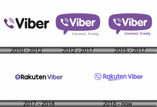
The logo displayed is a clean and modern representation of the Viber brand, featuring a minimalist design. Dominating the image is a lilac telephone handset, angled upwards to the right, signifying progression and communication. Above the handset, three curved lines emanate, symbolizing the transmission of sound and connectivity, a nod to the app’s core functionality in voice-over-IP services. To the right, the brand’s name “Viber” is written in a bold and rounded sans-serif typeface. The overall simplicity of the design ensures easy recognition and suggests a user-friendly platform, while the choice of purple implies creativity and originality. The logo’s straightforward yet dynamic aesthetic aligns with the app’s mission to provide straightforward, secure, and engaging communication solutions.
2012 – 2017
This logo portrays Viber’s identity through a speech bubble, symbolizing communication, with a rich purple hue signifying creativity and originality. Within the bubble, the handset icon is paired with radiating waves, illustrating the app’s calling feature. The brand name “Viber” is nestled inside the bubble, its typeface white and rounded, which stands for clarity and friendliness. Below the bubble, the slogan “Connect. Freely.” in a lighter font, emphasizes the ease and liberty with which the app allows users to interact. Compared to the previous version, this design encapsulates Viber’s messaging functionality more prominently and adds a tagline, enhancing the brand’s message of unhindered global connection. The transformation from a simple name and handset design to an encompassing speech bubble indicates a shift towards a more integrated communication experience that Viber offers.
2015 – 2017
The logo evolves from its predecessor, encapsulating Viber’s essence in a conversation bubble, symbolizing easy and open communication. The handset icon, signifying voice calls, is now elegantly merged with a Wi-Fi signal, emphasizing the app’s internet-based connectivity. “Viber” is inscribed within the bubble in a clean, white sans-serif font, reflecting the app’s straightforward and user-friendly interface. The new addition of the slogan “Connect. Freely.” in a purple, conveys the core value of Viber – the freedom to communicate without barriers. This iteration of the logo signifies a more cohesive brand message, integrating the visual elements of calling and messaging with the freedom of connection that Viber provides. It shifts focus towards a broader communication platform rather than just a calling app, indicating Viber’s expansion into a more diverse messaging service.
2017 – 2018
The logo presents a significant rebranding, highlighting the incorporation of Viber under the Rakuten group. The graphic elements from the previous designs have been stripped away, leaving a streamlined wordmark. “Rakuten” is placed prominently in bold, black letters, with “Viber” following in its signature purple hue, suggesting a partnership where Rakuten’s identity harmonizes with Viber’s established brand color. The letter ‘R’ from Rakuten is enclosed in a purple circle, creating a visual link to Viber’s earlier logo motifs. This minimalist approach marks a strategic branding alignment, signifying Viber’s status as a key player within Rakuten’s portfolio of digital services. The redesign represents a mature evolution, focusing on the synergy between the two brands and indicating a more corporate, unified future.
2018 – Today
In this logo iteration, the design reconnects with Viber’s communicative roots. The reintroduction of a speech bubble around the handset icon, now stylized and modernized, signals a return to the brand’s messaging and calling essence. The “Rakuten” name precedes “Viber” in a harmonized, bold sans-serif font, both rendered in a consistent purple shade, showcasing a unified brand identity. This shift from the previous, more corporate Rakuten-dominant design to one that balances both Rakuten and Viber elements suggests a strategic blend of corporate presence with the app’s familiar user-centric interface. The logo’s evolution is indicative of a symbiosis between Rakuten’s corporate backing and Viber’s established communication services, striving for brand recognition in a competitive digital market.
