Publix Logo
Publix is the chain of supermarkets which is owned by the family of the founder, George W. Jenkins. Publix operates services not only of food selling, but event planning and real estate. It’s one of the largest and oldest chains of supermarkets in the United States, having locations mostly in the south-east of the country.
Meaning and History
1948 – 1952
For the first logo, Publix brand designers used the white circle with a black dotted line. On this circle there was the name, ‘Publix Markets’, in two fonts: one with tall letters and little space between and one with squat letters and big intervals in-between. The circle was placed onto the black background, so the whole logo looked eye-catching.
1952 – 1955
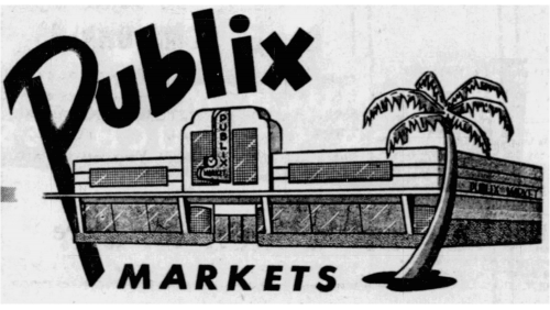
The 1952 logotype represents the image with company name written in black sans-serif. The brand designers put it above the image of a Publix supermarket. In front of it, there’s a palm tree and a big word ‘Markets’ beneath it.
1955 – 1957
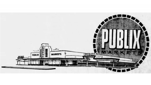
Another logo depicted the same idea, but somewhat rearranged. The name ‘Publix Markets’ in this case was placed inside the circle with a black dashed ring around, while a similar image of the building was put further away, making it look more massive.
1957 – 1958
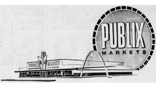
The 1957 logo looks very similar to the predecessor, except with some structural changes regarding the building.
1958 – 1972

This emblem is basically the circular part from the previous logo (so, without the building illustration). The color scheme was primarily white (for the circle itself) and green (for everything else).
1972 – 1979

This time, they added the minimalistic dark-green brand company name. The font was a round, smooth sans-serif style. On the right side from it, we can see the emblem of a small white ‘p’ letter with a dark green circle inside and a light green square for background. Below the square, the designers wrote the faintly visible ‘markets’ word in thin lime letters.
1972 – 2003

This time, there’s just the word as seen of the left side of the previous logo.
1972 – today
The 1972 logo is a lime green square with a white letter ‘P’ sitting right in its middle. In the center of this letter, they also put a dark green dot. Moreover, there’s the company’s name written in the same color in the bottom right corner of this square.
2003 – today
A few years later, the designers reworked the logo by removing much of the logo, save for the green name part. This inscription had the dark green typeface with clear and minimalistic forms, as well as bigger gaps between the letters.
2012 – today
In 2012, they replaced the dark green coloring with a brighter hue. That’s also when they introduced a new emblem – a circle of the same color with a white lowercase ‘P’ in the middle.


