Rocket League Logo
Rocket League is an arcade videogame released in 2015. The premise of the game is that you drive a car of your choice across a peculiar stadium, while using it do punch a giant ball towards the gates. It’s basically football with cars, although there is a lot more emphasis on tricks and bizarre ‘athletics.
Meaning and History
![]()
Rocket League was released on PC in the year 2015 by Psyonix, an American developer. The name refers to the fact that a lot of the movement in this game is conducted via thrusters and accelerators. It has a flexible relationship with physics and gravity, in particular.
2014 – 2015
![]()
The original logo of the cross-platform video game featured a complex geometric shape resembling two stacked rectangles: a larger one on top and a smaller one below. A prominent chrome frame with a voluminous 3D appearance surrounded the entire design. The primary color of the icon was blue, serving as the background for both the icon and the text.
The central element of the logo was a detailed white racing car, characterized by a high cockpit and wide front and rear fenders, conveying a sense of speed with its large wheels and either a headlight or a powerful exhaust depicted as a “star” element with rays radiating outward, accentuated by a red outline.
The textual component showcased the game’s name in wide characters, initially presented in a stylish sans-serif typeface with slight variations in letter size, tapering from the center to the edges due to the background design’s configuration.
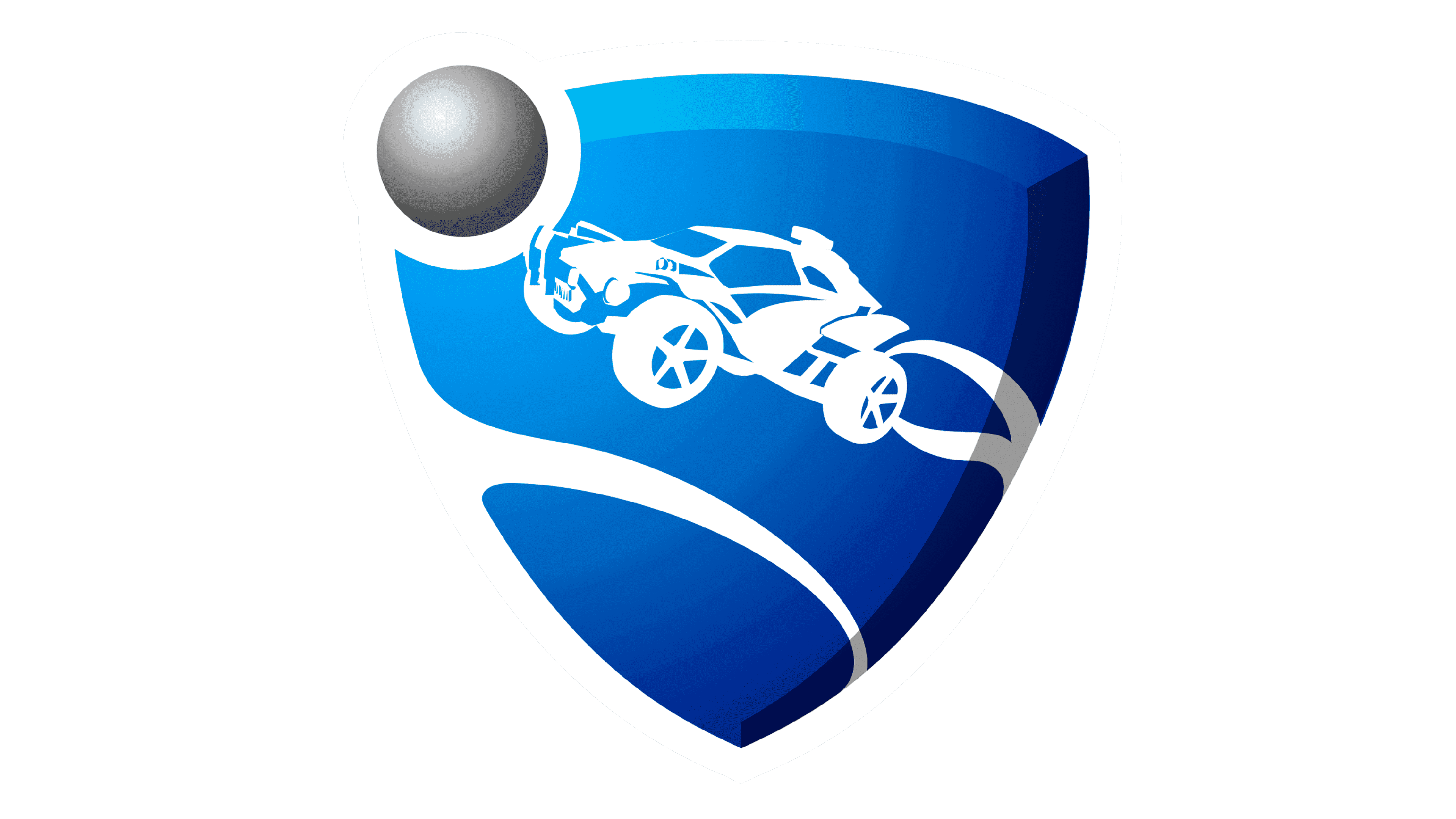
2015 – 2020
![]()
The main logo consists of two main elements: the shield logo and the lettering to its right.
The logo featured a blue shield (inspired by the logo of NFL and others) with a drawing of an off-road car on it. Notably, the vehicle is mid-air, as suggested by the white trails left on the car’s trajectory. The similar trail is visible in the lower part of the shield, but it doesn’t serve a purpose there.
In the left top corner of the emblem, they put a metal ball. It’s not this proportion or texture in the game, but the meaning is clear – the car is supposed to fly directly into the ball, that’s how the game works.
The writing to the right is simply stating the name of the game in big black letters. The font is rather plain, there’s nothing particularly unique about it.
2020 – Today
![]()
Following Psyonix’s acquisition by Epic Games, the logo underwent a transformation, coinciding with the game’s transition to a free-to-play model. The contemporary emblem no longer features the Octane shield, opting instead to place all the emphasis on the game’s name. Consequently, the redesign involved the removal of all graphic elements. The phrase “Rocket League” remains unchanged, without any alterations. It continues to be presented in uppercase letters, rendered in black, and composed of large, bold characters, just as it was before.
Emblem and Symbol
The game also released as a separate version for the Chinese market. They implemented several changes for it, including an updated logo. For some reason, it’s mirrored vertically, the shield and the car are shaped differently, and there are several more changes, such as just one trail spiraling around the emblem.


