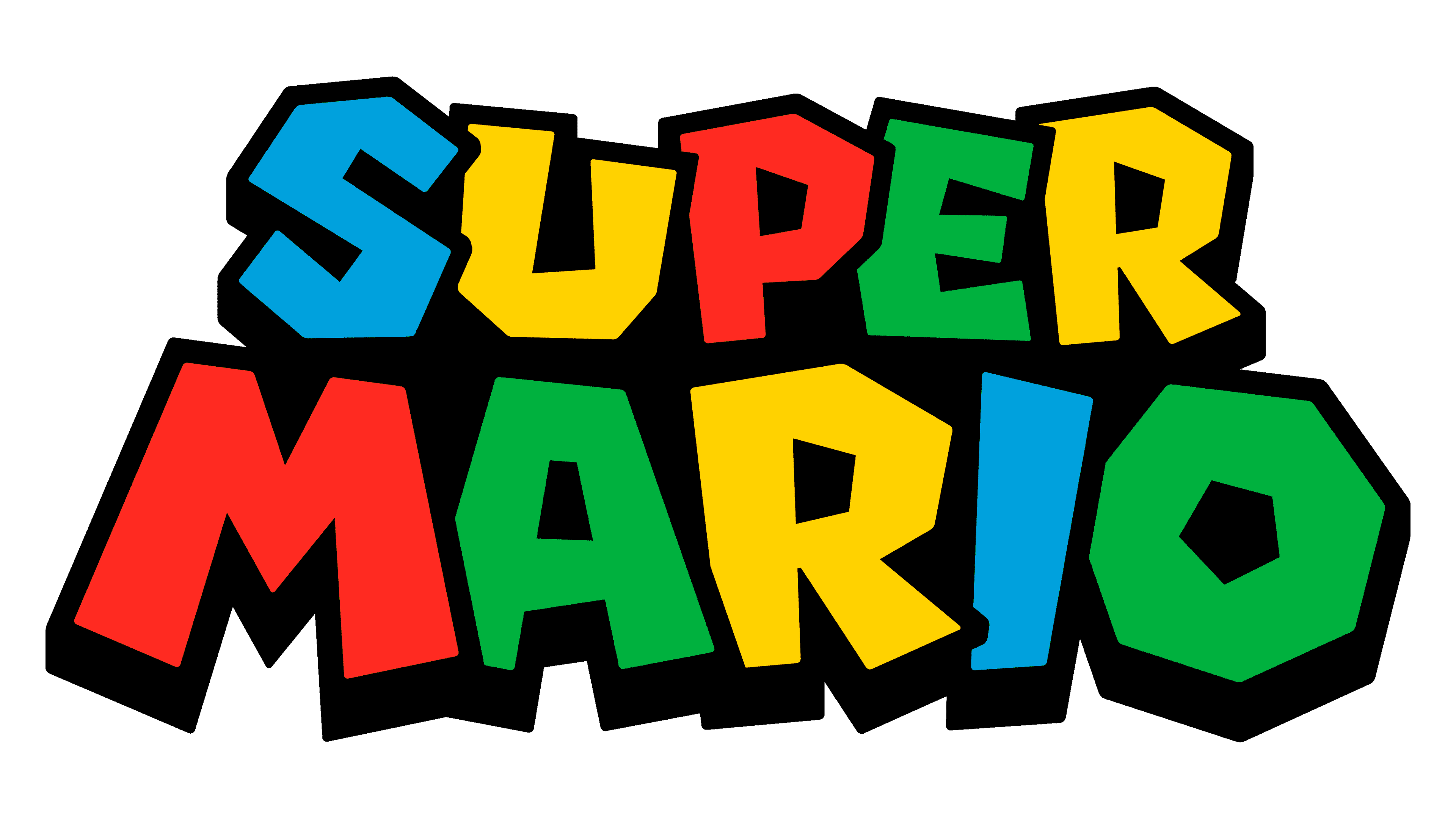
Super Mario Logo
Super Mario is an iconic video game series developed by Nintendo, first introduced by the visionary game designer Shigeru Miyamoto. Created in Japan, this franchise centers around Mario, an Italian plumber who adventures through various realms to rescue Princess Peach from the villain Bowser. Its inception was for entertainment on the Nintendo Entertainment System (NES), revolutionizing platform gaming with its innovative design, engaging gameplay, and enduring popularity across generations.
Meaning and history
In 1985, Japan birthed Super Mario, a game by Nintendo, imagined by Shigeru Miyamoto. Mario, an Italian plumber, became a hero. He jumps and runs, aiming to save Princess Peach. His nemesis, Bowser, constantly schemes against him. Each game unfolds in vibrant, diverse worlds. From 2D platforms, Mario evolved into 3D adventures. The series includes racing, puzzles, and role-playing. Global fans adore Mario. He symbolizes video game culture. Mario games lead in innovation, fun, and sales. Nintendo’s icon, Mario, continues to inspire.
What is Super Mario?
Super Mario stars a plucky plumber with an iconic red cap, navigating whimsical lands to rescue Princess Peach from Bowser. Created by Nintendo, this saga epitomizes adventure, merging classic platforming with inventive worlds that captivate and challenge.
1996 – 2011
The logo bursts with playful geometry, each letter a patchwork of primary colors—red, blue, yellow, and green. Bold, blocky shapes interlock, giving a nod to pixel art, a homage to the logo’s video game roots. Shadows lend depth, suggesting a three-dimensional space, reminiscent of Mario’s leap from 2D to 3D gaming. It’s a vibrant, dynamic dance of hues and forms, encapsulating the spirit of adventure and fun inherent to the Super Mario universe.
2011 – Today
This rendition of the Super Mario logo retains the primary color scheme but enhances the contrast, sharpening the visual appeal. The letters appear more three-dimensional with pronounced black outlines that make the colors pop. There’s an emboldened confidence in the design, echoing the evolution and boldness of the Super Mario series itself. This logo is less about nostalgia, more about the vibrancy and excitement of Mario’s ongoing journey.


