Tampa Bay Buccaneers Logo
Tampa Bay Buccaneers is a professional American football team from Tampa, Florida. It’s the most successful team to come from this state, and they also occasionally feature as one of the leaders in different leagues. They are amongst the strongest rosters in the South, notably.
Meaning and History
The team started in the year 1974. Their name is directly derived from the Florida’s place as one of the primary targeting spots and shelters for pirates during their Golden Age. ‘Buccaneer’ is a pirate who robs Spanish vessels, literally. They decided to take inspiration from that exciting period in this way.
1976 – 1996
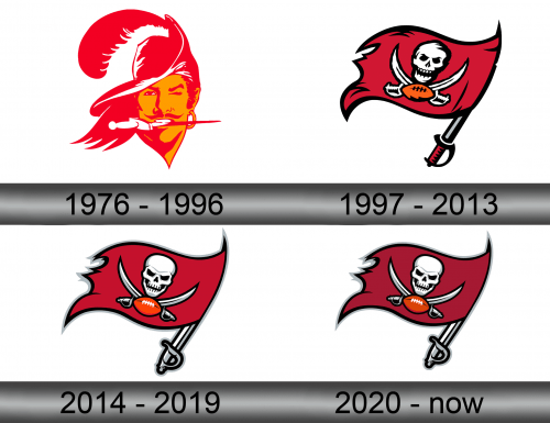
The 1976 logo was a classic image of a Southern outlaw, if not necessarily a pirate: a handsome man with long hair and a big skewed hat with a single feather for plumage. To add to the manliness of the character, they added a dagger between his teeth. Notably, its handle was the only white thing on the emblem.
Everything else was either red or orange, because those were the colors of the team back then. And these colors are still used even today.
1997 – 2013
In 1997, they decided to pick something that would reinforce their branding as a ‘pirate team’. They opted for a Jolly Roger depicted on a dark red cloth. Between the white sabers on the flag, they put an orange football (orange still being the color of the team). Furthermore, instead of a flagpole they used another saber with grey blade and a red handle.
They put a lot of effort into the flag, visibly. They highlighted the waving effect with the black lines here and there and generally spend some time designing the skull.
2014 – 2019
The 2014 design changed a few things.
First of all, the entire logo became bigger and clearer. That allowed them to add more nuance to some of the elements there. For instance, the skull became visibly more malicious. They even put effort into making the ball more visible and nuanced.
Secondly, the colors slightly changed. The red cloth on the flag was now slightly paler than before – on the previous attempt, it was very dark. Secondly, the black lines all over the cloth were removed. Lastly, they reworked the flagpole-saber. It’s now more fleshed-out and is mostly grey or white.
2020 – today
The only change that happened in 2020 was the return of the red shade to the previous dark hue seen in the 1997 variant.
Emblem and Symbol
A lot of the football teams in America have a wordmark – a secondary emblem used occasionally for branding purposes. Buccaneers have that. In fact, their design is much more unique than most wordmarks. It’s aggressive, angular and generally more predatory than what other teams have to offer.
