Universal Pictures Logo
Universal Pictures is a major American movie production company. What it means is that they give money to promising cinema projects and provide resources for the filming. They are currently one of the biggest corporations in this business, and one of the oldest surviving.
Meaning and History
1912 – 1913
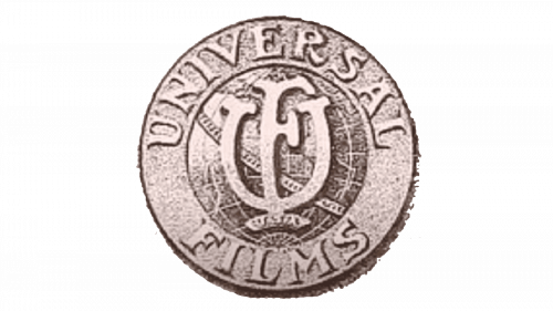
The founding emblem was a round emblem that looked like a metallic badge with the company’s wordmark etched in two parts along the rims. The central section looked like a globe, and two capital ‘U’ & ‘F’ letters were also placed in its middle.
1913 – 1914
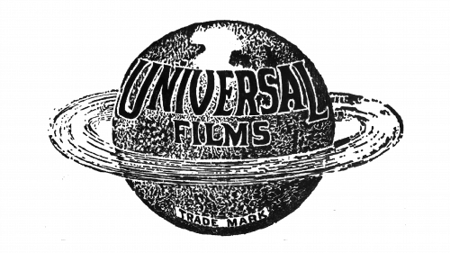
The 1913 logo was the first proper planet drawing they had. It’s basically a pencil drawing of a ball with undetermined shapes across its service. They also drew a meteor belt around the globe. On the planet’s upper section, they wrote the company’s name in big black letters.
1914 – 1919
In 1914, the emblem turned into a simple plaque. It’s still the same shape: a thin rounded rectangle with a circle figure in the middle. The former held the word ‘Universal’ written in black. The circle part had words ‘moving’ & ‘pictures’ written along its edges.
1919 – 1923
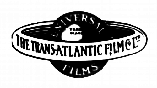
In 1919, they adopted a different sort of globe design. It was a more simplistic, 2D planet with a thicker ring-like belt around it. The former was black and had ‘Universal Films’ written along its top and bottom edges. The latter had a white coloring with the black text of ‘the transatlantic films co’ written over it.
1923 – 1931
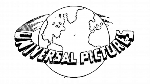
The 1923 emblem introduced the first comprehensive globe drawing – it roughly depicted the Atlantic Ocean with American continent on the left and Europe on the right. The wordmark ‘Universal Pictures’ was floating around it like a sputnik.
1931 – 1936
The 1931 depicted the same thing as the 1923 globe, but in a simpler way. The continents were more detailed and completely black this time. It was also a flat 2D drawing with a ring frame around it. On the ring, they wrote ‘Universal Pictures’ in thin capital letters with dashes in-between.
1936 – 1947
It’s a similar globe design, but focused on the Western Hemisphere. The ring around it is gone in favor of a black ribbon shape wrapped diagonally around the planet. The usual wordmark – in white – was written on it.
1947 – 1960
The 1947 was a proper 3D emblem. They drew a grey Earth with what might be Atlantic Ocean on it. The ‘Universal International’ bit was written in front of it using white serif letters with black outlines.
1960 – 1963
In 1960, they decided to depict the American continent again, but the approach was mostly the same. The text part increased in size, and that’s all.
1963
The previous design was darkened, the text (averaged) grew even bigger, and they turned ‘International’ in the name back into ‘Pictures’.
1963 – 1990
The 1963 logo was more conceptual. It was basically a circle with some scarce grid on it plus a horseshoe-like black shape on its sides and bottom. Beneath this contraption, they simply wrote ‘Universal’ using a basic black sans-serif.
1990 – 1997
The 1990 emblem was the first in the line of modern Universal logotypes. It’s a 2D drawing of a gridded globe with actually decent depictions of continents on them, made in white with black edges. The center of the image is blocked by a big word ‘Universal’ made from slightly serif capital letters.
1997 – 2012
The text stayed as before, although with slightly smaller letters and bigger intervals. The image changed a lot – they removed the grid, colored the continents black and turned the circle borders into just two crescent shapes above and below.
2012 – today
Crucially, some curve was added to the text, making it bend upwards. The font also changed a much more usual sans-serif style. As for the planet, its point of view shifted below and to the right, which ensured Europe is in the picture.
2021 – today
The letters moved closer together, and the globe was shortened height-wise. That’s about it for this version.


