Washington Commanders Logo
The Washington Commanders are a professional American football team, part of the National Football League (NFL). The franchise is owned by Daniel Snyder and operates out of the Washington metropolitan area. The Commanders have a rich history and are known for their competitive spirit in the league. Their colors, emblem, and mascot are integral to their identity, representing the team’s values and traditions, and they continue to be a significant presence in American football, striving for excellence and contributing to the sports legacy.
Meaning and History
The Washington Commanders, an NFL team, have undergone several changes and evolutions since their inception. Initially, they were established as the Boston Braves in 1932, later undergoing a name change to the Redskins in 1933, and relocating to Washington D.C. in 1937. The team encountered a significant shift in 1999 when Daniel Snyder acquired the franchise. He has maintained ownership since, overseeing numerous alterations and adaptations. The most monumental transformation came in 2020 when, amidst societal shifts and pressures, the team decided to retire the Redskins name and logo, leading to a period of being known as the Washington Football Team. The adoption of the current name, Washington Commanders, occurred in 2022, symbolizing a new era for the franchise, focusing on inclusivity and progress, while honoring their extensive and rich heritage in the NFL. The Commanders continue to evolve, reflecting their resilience and commitment to excellence within the dynamic landscape of American football.
1932 – 1933
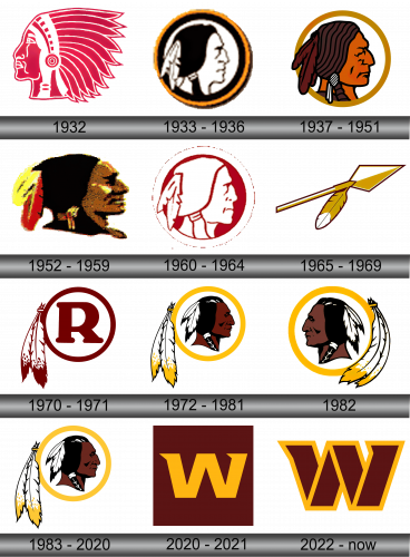
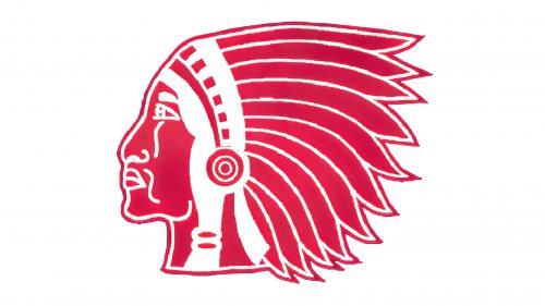
Even before the team was known as Redskins, they used a classic depiction of a Native American as their mascot. It was a bicolor (red and white), simplistic illustration of one’s head, adorned with an ordinary (at least, for the popular culture) feathery headwear.
1933 – 1936
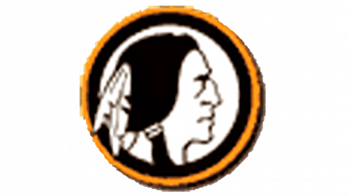
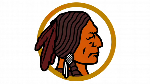
By this time, they were renamed Redskins. The idea of an Indian’s head as a mascot persisted, although there were some changes. Firstly, the entire thing was repainted black-and-white and encircled by a golden ring.
The general style also changed from an illustrative to a more realistic approach. That’s partly why they opted for a two-feather decoration rather than a full-blown, bulky headwear this time.
1937 – 1951
Reversing the previous trend, they used pretty much the same emblem, but made it colored instead of the black-and-white. The coloring wasn’t too realistic, either – these were bright, strongly saturated shades of brown this time.
1952 – 1959
The 50s logo was more of a metal badge rather than an illustration. The colors matched too – they styled it to look bronze or gold with some black additions in the middle.
1960 – 1964
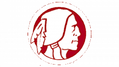
The 1960 version was again the same head illustration from 1933, but colored red and white (after the uniform colors back then).
1965 – 1969
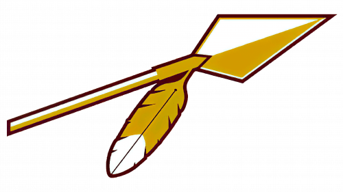
The 1965 logo was a sudden change in design. Instead of the American’s head, they used a golden spear for 4 years. It was mostly golden, with some white additions here and there. Compositionally, it was a spearhead with just a small stick attached to it, as well as a feather protruding from the spearhead’s base.
1970 – 1971
The 1970 logo was another attempt of creating a long without using a head as a Native American profile as mascot. This time, they used a big letter ‘R’ colored in dark red, with the circle around it colored the same. On its left side hung two big feathers with golden tips (both this and the burgundy in the letter design were team colors).
1972 – 1981
In 1972, the Indian portrait returned in a slightly different shape, surrounded by a golden ring. The feathers stayed, but the golden tips they had were made paler this time.
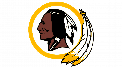
1982 – 1983
In 1982, they basically just took the previous logo and mirrored it. The feathers were also curved to fit the curvature of the ring, and the face of the mascot was bleached just a bit.
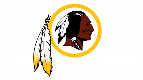
1983 – 2020
In 1983, they returned the 1972 logo, but kept the slightly bleached hues from the 1982 attempt.
2020 – 2021
Following the racial controversy in 2020, the team decided to change the name to just ‘Washington Football Team’ – it’s an interim name that will be replaced by a permanent candidate later.
The new logo consisted of the word ‘Washington’ in burgundy letters, as well as a smaller inscription that said ‘Football Team est. 1932’ right below the main writing part. Often, they’d put the entire thing inside a golden rectangle, which, again, are the colors of the team.
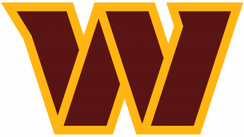
2022 – Today
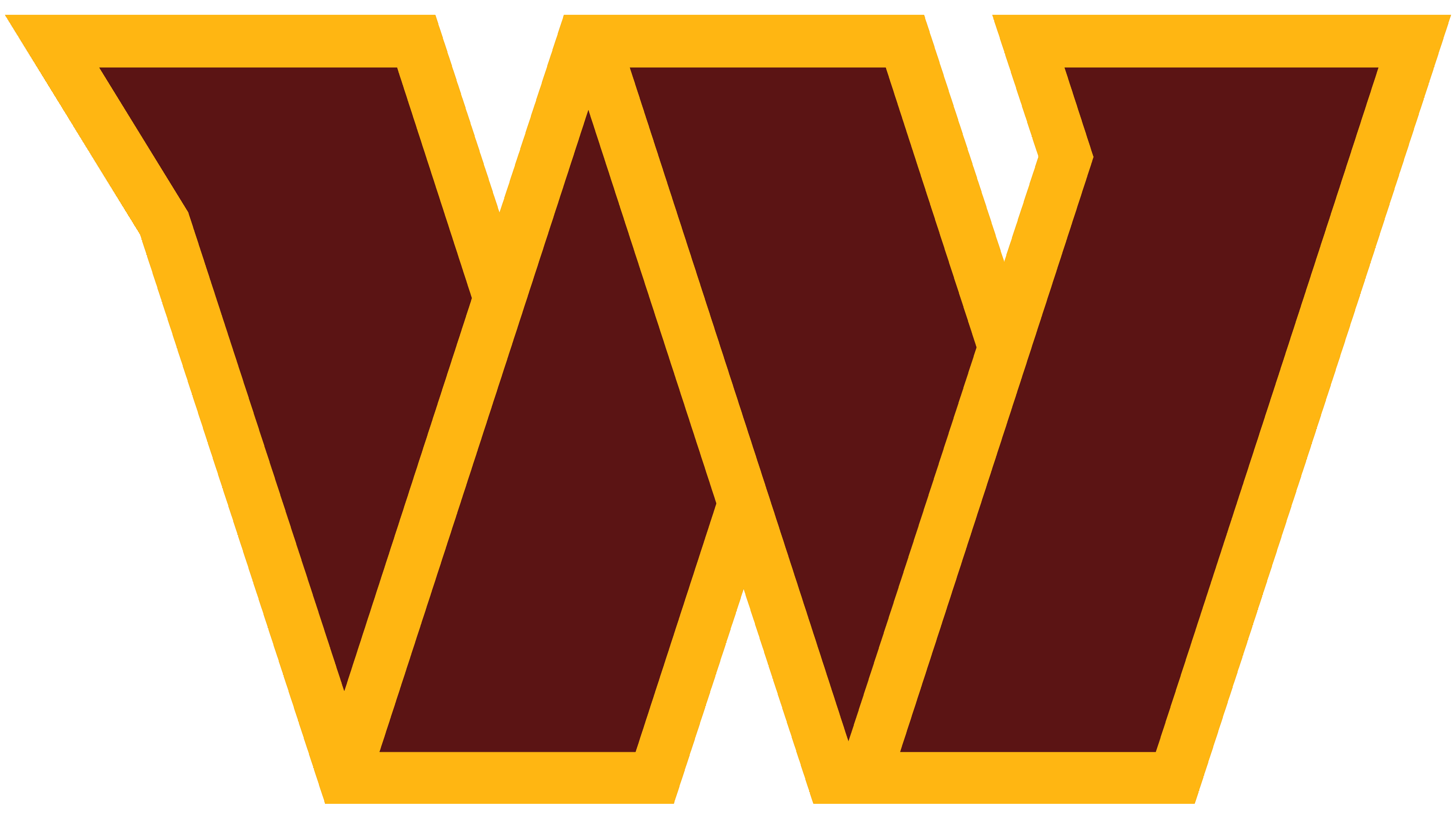
Central to the design is a sleek, stylized emblem that, while abstract, hints at a shield or crest motif. The color palette predominantly features deep burgundy and gold, evoking a sense of prestige and tradition. The name “Washington Commanders” is conspicuously emblazoned below the emblem in bold, capitalized letters. The font choice is modern, yet with a nod to classic design. It’s evident that the logo blends contemporary aesthetics with elements that hint at history and heritage, likely reflecting the legacy of the team or the region it represents. The balanced combination of colors, typography, and design elements make it stand out, ensuring easy recognition.
Emblem and Symbol
When the team changed its long-standing name to ‘Washington’, they also introduced an emblem to be used during this interim period. It was a yellow capital ‘W’ put inside a burgundy (or dark red) square.
 These are supposed to represent the iconic team colors so that fans would understand the connection.
